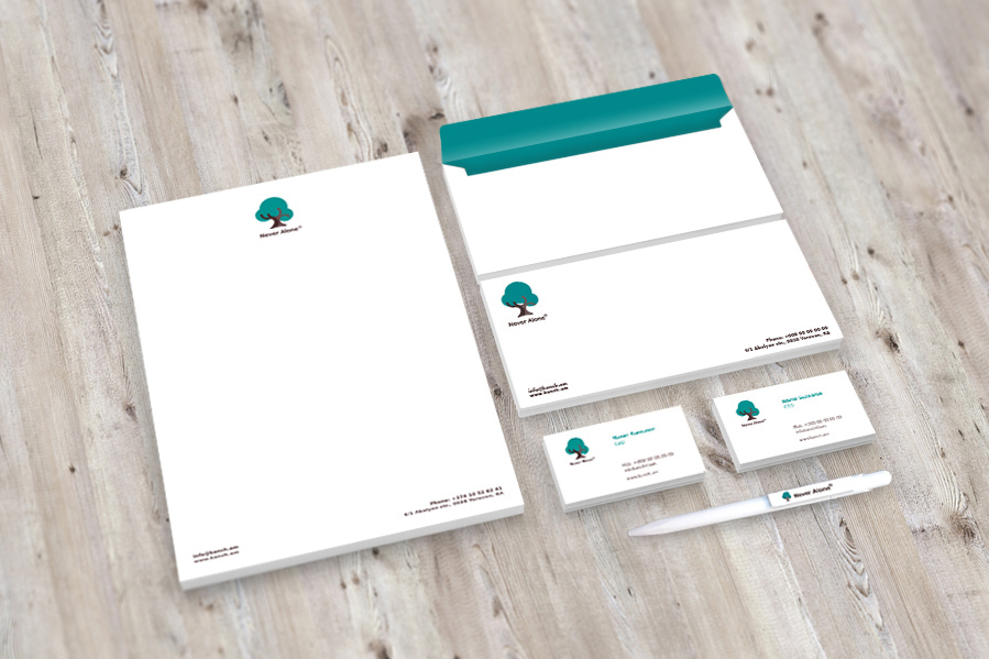
Never Alone® service is a round-the-clock system of providing everyday safety to people who may find themselves in emergency situations and need medical or other urgent aid indoors and outdoors.
The Challenge
Our team was briefed to create a brand for one of a type service in Armenia. A specific request to create a brand that communicates family values was set by the client.
The Solution
Sense of security, freedom of actions and extra care – this is what everyone wants to give to their loved ones, especially when those are seniors or children who require additional attention.
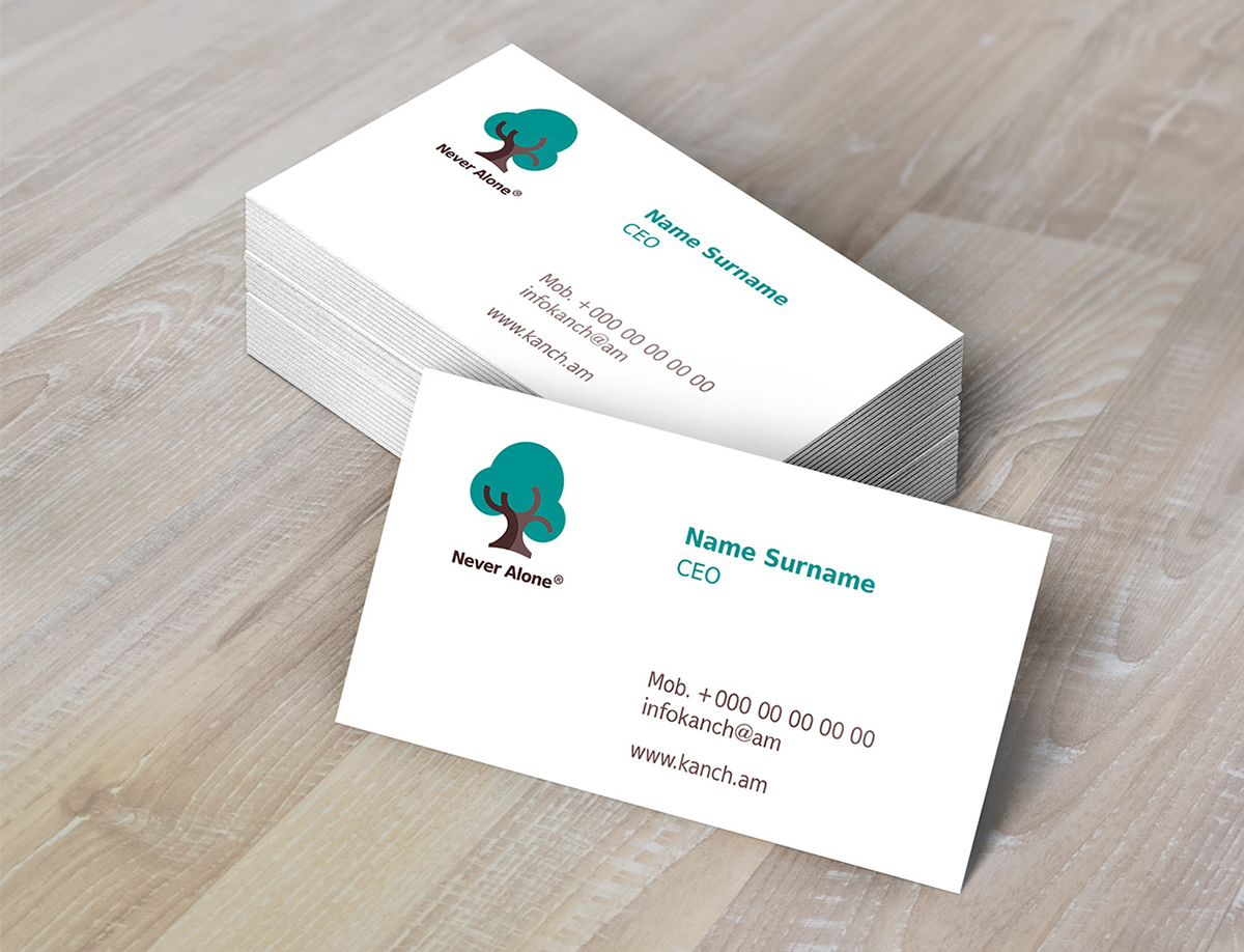
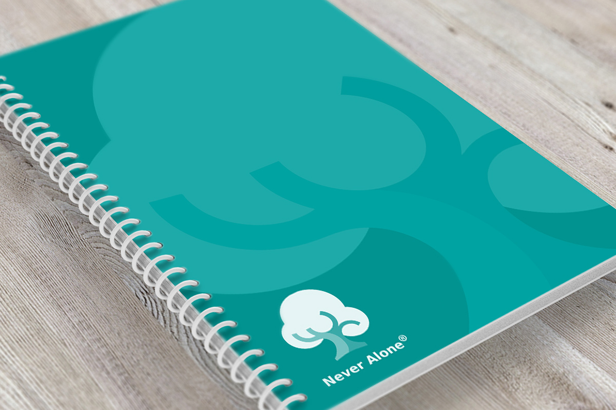
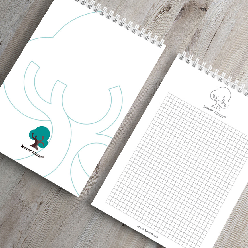
In the notion of family values, we put tree as central figure for the brand. It transmits the succession of generations and vitality. The circular shape focuses on friendliness of brand, whereas rotated branches emphasize protection that is expressed in brand naming - Never Alone/Всегда Рядом/ Միշտ Կողքին.
Color selection helped us highlight the main values of the brand: open communication, sense of confidence, clarity and harmony.
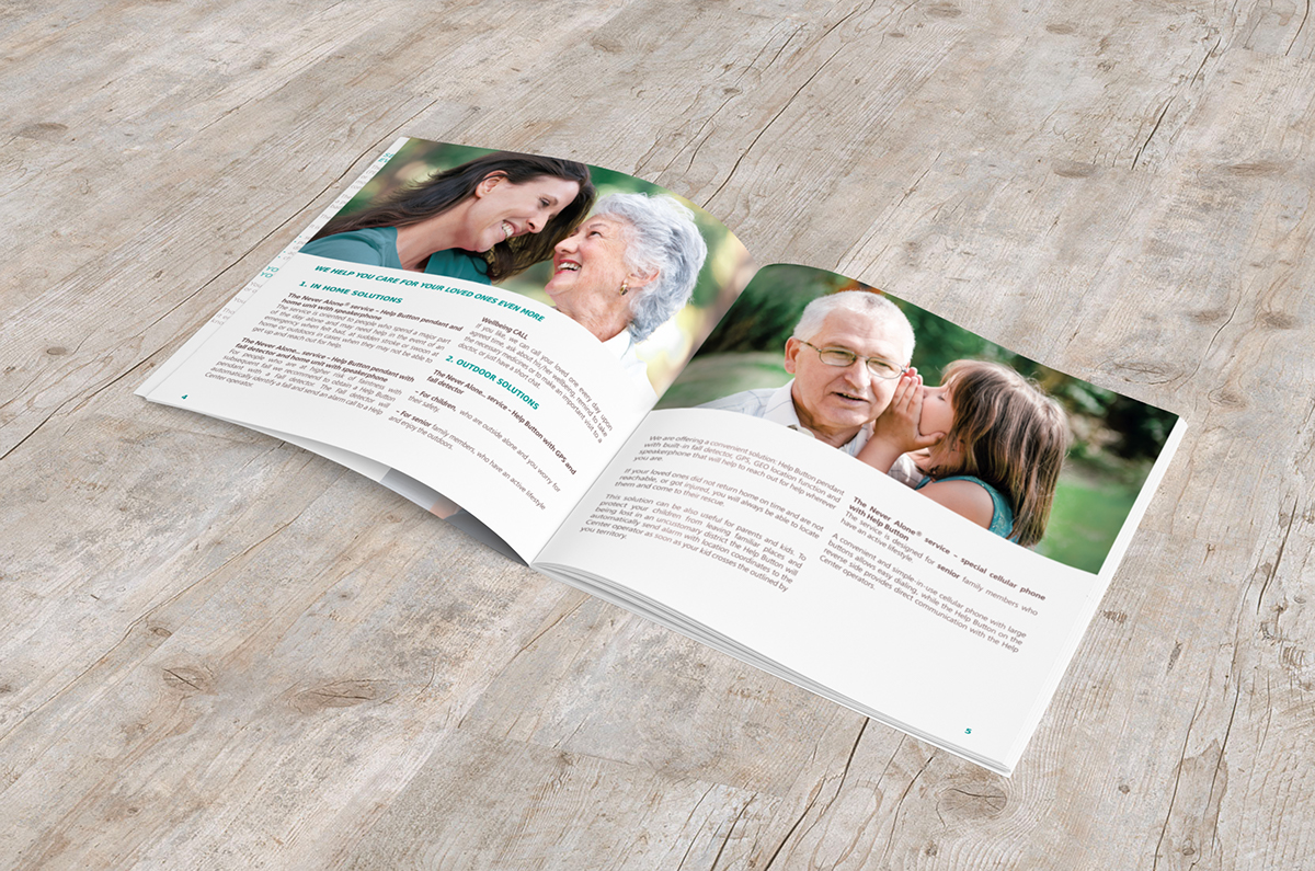
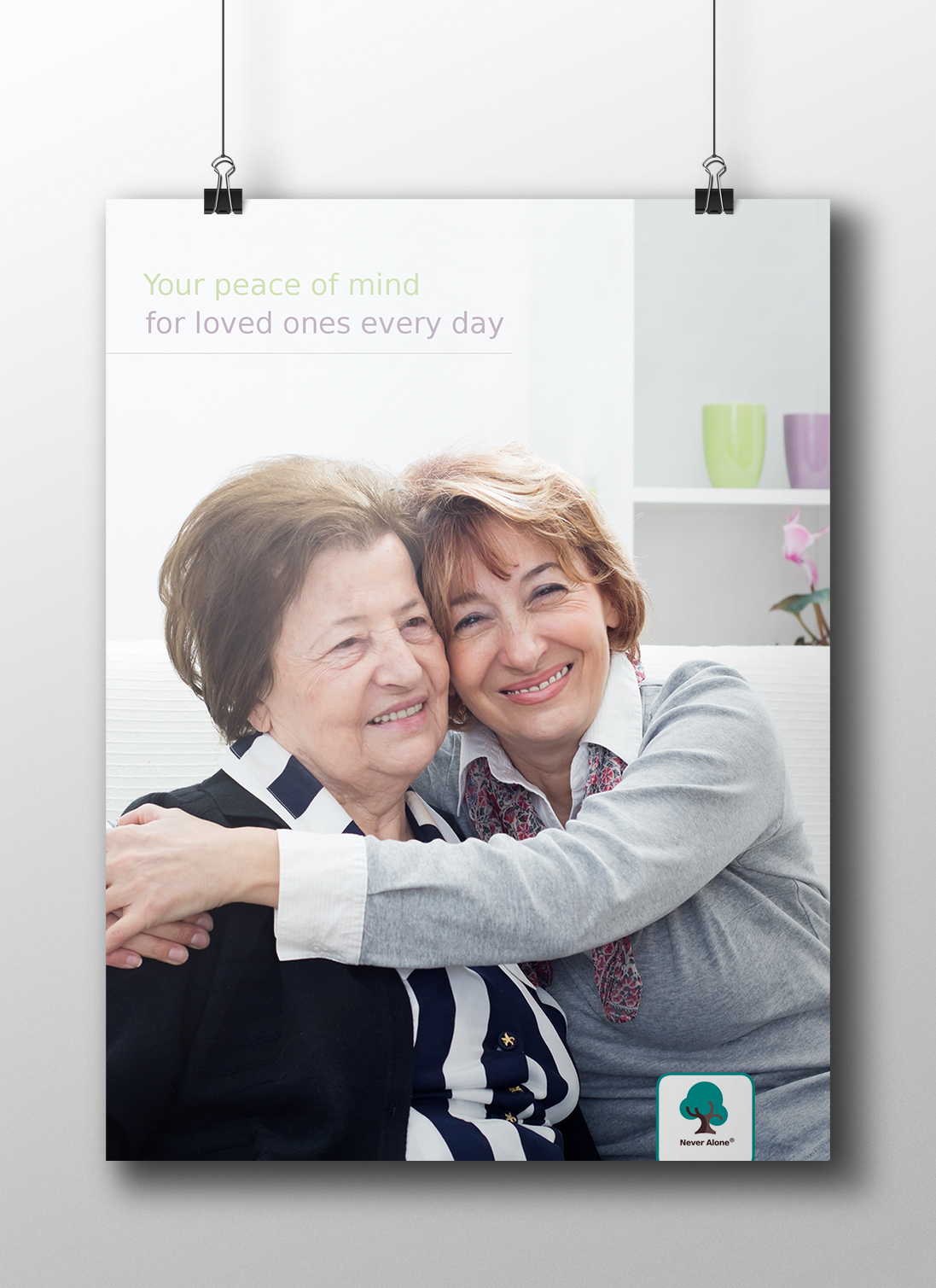
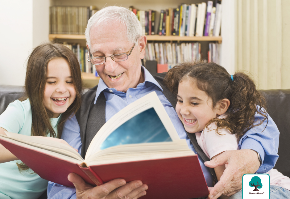
While developing visuals for the brand, we put special attention to photography style. Caring, mindful family members, enjoying quality time with their loved ones are selected as main characters.
Assuring the user that he/she is never alone, the brand enhances the bonds within family members no matter where they are.

