"Tętno"
BRAND IDENTITY PROJECT
"Take a break, take a sip."
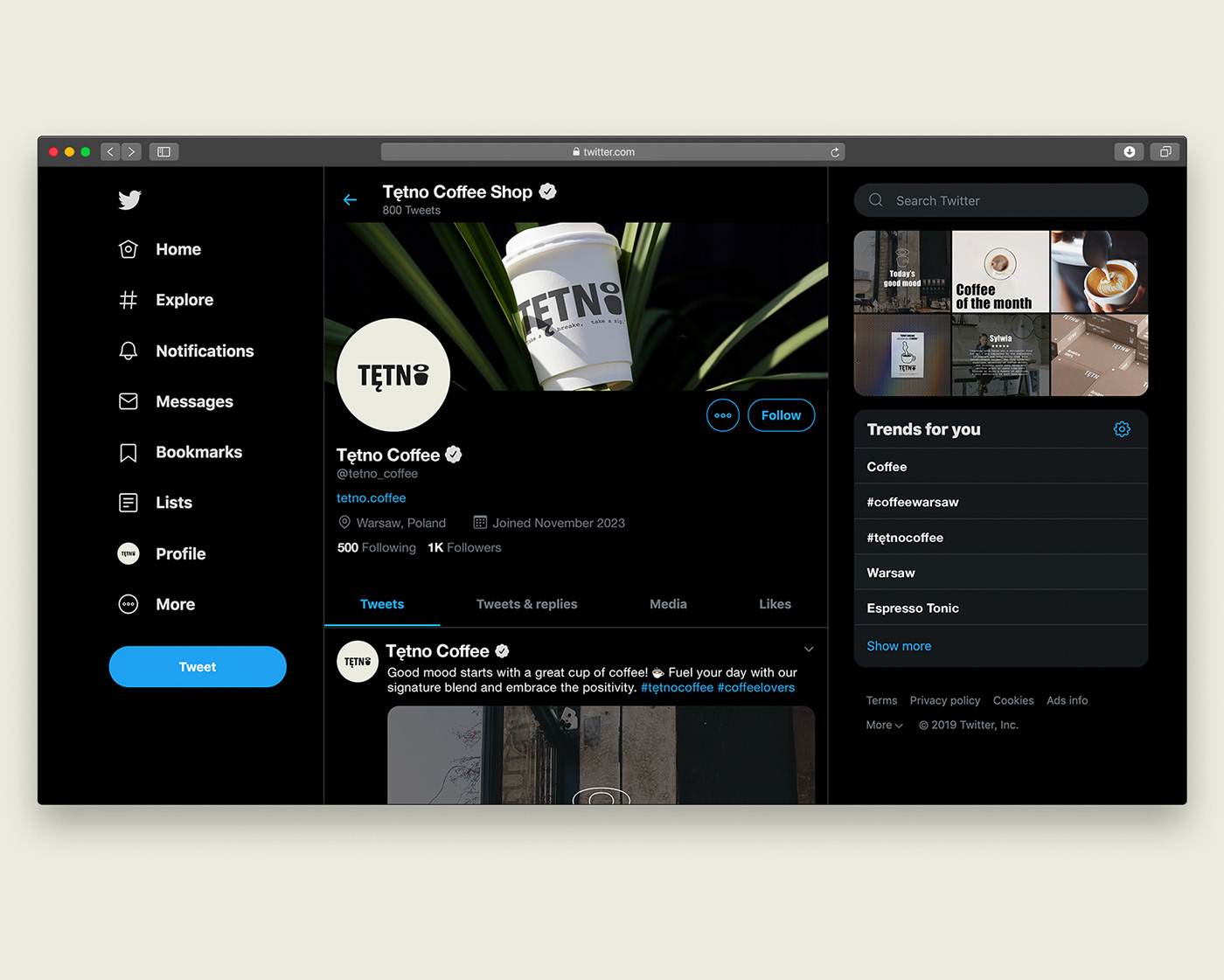
Tętno is a conceptual visual identity project for a potential coffee shop in Warsaw, Poland.
It is envisioned as a place where people can come to relax, enjoy a cup of coffee, and take a moment for themselves. Whether it's to catch up with friends, work remotely, or simply unwind from the hustle and bustle of the city, Tętno offers a welcoming atmosphere for all.
The logo features a coffee cup integrated with the last letter "O," symbolizing the essence of coffee itself. The illustrations, fonts, and overall design elements reflect the concept of everyday simplicity while subtly encouraging patrons to pause, take a breath, and savor the moment with a refreshing cup of coffee.
In the design, three fonts were used: Impact, Courier, and Thunder, chosen for their ability to convey boldness and clarity. Impact is used for larger text to make a statement, while Courier and Thunder add a touch of elegance and readability to the smaller, almost script-like words.
The color palette is limited to two coffee-inspired hues: one resembling creamy milk coffee and the other a deep, rich brown. These colors, along with the minimalist design elements, evoke a sense of warmth and comfort, inviting customers to step inside and experience a moment of tranquility amidst the daily rush.
Graphic Designer
Valerii Ponomarenko
2024