
APDZ384 Navi-Cycle Final Prototype Project
by Karl Olson
by Karl Olson
Introduction
My project is to develop a bicyclist navigation app for phones or smart watches that will help bicyclists safely navigate along a custom-made bike route. The app will help provide directions and alert them if there are any changes, such as traffic, news alerts weather notifications and provide certain service stops along that route.
Problem Statement
Bicyclists need to navigate safely to their destination by giving them accurate real time updates to their route and surrounding areas as they travel. The app should make travel safe and efficient. The app will also give them a better experience through sightseeing recommendations (as an option).
Goal
The goal of this project is to provide bicyclists with navigation assistance while they are riding their bikes along a route. It had to be a free app; this way people from low income backgrounds could afford to at least give it a try. While they are traveling, the app should give them all they need to know about their route and service stops and sightseeing destinations to give not only good timing on their route but also give them a great bike riding experience. Here I will show you the process in which I built my app.
Research
Research for this project included a competitive audit of my competitors who were doing similar things to my app. I compared each of the competitor’s pros/cons and what users said about them in reviews. This Market Analysis Data would be to get me familiar with the existing bicyclist navigation apps. Looking at the reviews for these competitors would prove vital for me to understand their app's UI, UX, User flow, and key features to identify the common problems they have that I would address with my app.
Competitive Audit
Most of the bike navigation apps I looked at received this feedback. First, that being able to customize the interface and having the freedom to choose their routes without having to pay for them was a good thing. What was also helpful to users was having a simple yet accurate map on which to track their bike trip progress. Some users also would like if there was a place to save their routes for next time. Finally, the users of these apps were looking for the quickest, safest, route they need for their biking trips. All of these apps were effective on mobile phones. Below are each of the result pages from that Competitive Audit.


Customers Interviews
Demographic Information
The group I interviewed were two veteran bicyclists who had been biking for years. They have either done it solo or with a group. They are mostly into recreational bicycling but have done biking when it came to work related commutes though only if they lived nearby. They are part of the Bicyclists of the West Coast demographic. They are very careful in studying their route before and packing all the essentials they need to travel safely. This is how they are very aware of the environment given that it is vital for traveling. They love the outdoors especially. The user group is ethically and socially diverse.
Interview questions
1. Can you describe your favorite type of cycling route or trail and why it is your favorite?
2. Have you bicycled for work, commute, or recreational reasons during the time you rode your bicycle. Could you describe it?
3. What do you enjoy most about bicycling?
4. What are some of your favorite stops on cycling routes you take? For example, food service or maintenance stops if you need one. How do you navigate to them on your route?
5. How do you navigate when you are cycling? Is it electronic? If so, what have you tried.
6. What would your ideal form of navigation assistance be?
7. What time of day would you prefer to ride your bicycle?
8. How do you ensure your safety while cycling, especially on busy roads?
9. While bicycling, what would be the least distracting: a visual or audio alert if you need to have an urgent update about something while bicycling from your phone.
10. How do you handle different weather conditions when cycling?
11. Do you have any favorite cycling accessories or gear that you can’t do without? How do you manage them while riding?
12. Have you ever had any memorable or challenging experiences while cycling? Can you share one?
User Research Summary
The research I did on my West Coast bicyclists demographic was the result of doing two interviews with individuals who had done their share of bike riding over the years. I learned what they had done and what they like when bicycling. Based on my interviews, bicyclists prefer to travel on quieter routes away from cars if possible. They have done bicycling for both work-related commutes and for recreation, most of the time for recreation and exercise. Most bicyclists have prepared food and meals for travel beforehand so they don’t need food stops that much though, it would be a good idea to know just in case. For other destinations such as sightseeing, bicyclists have prepared maps in the past though in recent years, they have used their phone more for looking at the map online. Most of the time, they travel on familiar trails that they have studied beforehand. They especially would prefer traveling during daylight hours and in good weather that they check before their outings. They make sure that they are well prepared with reflective clothing and with a helmet. From what I have found out, they would find subtle audio cues from electronics or vibrations to be less distracting. They overall want to be prepared for their travels and have their most important gear, especially electronic navigation devices, be in easy to access areas on them such as their pockets or on their wrists in the case of watch like devices.
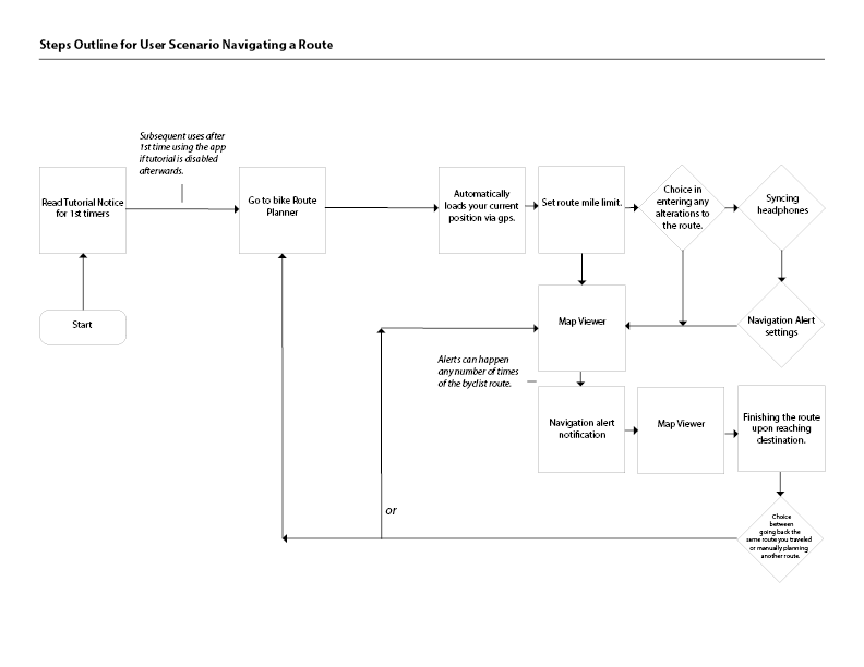
Scenarios Description
A West Coast Bicyclist is trying to plan a biking trip through their neighborhood and to a destination. They need to know the quickest bike safe route to their destination. They plan out the route and set their app to remind them where they should go based on the route they planned. Along the way they make a stop to get a snack at a store the app knew would be on the route. Then have to change the route due to an unexpected obstacle that blocks their path. After the West Coast Bicyclist makes it to their destination they chart a path home using the app to go the way they successfully used to get to the outskirts of their hometown.
Persona
After interviewing and observation was completed, I developed a persona that highlights the individual group that represents my primary user base.

Ideation
After the site map was developed, I reviewed the results from the interviews and determined the most important “user flow” I wanted to feature in this prototype. I decided to do how the app plans a bicycle ride route for a user. I then created some wireframes of the proposed interface.
Crazy Eight
After getting a clear picture through the user first journey, I started drawing by hand the low-Fidelity wireframes. I did these sketches in the crazy eight technique. I drew 8 sketches of each page I would do for my plan a bicycle ride route user flow.
Below are images of the sketches I did for the crazy eight phase of my app project. Red squares on the pages show what designs I would build on for the low-fidelity iteration or wireframes. Red rectangles around the thumbnails also mark which ones were chosen for use when making the wireframes. As a note, some app page design were done with two crazy eight sketch sheets made. The old and new versions of the same page are paired up back-to-back with each other. The rectangle outlines show which thumbnails were chosen for refinement and the final choice.


After I brought these sketches into class, I concluded from the feedback I received that I would set up these pages vertically. This was because I found out that most phone mounts on bikes are vertically arranged and would be easier to read for people when riding. This way I would make protypes for these pages in a vertical format as I went along with prototyping my app.
Wireframes
I prepared wireframes based on feedback I had received from the crazy eight sketches. I would do these wireframes in Figma which would be where I did my app project for the rest of the quarter. The user flow I would create is planning out a bike ride and following it to its conclusion.

Mid-Fidelity
For this version, I had copied the previous version within the same Figma file and modified the copy based on feedback I had received from the wireframes stage of my project. I had already in the wireframes used icons and images I had intended to use for this saved in the tutorial pages that I would complete when the app's high-fidelity version was done. This way, I would know what to type in the tutorial. With the icons I needed already there I would not have to replace much except if it was vital to improve the project. Below are two user flow tasks that were at this point part of the app: The task in which a user plans a trip and completes it while setting a "direction coming up" alert to help notify the biker that a change in direction would occur soon. The other user task was accessing the tutorial if the user was confused. They could use the hamburger menu button in the corner to access info on the app in tutorial to help them understand the app's process.

Basic App Bike Trip Set Up and Navigate Task

Access Tutorial Side Task User Flow
High-Fidelity
After doing many modifications from the mid-fidelity based on feedback from users who tested my prototypes this high fidelity prototype was the culmination of my Navi-Cycle App.
Colors and Typography Design Guidelines
Icons and Design guidelines for the final design were developed for this project. This includes color palette and typography. Below is the final color palette and typography that was used for the Final High-Fidelity prototype.
Colors

App Typefaces

High-Fidelity Prototype User Flow
A high-fidelity prototype was created for the intended user flow. Below is a breakdown of the plan your trip page with highlights on it’s available features.

Basic App Biking Trip for User Task
This user flow demonstrates how the user can plan out the route for their biking trip and navigate it from start to end.

Set the Direction Alert Audio for the Bike Trip Task
This user flows demonstrates how the user can set a direction audio alert that will trigger when they approach the next direction on their bike route.

Toggle the Return Trip Map Icons Side Task
These user flows demonstrate how the user can, in the route completed page, toggle the map icons on and off in the return route preview map on and off.

Examine the Notifications Bar in the Plan your Trip Page Side Task User Flow

Extend the Plan Your Trip Map Key Sidebar Side Task User Flow
This user flows demonstrate how a user can extend the map key in the Plan Your Trip page to identify any icons on the map and what they represent.

Clicking on a map Icon to access info on that location Side Tasks
This user flows demonstrates how a user can access information on a notable location marker in the maps by clicking on them for extended detail about that location.

Access Tutorial Side Task User Flow
This user flows demonstrates how a user can access the Navi-Cycle app tutorial from the menu options page.

Overall, a prototype demonstrating all the user flows in the Navi-Cycle app was created in Figma.

A link to the final working prototype is available to access here: Figma Prototype
Project Conclusion
Overall, I was able to do well on this project despite its challenges. I was able to get better research on the bike apps by looking at the reviews of my competition. I also got a decent amount of info from my interviews, but I wish I had a larger sample size of bicyclists. I also was able to give a clear final layout with my app once I got the recommendations I received through user tests. I was able to implement a decent movable map with icons users can click on. I was also able to implement the color schemes involving primary, secondary, and tertiary despite being new to the concept. I look forward getting more practice with these concepts. Doing the alert sound selection is, I believe, was still the most effective way to help with navigation during bike ride. I do believe it has potential as an effective navigation aid app system despite not being able to demo the direction alert system itself in the Figma prototype. I also made a good system for establishing a hard limit on how far the user wants their trip to be. This served the purpose of limiting the number of routes one has available within their mile limit, so the map is not too cluttered when planning out a user's bike trip. Finally, I believe I had found a better way to navigate the instructions pages by having multiple pages then having them all be visible on a single long page to scroll. There are some things I wish I could have implemented or done better such as a customizable UI system to accommodate people who view parts of the app UI differently or would prefer certain UI layout aspects to be in a different spot. However, I was limited from doing so in the Figma software program. I would have liked a way to display how busy some routes are in the map, but the number of colors involved need to code them would have, in my view, made the map too messy to read in the trip planner page. Lastly, I would have liked a way to simulate the zoom in "zoom out" function of a map in Figma but I was constrained from doing so because of the limits of the program. Overall, I was still able to do a good first attempt at designing a navigation aid app like Navi-cycle.
