


OVERVIEW
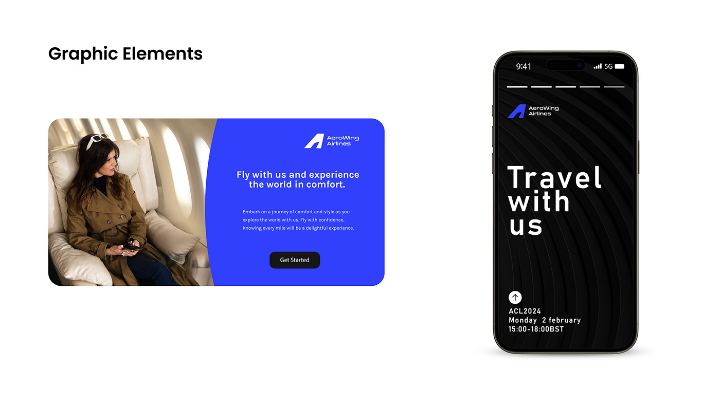
Aerowing Airline is a new, dynamic airline company aiming to provide exceptional service, reliability, and comfort to its passengers. With a focus on efficiency and safety, Aerowing Airline seeks to become a leading player in the aviation industry.
DESIGN ELEMENTS
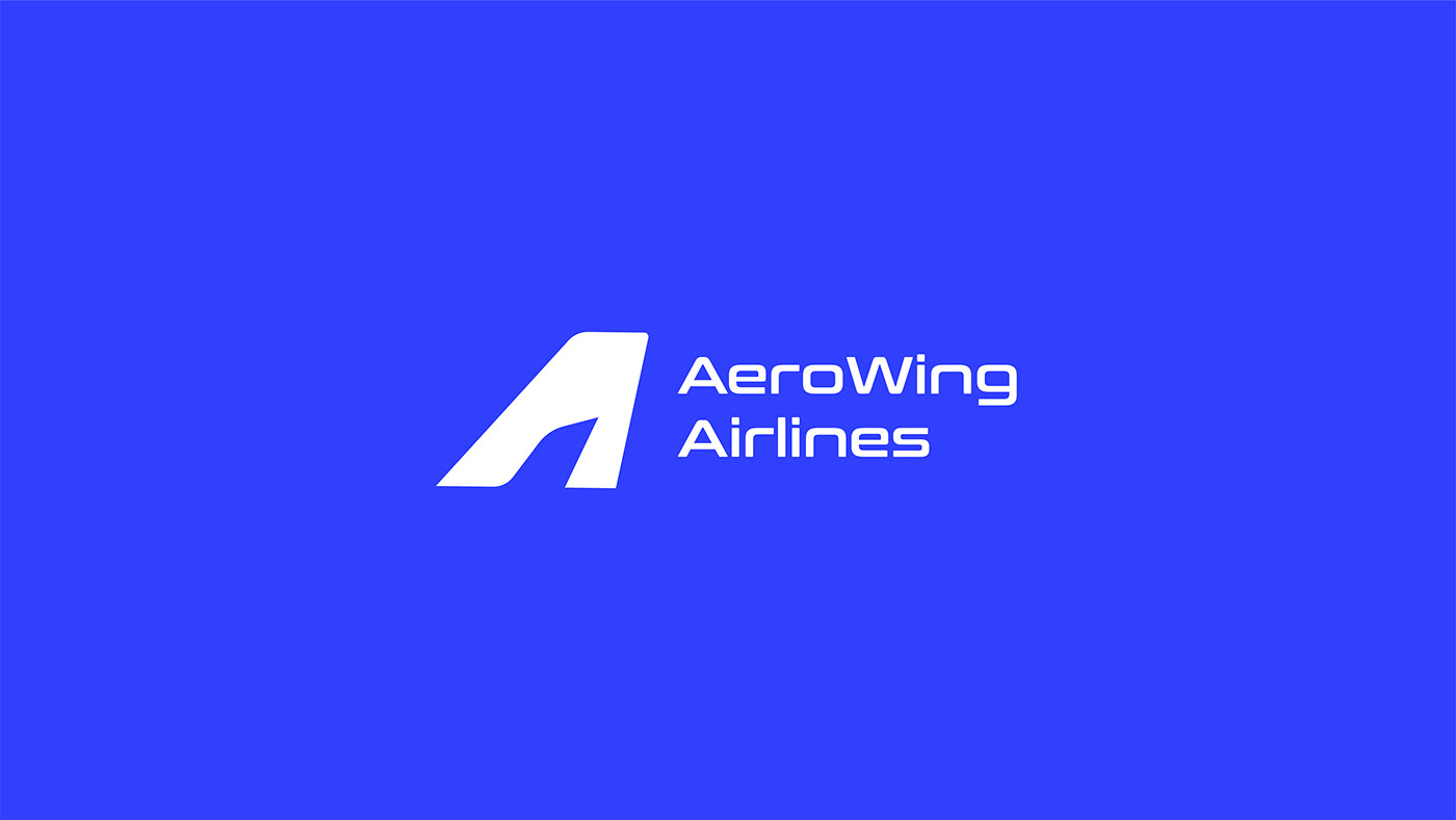
The logo for Aerowing Airline incorporates the letter "A" with a sleek and stylized airplane wing symbol. This design captures the essence of flight, speed, and innovation, while also conveying the brand's modern and dynamic identity.
Color Scheme
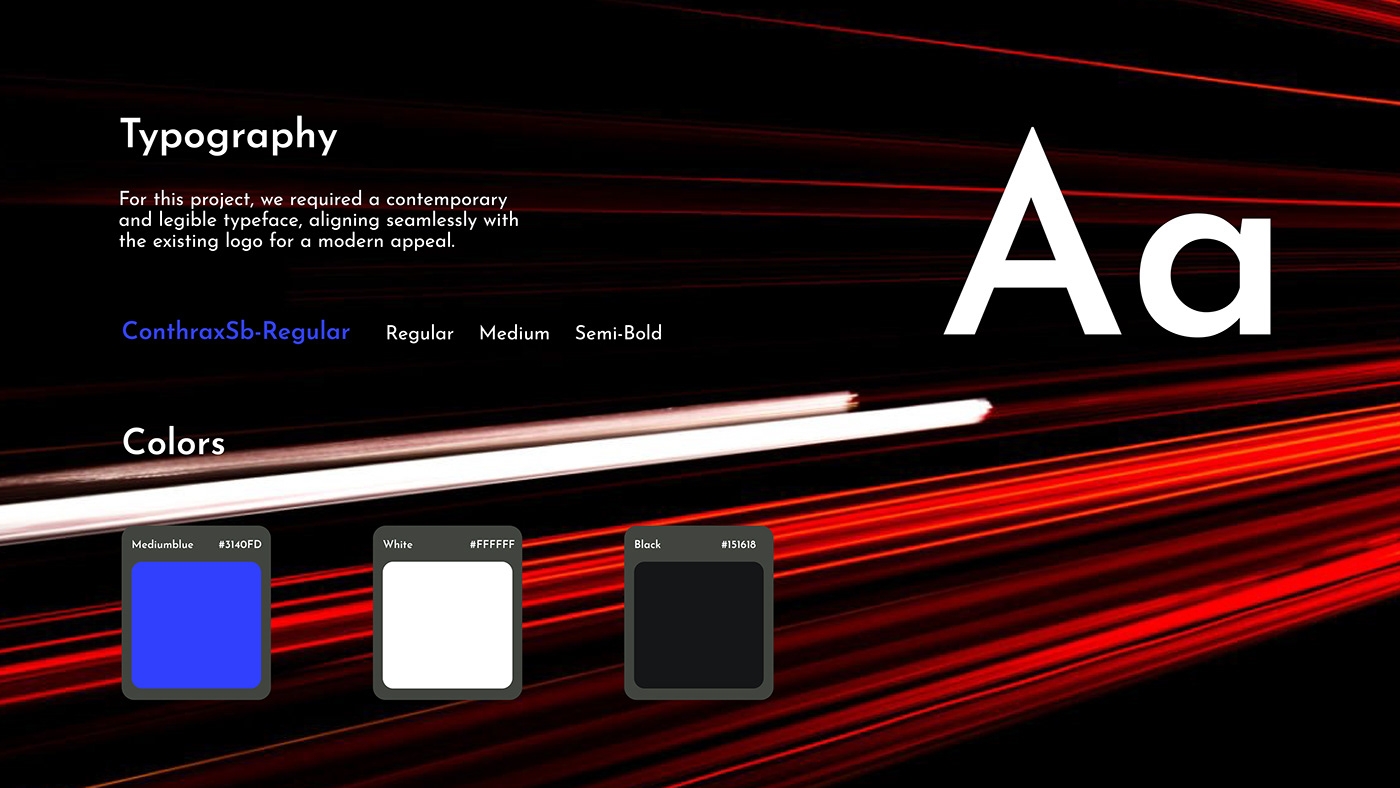
Blue: Blue is the primary color in Aerowing Airline's logo palette, symbolizing trust, reliability, and the vast expanse of the sky.Blue is a universally recognized color associated with air travel, making it an ideal choice to instill confidence and reassurance in passengers.
White: White is used as a secondary color in Aerowing Airline's logo palette, serving as a symbol of purity, clarity, and cleanliness.
Black: Black is employed as an accent color in Aerowing Airline's logo palette, adding contrast and sophistication to the overall design.


Thanks For Watching!
Get in touch
abdullahalsadik116@gmail.com


