


Lloyd’s of London
Rebranding an iconic 17th Century insurance institution.
The experience of rebrand Lloyd’s of London taught me how to reframe challenges, not as obstacles but as opportunities in disguise. With unexpected challenges or elusive ideas, the journey we take on a project always has something new to teach us. Rebranding the iconic 17th Century insurance company, Lloyd’s of London in 1997 was no different. It had its fair share of challenges and with a history so rich there was no shortage of inspiration. In fact, there was so much it became a challenge in of itself.

Left: Portrait of Edward Lloyd, founder. Below left: Edward Lloyd’s signature. Top right: Dubious characters do business within Lloyd’s Coffee House. Below right: The Lloyd’s List, a weekly list of shipping news
Lloyd’s of London brand immersion
The process began by exploring The Chatham Archives in London’s Docklands. We spent more than three weeks sifting through hundreds of dusty boxes filled with all manner of extraordinary documents and historical gems. The archive was packed with over 300 years of long-forgotten material; from tales of adventure in exotic places, to correspondence with Lloyd’s from Napoleonic War widows thanking them for paying out on policies taken out on those who had perished at Trafalgar and Waterloo.
The research presented an enormous breadth of potential visual equities which could inspire design concepts; including logos, heraldic crests, shields, medals, typographic styles and all manner of printed material and memorabilia.

A visual identity history snapshot of Lloyd’s of London from The Chatham Archives

The Lloyd’s of London coat-of-arms (as detailed by the Royal College of Arms above) was rich in heritage, imagery and colour. It was also a rich source of inspiration for brand ideas
Embracing classicism
The most obvious visual equity was the logo designed in 1984 by the famous graphic designer Alan Fletcher (and co-founder of Pentagram). His work successfully united Lloyd’s behind a single identity consisting of classical typography as if cut in stone. It was understated, assured and respectable, but it was also considered to be “spidery”, “recessive” and “lacking personality” — the classicism was misconstrued as “old-fashioned” and by 1996 it was time for a brand refresh.

Designer Alan Fletcher, alongside his 1984 Lloyd’s of London logo design

The famous clock and bell at the centre of the Lime Street Underwriting Room is famously rung whenever a ship sinks. The iconic building is known as the “inside-out building” was designed by Richard Rogers & Partners in the 1980s
A winning concept
The front running concept was the “Double L” monogram which was an abstract evolution of the Lloyd’s anchor and expressed stability, security and integrity. It could also be repurposed for use within the coat-of-arms. However, there was a mild concern it was too connected to the maritime heritage of Lloyd’s and did not convey Lloyd’s breadth of interests, but as an abstract monogram, it was decided this would not be an issue.

The selected design concept from round 1 — The “Double L” Anchor monogram
Take one step back
As we were completing finished artwork and developing brand guidelines another more serious issue was raised. Following a meeting with the Lloyd’s board and a selection of partners (including Underwriters and Brokers) it was reasoned that “the icon had too much personality”. Whilst the Double L monogram was universally liked, it was felt that the monogram would “overshadow” independent partners (underwriters and brokers) when the Lloyd’s logo appears as an endorsement alongside partner logos.
Take two steps forward
We concluded that; any two (independently designed) logo icons would typically clash when used alongside each other. Of course, redesigning partner logos was off-limits as partners are affiliated with, but not owned by Lloyd’s, so a new Lloyd’s logo design was required, which would avoid complex icons or symbols. We revisited our concept exploration and developed the “Solid Foundations” idea. The new logo concept was an evolution of Alan Fletcher’s 1984 logotype – with redrawn classical typography underpinned with a thick, solid bar. It was a no-nonsense, ‘no-icon’ approach which was sympathetic with partner logos.

The evolution of Lloyd’s from Alan Fletcher’s 1984 logo to the new “Solid Foundations” logo

Lloyd’s of London — an institution built on solid foundations
Built on “Solid Foundations”
The new Lloyd’s logotype was specially drawn, meaning it is not available as an off-the-shelf font. The relationship of the typography with the bold underline was designed to be optically symmetrical and work as a single unit. In other words, the typographic component could never be used separately from the underline. On the other hand, the underline could be used without the Lloyd’s typography and manipulated in expressive and creative ways.

Construction of the new Lloyd’s “Solid Foundations” logo

The solid underline could be used creatively across brand application

Lloyd’s brochure covers utilising the new Lloyd’s gold underline
Partner relationships
We developed a simple ‘Partner Relationship System’ to dictate how the new Lloyd’s of London logo could be used alongside the logos of third-party underwriters and brokers.

The simplified Lloyd’s logo ensures flexibility and cohesion when endorsing partner logos
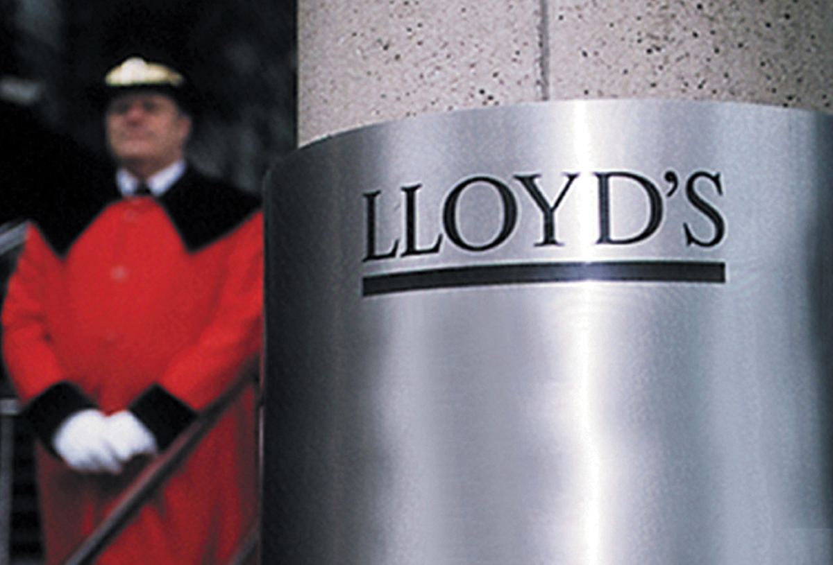
The new Lloyd’s logo applied to the exterior of 1 Lime Street alongside the famous doorman

The new 1997 Lloyd’s of London logo set against Richard Rogers iconic structure

Signage and Lanyard application of the new Lloyd’s logo

Co-branded underwriter partner signage designed for Lloyd’s of London


Versions of the Lloyd’s logo; Positive, Reversed and Colour Alternatives

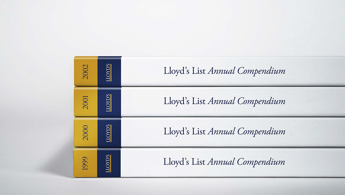
The Lloyd’s List has been published continuously since the 17th Century
Anticipating the future of the Lloyd’s brand
All good things come to an end and by 2010, Lloyd’s commissioned UK design firm, Addison to redesign the logo. Now, whilst I’m certainly not suggesting Addison copied, or even saw our original conceptual work at Springpoint, I was delighted by how, within our initial concept exploration we accidentally anticipated the evolution of the Lloyd’s logo. See for yourself below!

One of our proposed concepts and Addison’s: Anticipating the future evolution of the Lloyd’s logo
Online resources
The history of Lloyd’s of London is a fascinating read. It is as much a record of the commerce, expansion and end of the British Empire as it was the story of an insurance institution. There are many great sources of information which go into far more depth than was possible in this post and I highly recommend the following websites:
The History of Lloyd’s of London - © Lloyd’s of London website
The Chatham Archive - © The World Ship Society website

Acknowledgements
Project Date
1997
Design
Mark Pearce
Gary Broadbent
Laurence Lassalle
Oonagh Connolly
Kathy Miller
Strategy
Fiona Gilmore
Production
Dennis Furniss
Aubrey Hastings-Smith ( - 2006)
Michael J Pratley (1941-2018) Hand Lettering
Client
Sir David Rowland
Thank you!
Your likes and comments
are much appreciated.
This case history is designed and
published by Gary Broadbent who
was creative director and designer at
Springpoint between 1990 and 2002.
Gary lives and works in Australia
with his branding agency Propella.
For all project enquiries please


