


"the time" is a wristwatch boutique located in France. The name speaks for itself. The brand wants to convey to us that many people now forget how valuable our time is and throw it away haphazardly. 2 years here, 4 years there. They waste time on unnecessary people, and only years later they realize that nothing can be returned or changed. But time is one of our most important resources, so the brand urges you to be more careful about where you leave your years. And their wristwatch will help you with this.
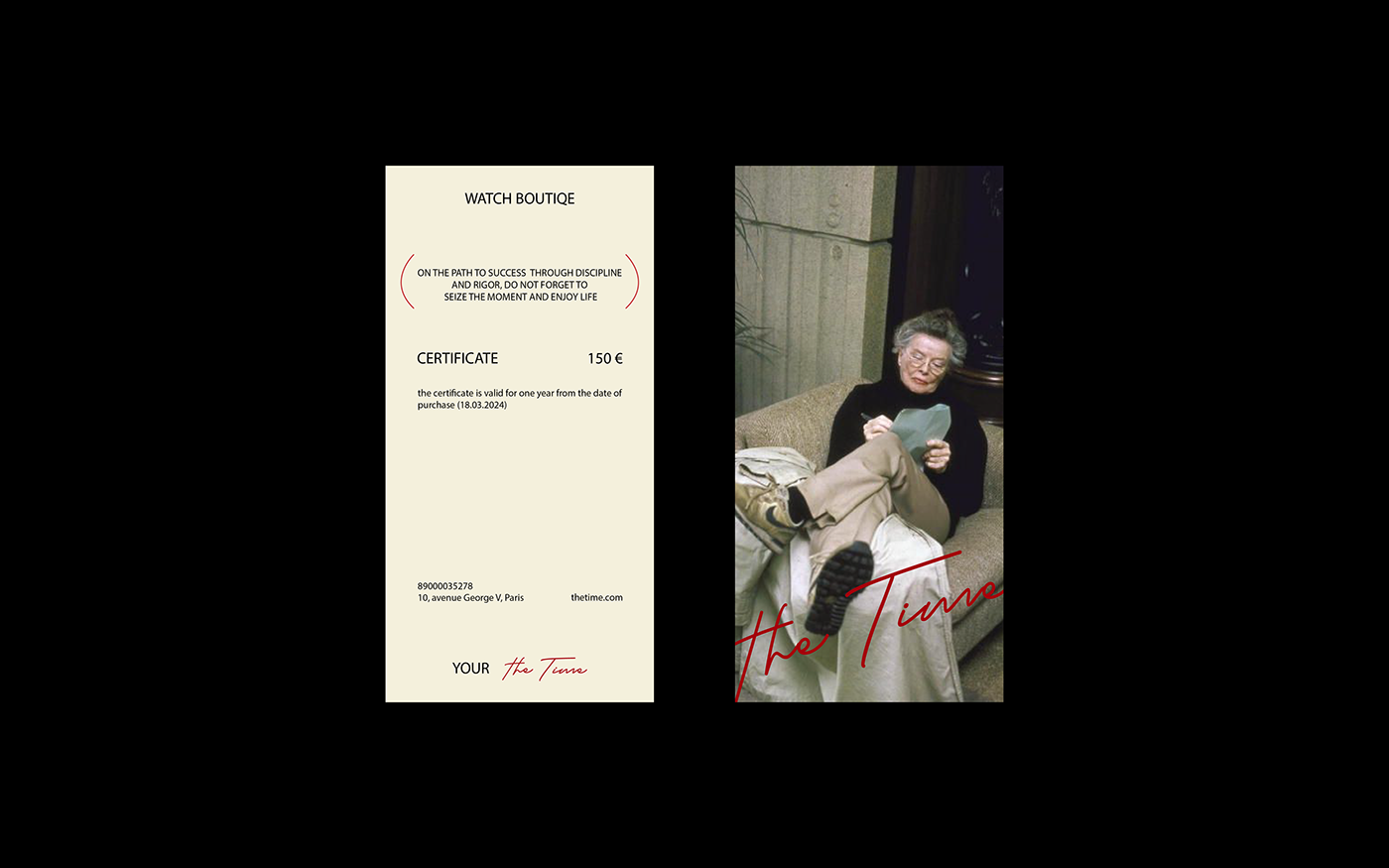
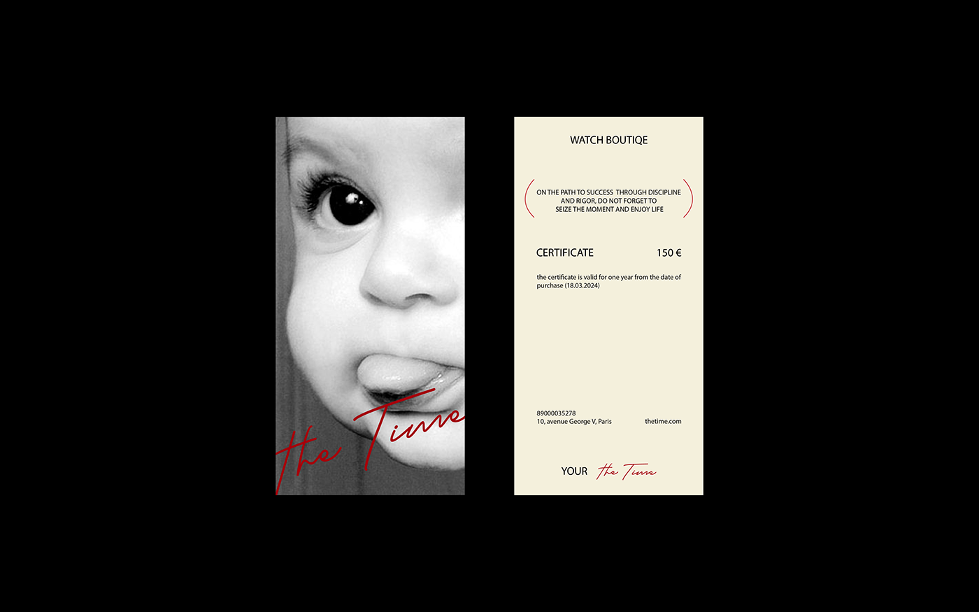
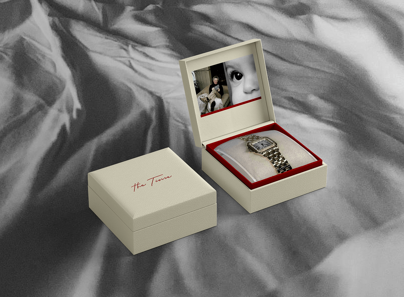
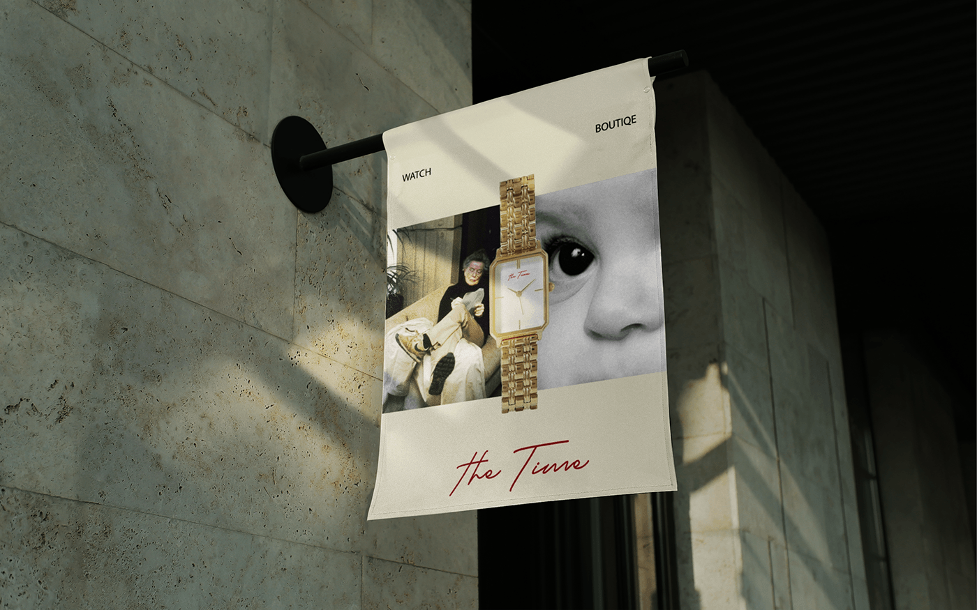
The image of a grandmother and a child is located on all the main media of the brand, as if warning that time is fleeting, and below is a red line, which symbolizes a person’s time period.
The brand's typography is also continued in contrasts, as is the main image, so all headings are in caps and all body text is in caps.
The main phrase of the brand is in brackets. They symbolize each person's time frame.
The brand also uses a black and white filter in many of its photos. It is he who makes reference to memories of past moments in life, and tells us that we do not need to rush time, but rather be in the moment and live in the present.
Enjoy watching!
the time – бутик наручных часов, расположенный во Франции. Название говорит само за себя и переводится "время". Бренд хочет донести до нас то, что многие люди сейчас забывают, как ценно наше время, и разбрасываются им как попало. 2 года сюда, 4 года туда. Тратят время на ненужных людей, и только спустя года понимают, что ничего уже не вернуть и не изменить. А ведь время – это один из самых важных наших ресурсов, поэтому бренд призывает внимательней следить за тем, где вы оставляете свои года. А их наручные часы вам в этом помогут.
Изображение бабушки и ребенка расположились на всех главных носителях бренда, как бы предупреждая, что время скоротечно, а ниже красная линия, которая символизирует временной отрезок человека.
Типография бренда также продолжена на контрастах, как и главное изображение, поэтому все заголовки написаны заглавными буквами, а весь основной текст написан прописными.
Главная фраза бренда находиться в скобках. Они символизируют временные рамки каждого человека.
Также бренд использует черно-белый фильтр на многих фотографиях. Именно он делает отсылку на воспоминания о прошлых моментах жизни, и говорит нам о том, что не нужно торопить время, а больше находиться в моменте, и жить настоящим.
Приятного просмотра!


Thank you for watching!


