Este proyecto para mi es MUY especial ya que fue un gran desafío. Nuestra clienta, Arquitecta y Diseñadora Interior nos contacto para diseñar su logotipo, pero además agrego “no tengo nombre y no quiero que aparezca mi nombre personal”. Yo en ese mismo momento deje claro que nunca había hecho naming y que no estoy especializada en ello, pero ella implacable, me dijo “yo quiero que me diseñes un nombre y además necesito que lo entiendan tanto personas de habla inglesa como hispanohablantes, debido a mi cartera de clientes”. Un poco insegura a lo desconocido dedique una semana completa a informarme intensivamente sobre cómo se diseña un nombre, cuál es el paso a paso, cómo se “busca”, cómo se “idea”, qué puntos había que tener en cuenta y cuáles eran los errores que no podía cometer. Trabajamos una lista de 100 nombres hasta que dimos con el indicado.
ENG · This project for me is VERY special because it was a great challenge. Our client, Architect and Interior Designer contacted us to design her logo, but she also added "I don't have a name and I don't want my personal name to appear". I made it clear that I had never done naming before and that I am not specialized in it, but she relentlessly told me "I want you to design a name for me and I need it to be understood by both English and Spanish speakers, because of my client portfolio". A bit insecure about the unknown, I spent a whole week intensively informing myself about how to design a name, which is the step by step, how to "search", how to "think", which points to take into account and which were the mistakes I couldn't make. We worked on a list of 100 names until we found the right one.


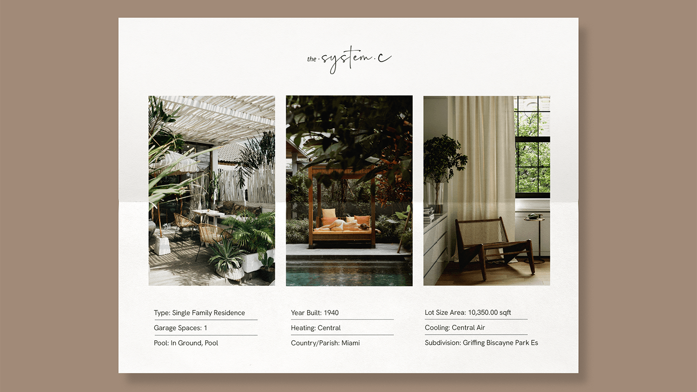
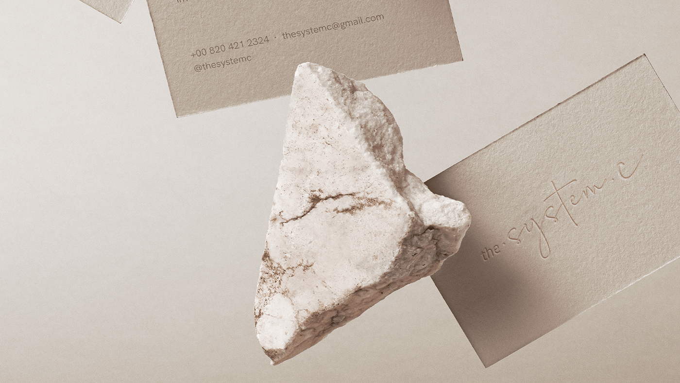
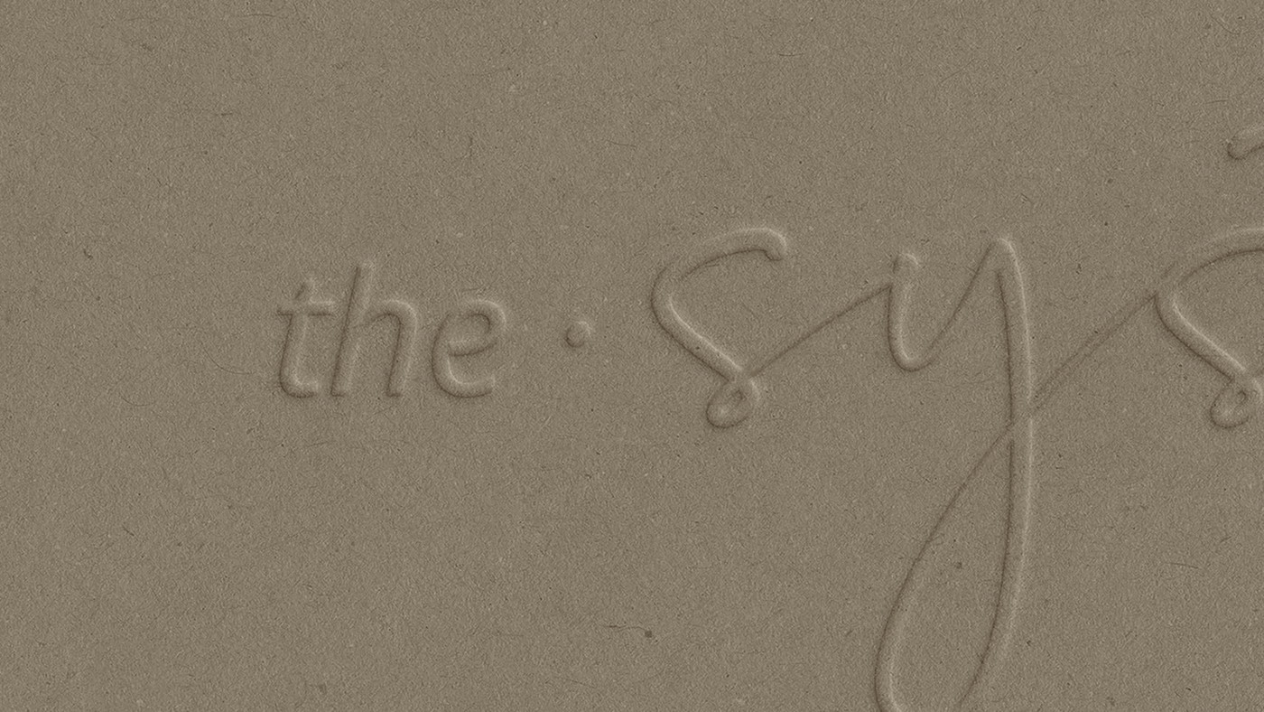
Con respecto a la imagen, ella buscaba una imagen simple, elegante, con personalidad y gran presencia. También quería la elegancia de los tonos neutros. Combinamos dos estilos tipográficos los cuales aportaban diferentes características a nuestros logotipo. Por un lado una tipografía sans serif en la palabra “the” en la versión italic, la cual aporta simplicidad y elegancia en sus sencillos, delgados, claros y estilizados trazos. Por otro lado en “system C” utilizamos una tipografía estilo manuscrita, en este caso a pincel. Esta tipografía nos brinda frescura, carácter, personalidad y fuerte presencia. La paleta de color trabajada representa los tonos tierra que transmiten simplicidad y un estado de serenidad y relajación mental. Tonos suaves y cálidos como Silver Pink y Beaver que transmiten confianza y calma; a su vez los combinamos con Dark Silver un gris oscuro cálido que aporta un acento elegante y sofisticado.
ENG · Regarding the image, she was looking for a simple, elegant image, with personality and great presence. She also wanted the elegance of neutral tones. We combined two typographic styles which brought different characteristics to our logo. On the one hand a sans serif typeface in the word "the" in the italic version, which brings simplicity and elegance in its simple, thin, clear and stylized strokes. On the other hand, in "system C" we use a handwritten typeface, in this case a brush typeface. This typeface gives us freshness, character, personality and strong presence. The color palette used represents earth tones that transmit simplicity and a state of serenity and mental relaxation. Soft and warm tones such as Silver Pink and Beaver transmit confidence and calmness; in turn we combine them with Dark Silver, a warm dark gray that provides an elegant and sophisticated accent.