About Project:
uParcel is your trusted partner for fast, reliable, and cost-effective delivery services. We offer seamless same-day delivery solutions for businesses and individuals alike, ensuring your parcels reach their destination safely and on time.
UX Problems in website: UX testing is key to creating a positive experience for your users and achieving your website's goals. Here are some recommendations in a website.
Poor Navigation
Poor Design
Unclear call to actions
Insufficient Information(Missing Information)
Poor product images
Unaesthetics
Poor Design
Unclear call to actions
Insufficient Information(Missing Information)
Poor product images
Unaesthetics
Solution: Based on the UX problems you outlined, here are specific solutions and recommendations for each issue:
For Poor Navigation, organizing menu logically by CTA button and removing unnecessary options.
For Poor Design, Adhere to design principles such as balance, alignment, contrast, and hierarchy to create a visually appealing layout. Using high-contrast colors for better readability, especially for text and important elements.
For Unclear call to actions, using contrasting colors and larger fonts to make CTAs easily noticeable.
For Insufficient Information, including detailed information about products, services, or other relevant topics to help users make informed decisions. Displaying client testimonials and ratings to provide social proof and additional insights.
For Poor product images, Maintain a consistent style and background for product images to create a cohesive look.
For Unaesthetics, Ensuring the website aligns with your brand's visual identity, including color scheme, typography, and imagery. Using whitespace effectively to create a clean and uncluttered design that allows users to focus on key elements. Choosing readable fonts and maintain consistency in font sizes and styles across the website. Creating a clear visual hierarchy by prioritizing key content with size, color, and placement.
Website Redesign:
For a website redesign for uParcel, a leading same-day delivery service, the content should be structured to enhance the user experience and highlight the company's strengths, such as efficient delivery, affordable rates, and user-friendly features. Here's an example of content that can be included on the website:
Header: In addition to the text-based content, consider including the following elements in the header:
Brand Logo: Display the uParcel logo prominently in the top left corner.
Navigation Menu: Provide easy access to different sections of the website, such as services, how it works, tracking, rates, agent.
CTA: Contact us button.
Remember to keep the header clean and organized to enhance the user experience.

Hero section: The hero section is the first thing visitors see when they land on the uParcel website, so it should make a strong impression and clearly communicate your key services and value proposition. Here is an example of content for the hero section of the uParcel website:
Image: Consider using an image or graphic that visually represents bold heading, call to action button, stats regarding uparcel.
Call to Action: Include a prominent call-to-action (CTA) button that leads visitors directly to booking a delivery or signing up for services.
This layout focuses on the main benefits of using uParcel while also encouraging visitors to take action by booking a delivery. Make sure the text is concise and impactful, and that the visual elements align with your brand's style and colors.

Services: The services section of the uParcel website is crucial for informing potential customers about the various delivery options and features available. This section should clearly describe each service and its benefits, allowing users to quickly understand what uParcel offers and how it can meet their delivery needs. Here's an example of content for the services section:
Courier, Outsource logistics, Ecommerce fulfillment delivery, API Solution, Same Day Delivery, 3PL Services, Door to door delivery, Express courier service, Document courier singapore, Warehouse services, Van and lorry delivery, Cake and flower delivery, Medicine delivery, Food delivery, Night delivery, Additional services.

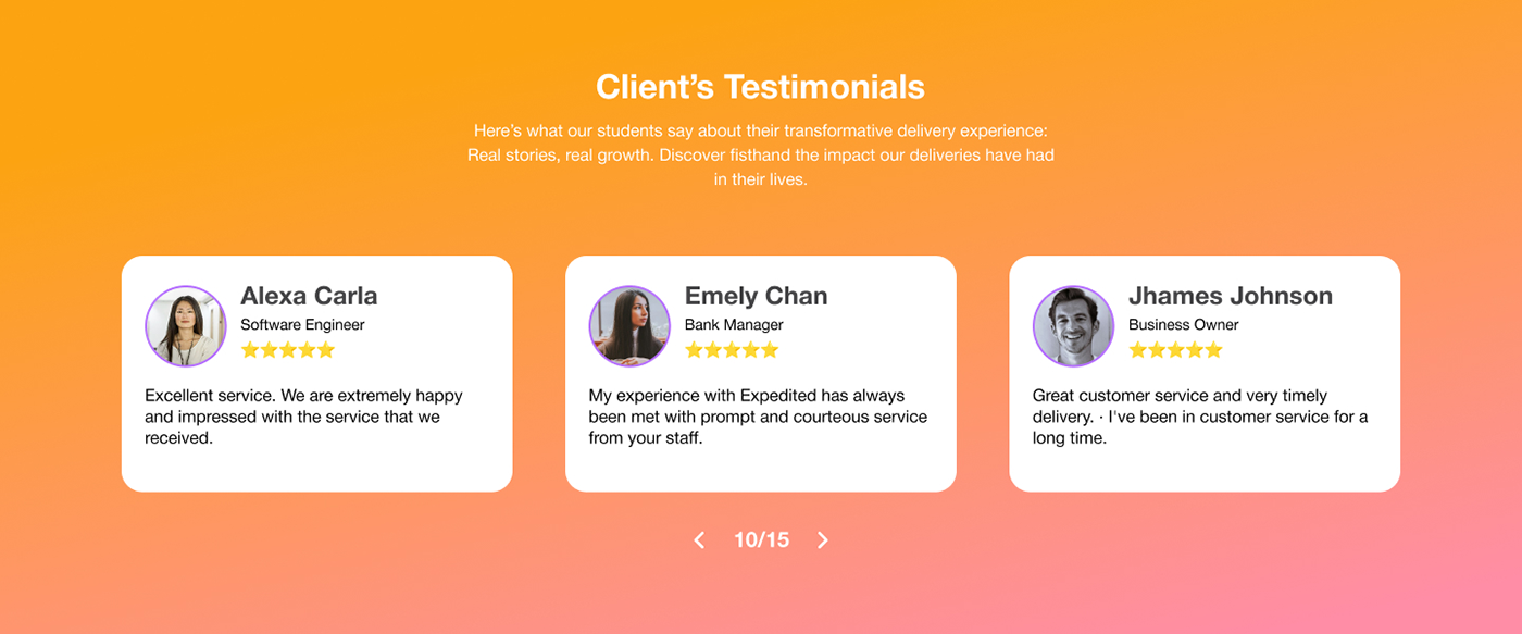
Client Testimonials: Our clients love our reliable and speedy service. Read our testimonials to see why businesses and individuals trust us for their delivery needs.

Contact Form: For the appointment contact form section of the uParcel website, you'll want to provide an easy-to-use form that allows users to schedule deliveries, pickups, or consultations with your team. The form should be user-friendly and collect essential information for the appointment. Here's an example of what the appointment contact form section might look like:
Schedule an Appointment:
Ready to book a delivery, pickup, or consultation with uParcel? Fill out the form below, and one of our team members will get back to you promptly to confirm your appointment.
Appointment Contact Form: Full Name, Email, Phone.

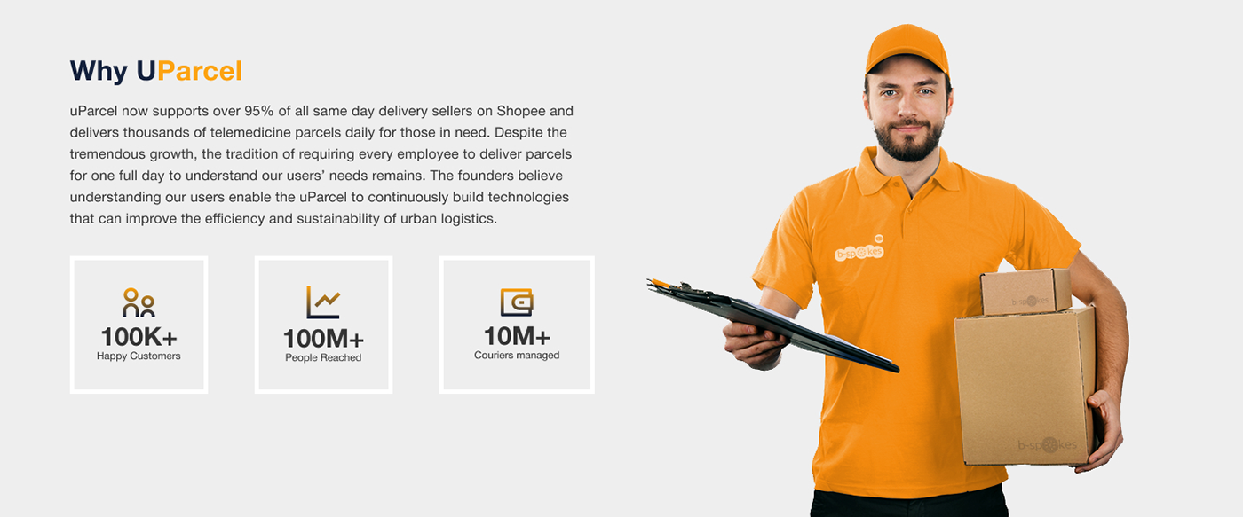
Why uParcel: The "Why" section of the uParcel website is an opportunity to highlight the unique selling points of the company and persuade visitors to choose uParcel over competitors. It should clearly communicate the advantages of using uParcel's delivery services. Here's an example of content for the "Why" section: Happy customers, people reached, couriers managed.

Footer: The footer section of the uParcel website is an important area for providing visitors with useful information and links to essential parts of the site. Here's an example of content to include in the footer:
Main Pages:
Agent
Price
Customer guide
Courier guide
Blog
Contact Information:
Phone: +65 1234 5678
Email: support@uparcel.com
Address: address
Follow Us:
Accrediations & Certifications
© 2024 uParcel. All rights reserved.

Design System:
Key components include color scheme, typography, icons, ui elements.
Color Scheme:
Color palette that aligns with uParcel's branding.

Typography:
Using clear, legible fonts for headings and body text. Helvetica is one of the most popular and widely used typefaces in the world. Majorly for Clean and Modern Appearance, Versatility, Legibility.

Spacing and Layout:
Used ample spacing between elements for a clean, organized look for breathing space.
UI Elements:

UI Elements
UI Mockup Design: By incorporating these design elements and focusing on user experience, the uParcel website can offer an effective and efficient platform for customers to use its delivery services.

Thank you!
If you have any questions or need further assistance with your case study or anything else, feel free to ask. I'm here to help!

