Restaurant Rebrand
in this project, I was tasked to rebrand an existing local restaurant and enhance their social media, logo, website, and packaging.
I chose to go with Kimono Sushi and Thai. they own two branches one in Ormonde and one in Greenside, Gauteng, South Africa.
after meeting the owner and staff it was apparent that they were a family, the ytrusted each other and worked well togther. they treated every guess as if they were joining the family and made every guest feel important. they were very hospitable and welcoming. the staff were friendly and great at their job, each a master at their field.
Their previous Logo vs their rebrand
their previous logo was made by the owner's son, it was a good logo in the early stages of the business but was often cut out on social media posts due to it being in a round holding shape. the colours were black and gold but the gold didn't match the restaurant's personality or styling. due to every piece of information always being in capital letters and in bold it stood out and disturbed the hierarchy between elements.


The New logo
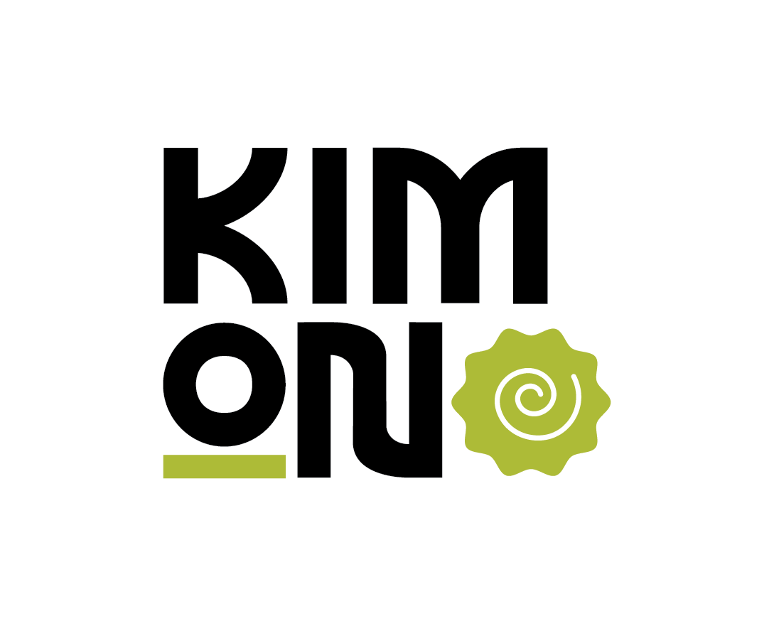
I created logo variations to fit different places and adapt to different platforms. the primary logo however contains just the name of the restaurant and includes a narutomaki in place of the second "o" This is to pay homage to its Asian roots and it is used in their dishes served at the restaurant. the first "o" contains an underscore to maintain balance and can be used when adding colour to the design. I chose to use my version of wasabi green as in Thai culture green is used to symbolize tranquility and harmony, much like in the dishes and atmosphere of the restaurant.

Logo colour variations


Logo Variations
Vertical options


Horizontal Options and Icon


Packaging
the packaging includes wrappers for the chopsticks and stickers for their containers which they serve sushi and Thai dishes. I wanted to keep the bold fun approach and showcase that in each design. They currently use recyclable plastic bags which I kept in the rebrand as their dishes can easily spill and mess if we were to switch to new material bags.


Social media
the social media played with typography and images keeping the over all appearance fun and lighthearted to appeal to the vast array which the restaurant appeals to.


The Menu
Due to the high quantity of dishes available on the menu i created a four page menu on A4's which was pop riveted onto a Masonite board. the idea is similar to using clipboards but rivets are used instead so that my logo may have a place to live above the pages.
the logo could either be the horizontal or vertical mockup or a combination of the two.


Website
the website designed is a single scroll which shows the landing page with the call to action, the specials for the week,the menu, a little about the restaurant, and a location and contact us page. it makes use of the colours being green and white and uses wiggles inspired by the narutomaki to create interesting visuals as it bleeds into the next page.


Website layout

Vehicle branding
the vehicle branding could be a scooter as the food isn't big. the designs are minimal and the number is displayed on each side.


