
YASHILLS
BY ABUDHABI X MASTERCARD
_
PROJECT OVERVIEW
YAS LAGOON, an epitome of serenity blended with luxurious living, signifies not just an upscale habitat but a tranquil oasis that transcends the traditional bounds of community developments. This endeavor aimed to forge a visual symbol that would capture the essence of YAS LAGOON, harmonizing with its core tenets of peace, purity, and natural harmony.
THE PROBLEM
Navigating a marketplace brimming with overstimulated designs, YAS LAGOON sought to distinguish itself not merely as a premium waterside development but as an enclave of calm and contemporary elegance. The pre-existing branding did not effectively convey the serene sophistication and the premium waterfront experiences offered by YAS LAGOON.
SOLUTION
Our odyssey led to the distillation of YAS LAGOON's majestic and tranquil spirit into an emblematic identity. The key was a fusion of clarity and fluidity, achieving an equilibrium between tranquility and architectural excellence. Embracing an approach of 'tranquility in simplicity', we developed a logo that is a manifestation of timelessness and a reflection of the progressive vision YAS LAGOON represents.
Client — ABU-DHABI X MASTERCARD
Project Scope — Brand Identity design system
Creative — Chidi Jindu
Project Scope — Brand Identity design system
Creative — Chidi Jindu

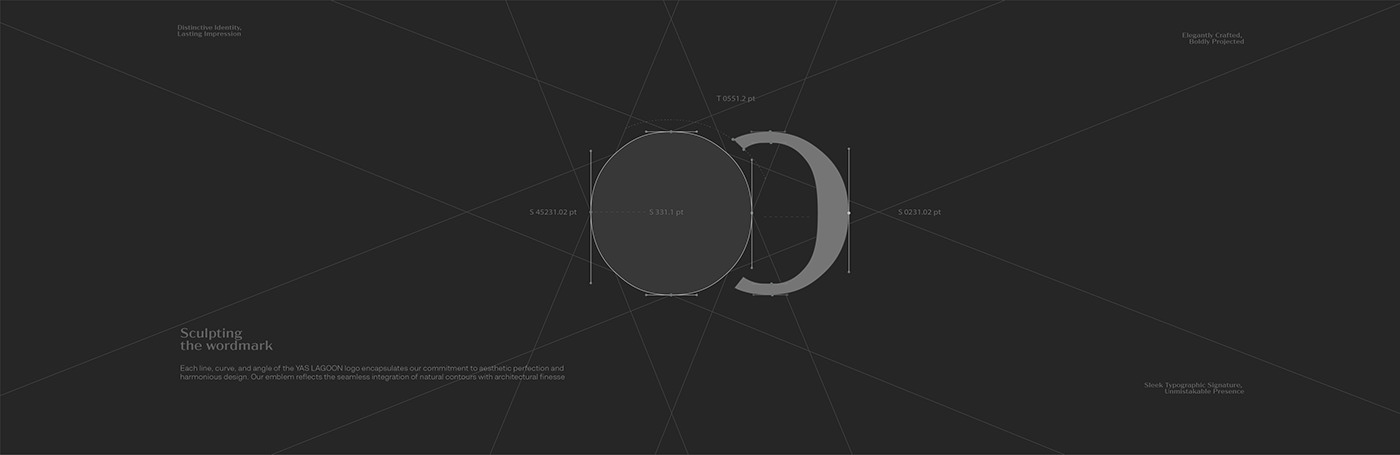
Why Typeface Is Integral to Brand Identity
YAS LAGOON has crafted a unique visual voice with their typeface that epitomizes elegance and embodies the brand's commitment to simplicity and natural elements. The custom geometric typeface is accentuated by contemporary curves that subtly tip their hat to organic forms, presenting a harmonious balance between modern aesthetics and natural simplicity.
Typeface Classification— Custom Geometric
Typeface Trait — Contemporary curves with a nod to natural form; optimized for readability and brand presence
Typeface Trait — Contemporary curves with a nod to natural form; optimized for readability and brand presence


Color Palette Overview
The branding for YAS LAGOON utilizes a grayscale color palette that anchors the visual identity of the brand. This spectrum is carefully curated, ranging from the deep introspection of Black Grey (#252525) to the delicate nuances of White Grey (#DDDDDD). The primary typeface color is a robust Black Grey (#252525), signifying impact and authority, while the secondary typeface contrasts with a crisp White Grey (#DDDDDD), underscoring the brand's modernity. The palette is built around core values of clarity, balance, and sophistication, creating a timeless aesthetic that transcends fleeting trends
Typeface Color Palette — A refined selection that transcends trends
Primary Typeface Color — A robust Black Grey (#252525) for impact and authority
Primary Typeface Color — A robust Black Grey (#252525) for impact and authority
Secondary Typeface Color — A crisp White Grey (#DDDDDD) for contrast and modernity


THANK YOU!
Please share your thoughts in the comments.
All feedback highly appreciated!
Are you looking for a long-term creative partnership?
Feel free to reach out and let's discuss how we can help.
Feel free to reach out and let's discuss how we can help.


