
Sketches & Brainstorming:
For this project, we wanted to go for a beachy sunset vibe. We would have three main images, one large background image, and 1 or 2 small images showcasing the products. We wanted to feature unique shadows with flowers and leaves. We also wanted some products to be spilled out and messy, as shown in makeup magazines.

First Draft:
For the first image we took, we used dark red sand, leaves, and different makeup products. We liked the images by themselves but felt they wouldn't fit with the rest of the ones we had planned.


On the left is the unedited version, and on the right the image has been retouched. You can see the warmer and darker vibe this image has. We wanted to represent Color Pop with more of a color pop and variety in colors. These images had lots of brown, but changing to the white sand allowed for the pinks and other colors in the final image to come to life.
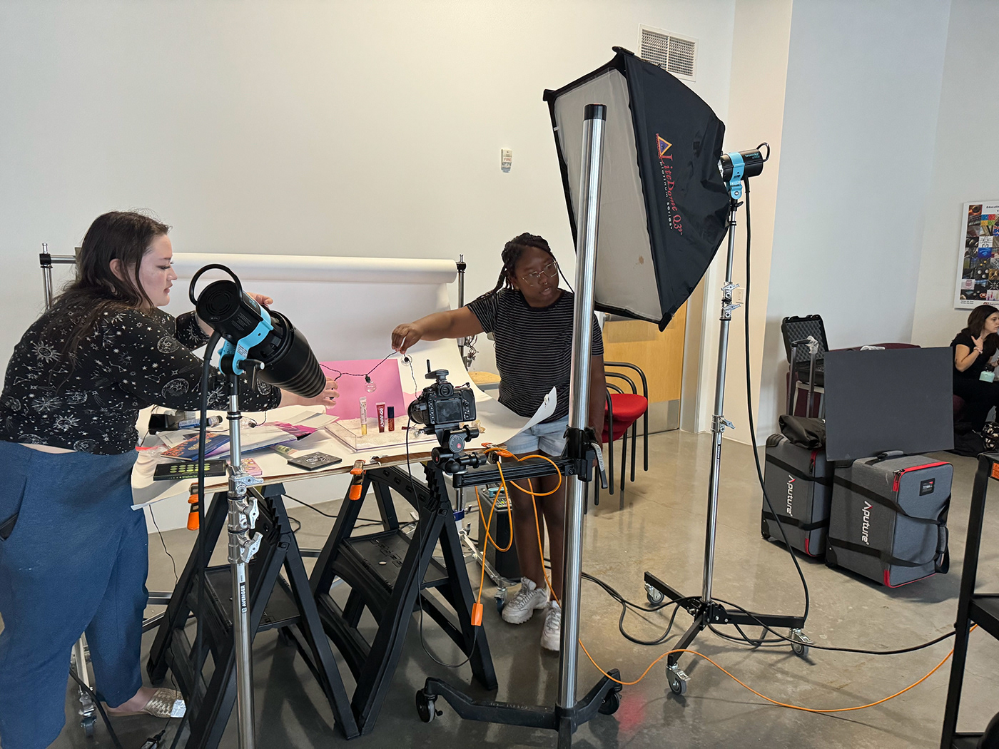
Goals & The Process:
The goal was to make the products pop while maintaining the warmth and vibe of the first draft. We made sure to use a softbox for the background lighting, and a snoot to light the products. We had a problem with the "Designer" lip gloss being legible due to shadows being cast. It took some tinkering, but we finally positioned the snoot in a way that everything was legible and had the lighting that we wanted. Once we got the images we needed, they were edited and organized in InDesign.


