Project Overview
Empyrean Estates is an exclusive real estate agency catering to the discerning residential market. With commitment to delivering unparalleled service and bespoke solutions, Empyrean Estates aims to establish itself as the pinnacle of sophistication and modernity in the real estate industry. The task was to position Empyrean Estates as the epitome of premium and excellence in the residential real estate market.
Project Scope
Brand Naming, Logo Design, Brand Identity
Project Roles
Brand Naming & Brand Identity design - Demola Drey

Brand Naming
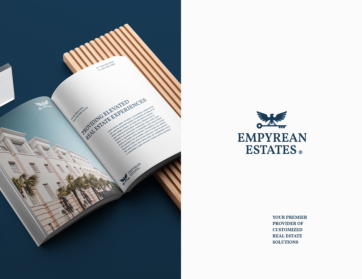
Choosing the name "Empyrean Estates" was a deliberate and thoughtful decision, rooted in the desire to evoke a sense of affluence, distinction and aspiration.
The word "Empyrean" conjures images of the celestial realm, a place of divine beauty and perfection. It represents the highest point of heaven, symbolizing a state of transcendence and excellence. By incorporating "Empyrean" into our brand name, we aim to convey the idea of reaching for the highest possible standards and achieving unparalleled levels of quality, sophistication and professionalism.
The word "Estates" simply reinforces the idea of expansive properties and refined living spaces. By combining these two words, a brand name was created that encapsulate the essence of elevated living.
Ultimately "Empyrean Estates" embodies the company's vision of providing exceptional real estate experiences that go beyond the ordinary. It serves as a beacon of excellence and professionalism guiding its clients towards a world of elevated living and success.

Logo Rationale
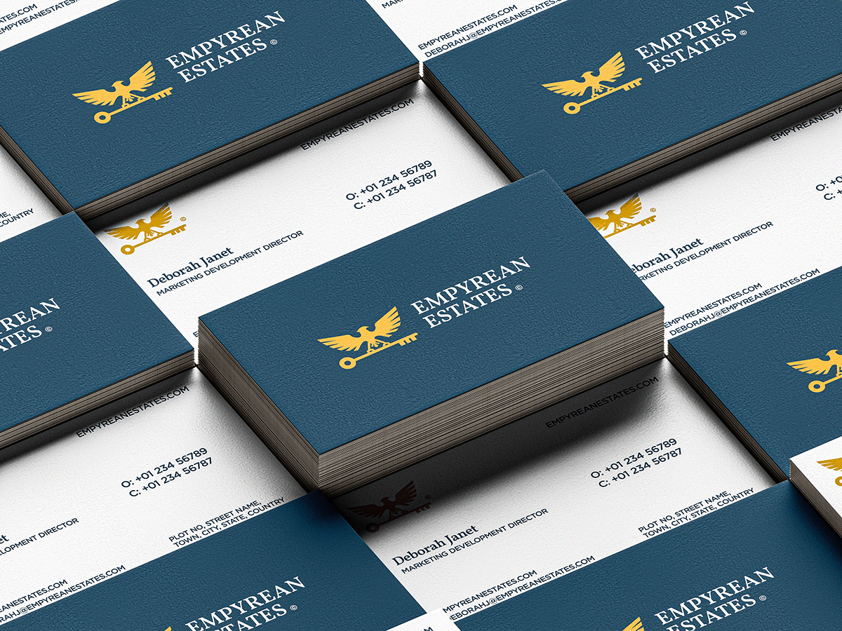
For the logo, I sought to capture the essence of aspiration and empowerment that defines the brand. The eagle, with its commanding presence and gaze, represents strength, vision and leadership. Perched proudly atop the key, it symbolizes the brand's commitment to guiding its discerning clients towards their goals and unlocking the doors to their dreams.
The key, a timeless symbol of access and opportunity, embodies the idea of unlocking new possibilities and realizing potential. Together, the eagle and the key form a powerful symbol of empowerment and achievement, reflecting the dedication to helping its clients reach new heights of success and distinction.
In crafting this logo, the aim was not only to create a symbol that only visually represents the values of Empyrean Estates, but also resonates with the audience, inspiring them to aspire to greater heights and embrace the journey towards their dreams.

Brand Color Palette
The colors were chosen as the brand colors for Empyrean Estates to evoke a feeling of timeless elegance, sophistication and optimism. When combined, this palette reflects the values and aspirations of the company, conveying trust, optimism and elegance to clients and stakeholders.