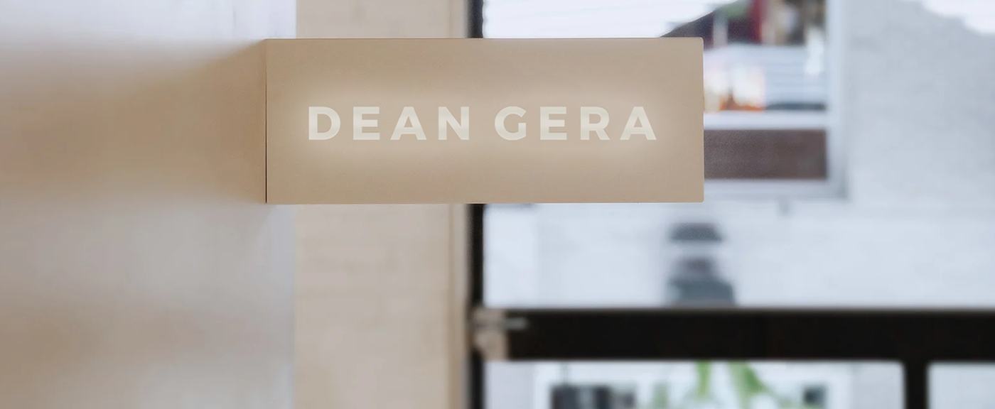
Reframing the Brand for Dean Gera
With Dean Gera having always been focused on the quality of the services it provided, the feeling of distinction needed to be maintained in its new branding. The black and white colour scheme that Dean Gera had used for so many years was now starting to feel too cold, too harsh and too masculine. With hair, skin and beauty remaining the fields within which all the sub-brands worked, the brief we were given at MOOD was the desire for a luxury spa-like feeling, with neutral colours being sought after.
Project by: MOOD
Client: NM Group
Project Lead: Michela Urry
Design Lead: Sandrina DeGabriele
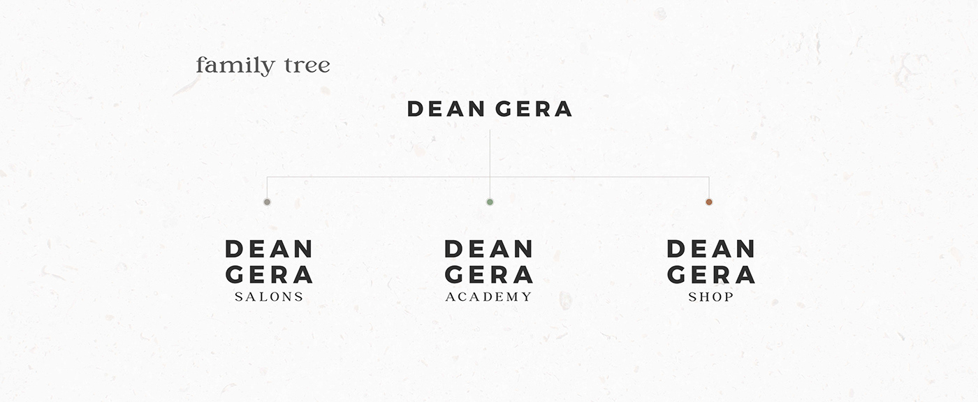


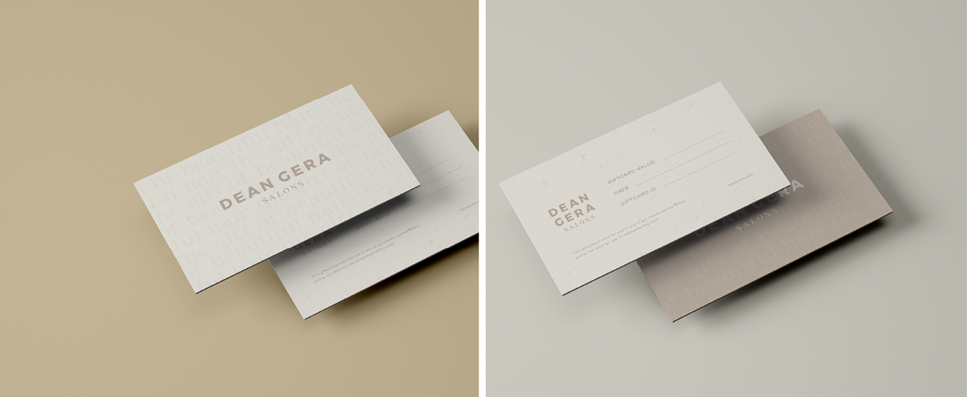
DEAN GERA SALONS
The brand image of the Salons needed to exude sophistication, quality and professionalism, but also be gender neutral. Here the most impartial of the colours, a clean and natural-looking oat, was selected.


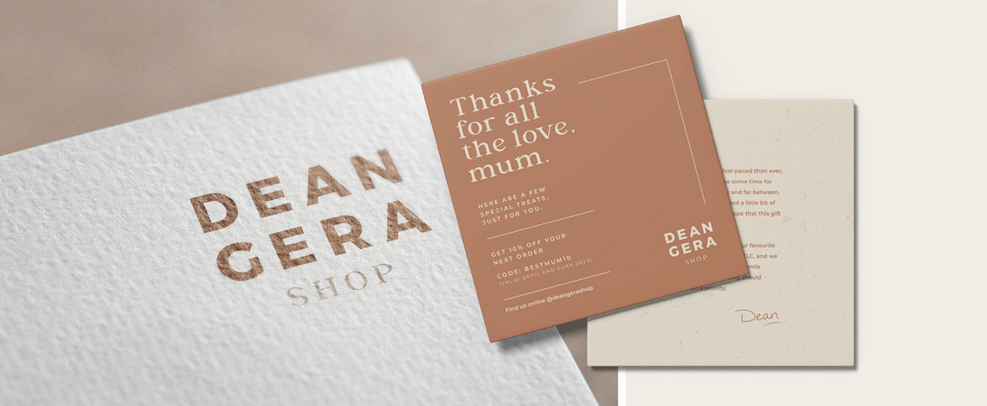
DEAN GERA SHOP
The Dean Gera Shop brand is slightly more feminine than the Salons brand, offering hair, skin and beauty products for sale on their website. A cool, current rust was used as the main colour here, with the Shop offering a vast range of products of quality on an easy-to-use website that is well-organised and easy on the eyes.


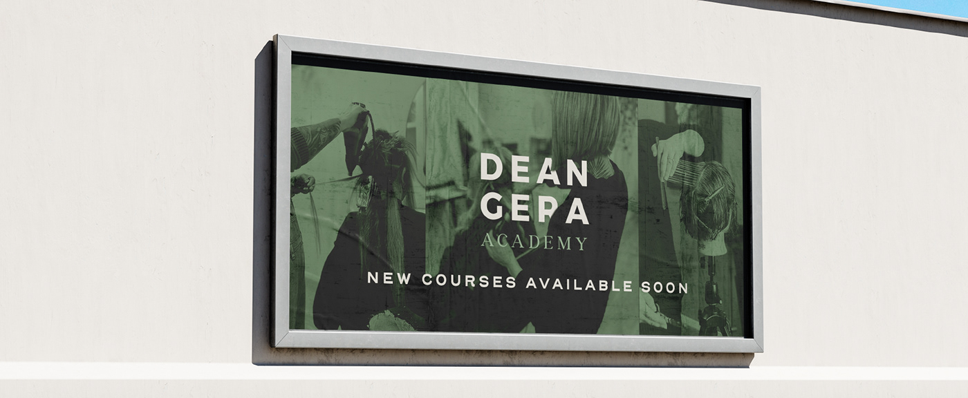
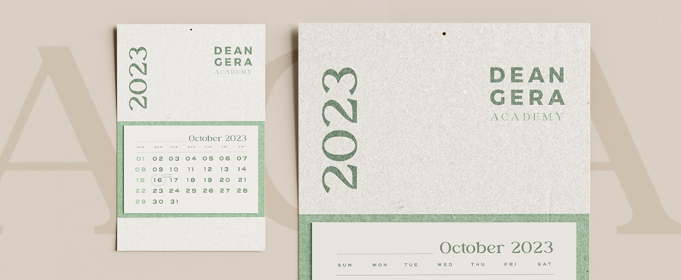
DEAN GERA ACADEMY
The Dean Academy is the company’s hub for creativity and learning, where junior stylists are hosted for their weekly training sessions and where participants from the outside world are welcomed into workshops and seminars to improve their cutting skills, colouring skills or product knowledge through short training courses led by the education team. This is a cool, current and friendly space that promotes personal growth, which is where the choice for the relaxing, nature-inspired green came from.