Typographic Tarot Cards
Brief:
The objective was to explore the creative potential of typography in representing subjects such as places, animals, artists, or other entities without direct textual references, using tarot cards as the medium of expression.
Ideation:
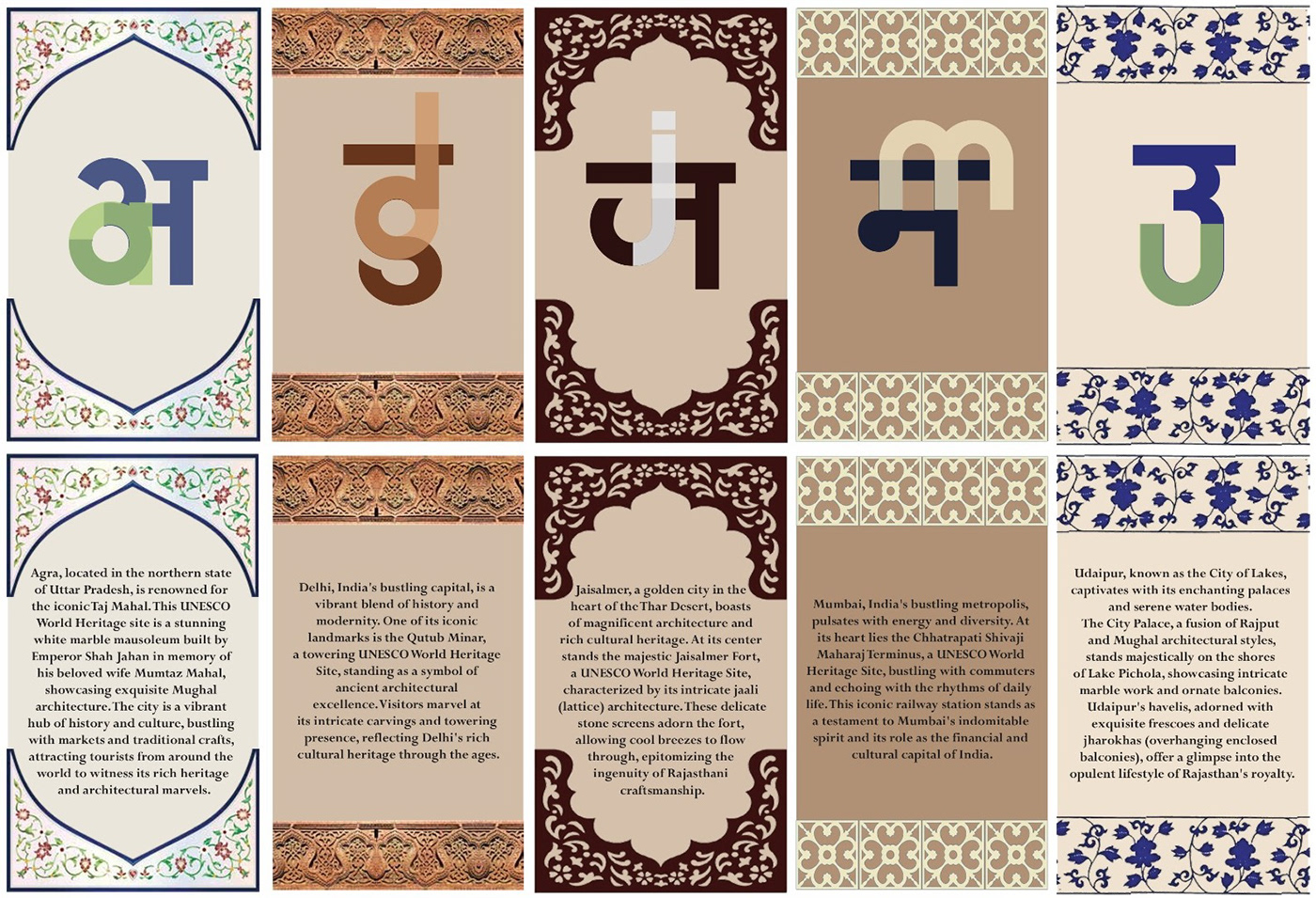
For my typographic tarot project, I initially aimed to showcase various cities in India, using the letters from my name to guide my selection. However, during the brainstorming process, I settled on cities like Yellapur, Udaipur, Kasol, Tapola, and Ahmedabad. Each of these locations demanded a unique color palette to capture their essence accurately. Yet, as I delved deeper, I realized that this approach led to visual inconsistency across the cards.
Consequently, I opted to depart from the initial constraint of using letters from my name and instead embraced a more fluid approach by selecting random letters. To ensure each city was represented authentically and maintain visual coherence across the tarot cards, I pivoted to focus on capturing the unique architectural features of each location.
To illustrate the essence of each city through its corresponding letter, I experimented with various fonts and conducted thorough research. Eventually, I stumbled upon "The Hinglish Font," which resonated deeply with me. This font beautifully encapsulates the essence of India by seamlessly blending Hindi and English letters, symbolizing the cultural fusion inherent in the country. For the description of each city, I opted for the Perpetua Bold font. Perpetua Bold's classical aesthetic adds depth and richness to the descriptions, enhancing the overall presentation of the typographic tarot cards.