The logo designed for GeekTickets company represents a skillful balance of innovation and elegance, embodying the core values of the brand. It stands out by integrating the first letter "G" (from GeekTickets) into the shape of a ticket, reflecting the essence of the company's business – selling tickets to various events.
The color used in the logo carries several symbolic meanings. Firstly, it is associated with energy, dynamism, and fun, which perfectly corresponds to the atmosphere of the events for which tickets are sold. Additionally, orange is the color of creativity and innovation, highlighting the technological modernity and innovative approach of GeekTickets to its activities.
The visual camouflage of the letter "G" into the shape of a ticket not only adds originality to the logo but also creates additional levels of perception for viewers. This element demonstrates attention to detail and a level of care for every aspect of the company's branding.


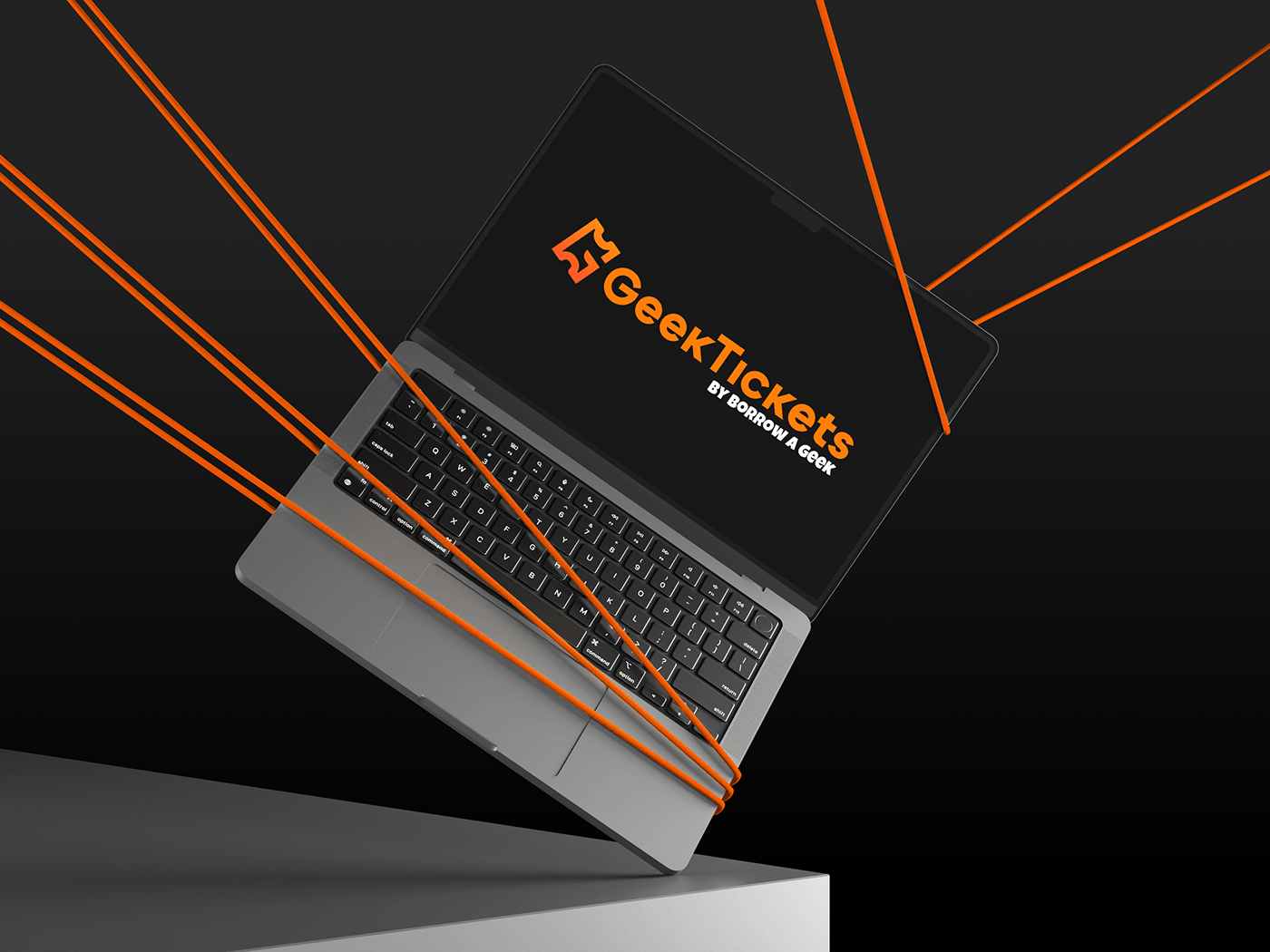


Ultimately, the GeekTickets logo is a modern and memorable visual solution that successfully conveys the essence of the brand and attracts the attention of the target audience, strengthening the company's position in the ticket sales market.