
Literary Themes
Shape

Approach
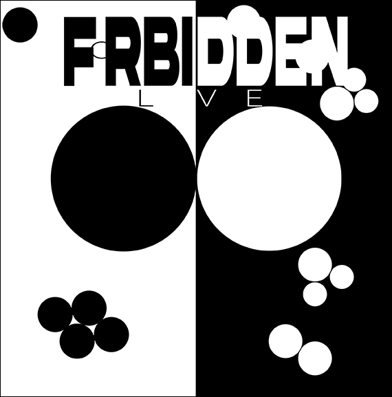
When considering various Literary Themes, my initial focus was on concepts such as "Good vs. Evil," "Temptation by Evil Forces," "Power of Friendship," and "Forbidden Love." Reflecting on "Good vs. Evil," I pondered on the notion of competition, where outcomes hinge not on moral judgments but on success and failure. The imagery of a checkerboard emerged, symbolizing conflict among participants, reminiscent of strategic maneuvers in both military campaigns and games like chess and checkers. While my composition was restricted to black and white, I delved into the idea of contrasting elements beyond mere color. I contemplated desires unfulfilled, such as indulging in prolonged gaming sessions or consuming comfort foods that may not be beneficial. In this piece, smaller black and white circles form distinct clusters, while larger central circles touch but remain confined to their respective domains. The composition evokes tension, with more white circles congregated together and fewer black ones. There's a sense of motion and narrative as smaller circles gravitate toward larger ones or other clusters, yet the central circles, though in contact, are unable to breach each other's boundaries.


Typography

Approach
The emphasis on the word "Forbidden" is pronounced through its heavy, bold typeface, seemingly exerting pressure on the delicate, thin-lettered "Love." The lowercase "O" in "love" is subtly obscured, adding to the sense of concealment. Various attempts were made, including experimenting with different fonts and rearranging letters or words. For instance, in some iterations, the two "d's" in "Forbidden" are positioned back to back or facing away from each other ('db'), symbolizing opposition and discord. Their connection at the bottom suggests a clandestine union. Additionally, in one design, the "E" in "Forbidden" is shaped like an "L," attempting to seamlessly integrate the word "love" within it, although the result lacked cohesion. Ultimately, a simpler typeface was chosen for clarity and readability, striking a harmonious balance with the overall design.


Hybrid
Approach
When blending Shape and Typography, I began experimenting with the composition and hierarchy of a book, inspired by hybrid design principles. Deliberately orienting the shape sideways was necessary to maintain typographic coherence; otherwise, the text would have appeared chaotic with a mix of white and black letters, disrupting the overall aesthetic. Specifically, the typography treatment remained consistent, emphasizing the word "Forbidden" with a bold typeface, symbolically overshadowing "Love." To achieve this effect, "Love" was rendered in white within a large black circle. Additionally, the "o" in "Love" subtly nestles between the "f" and "r" in "Forbidden," while the "L" and "E" are partially obscured, contributing to the visual narrative of Forbidden Love.
Book Cover

Approach
After researching novels on forbidden romance, I opted for "Maybe Someday" by Colleen Hoover as inspiration for my book cover. The dynamic interplay between the prominent black circle and its contrasting white counterpart captured my attention, symbolizing the tension within the story. Notably, the bold typography of "maybe" seems to overshadow the word "someday," echoing the thematic weight of the narrative. While the positioning of the author's name and the "by" align with conventions, the overall layout offers a unique twist.


