OK Stores, Zimbabwe
Scope of Works: Brand Design, Interior Design, Technical Documentation
Scope of Works: Brand Design, Interior Design, Technical Documentation
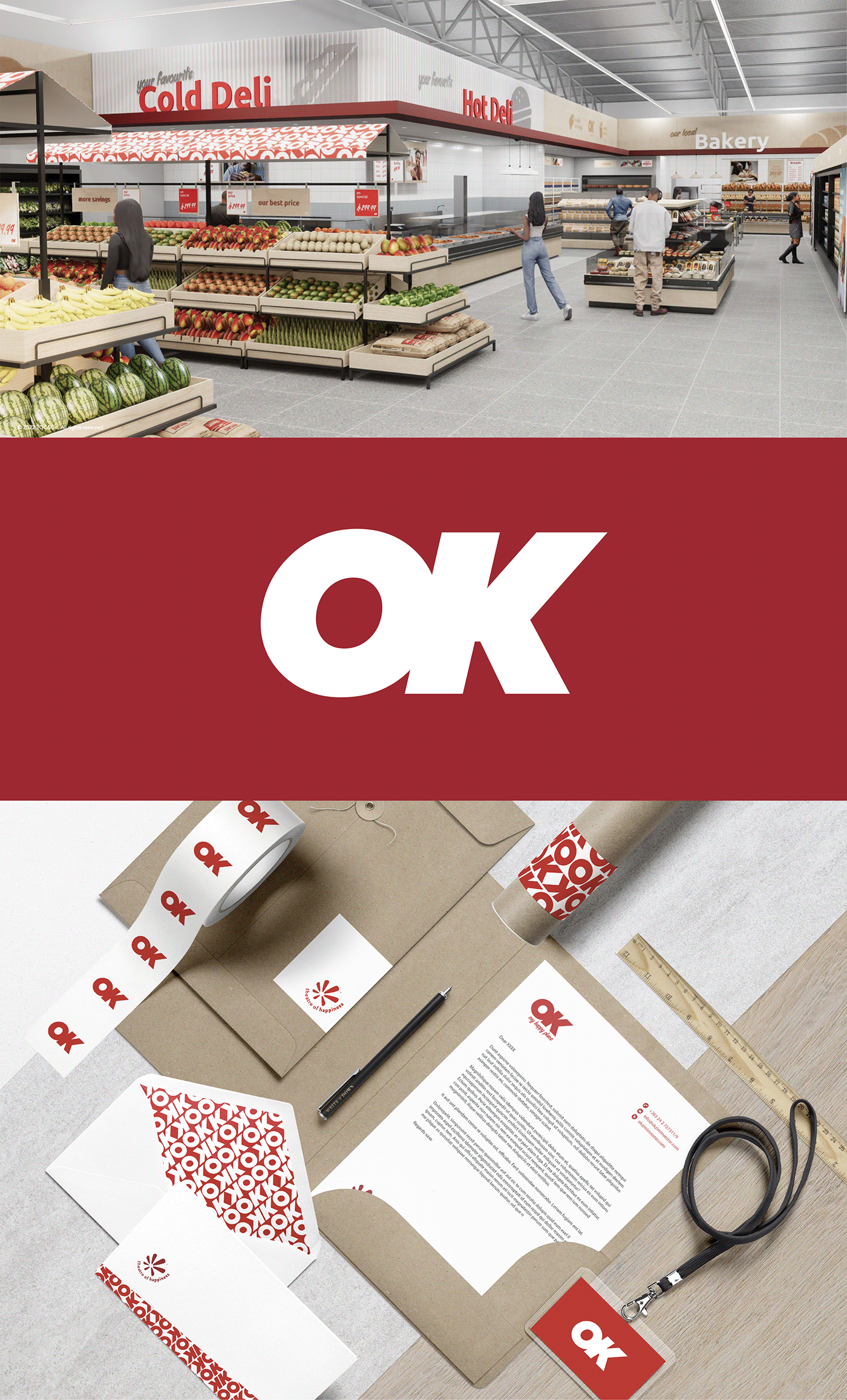
With over 50 years of history in Zimbabwe, OK Supermarket needed a fresh identity to step away from its association with the South African brand while preserving its core essence and brand equity. Our approach aimed to modernize the brand while retaining familiarity and nostalgia.
Our goal was to rebrand OK Supermarket to reflect a more modern and independent identity, emphasizing happiness as the central theme. While retaining the core essence and brand equity, we aimed to infuse the brand with vibrancy and warmth.

Color Evolution
Retaining the iconic red color, we opted for a juicier and punchier tone to modernize the brand's visual identity while maintaining its heritage.
Modern Typography
We updated the logo with a modern font that conveys forward movement and dynamism, reflecting the brand's evolution.
Nod to Tradition
In a nod to the brand's traditional heritage, we selected a secondary font inspired by traditional signwriting, adding depth and character to the brand's visual language.
Mood and Tone
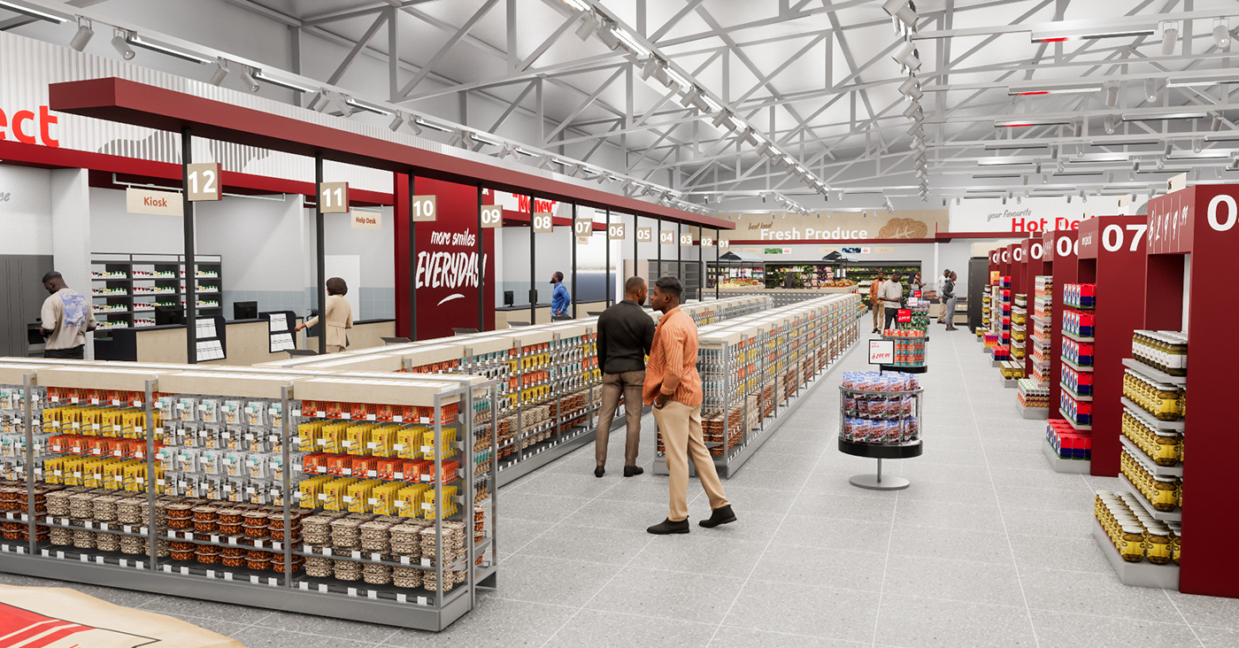
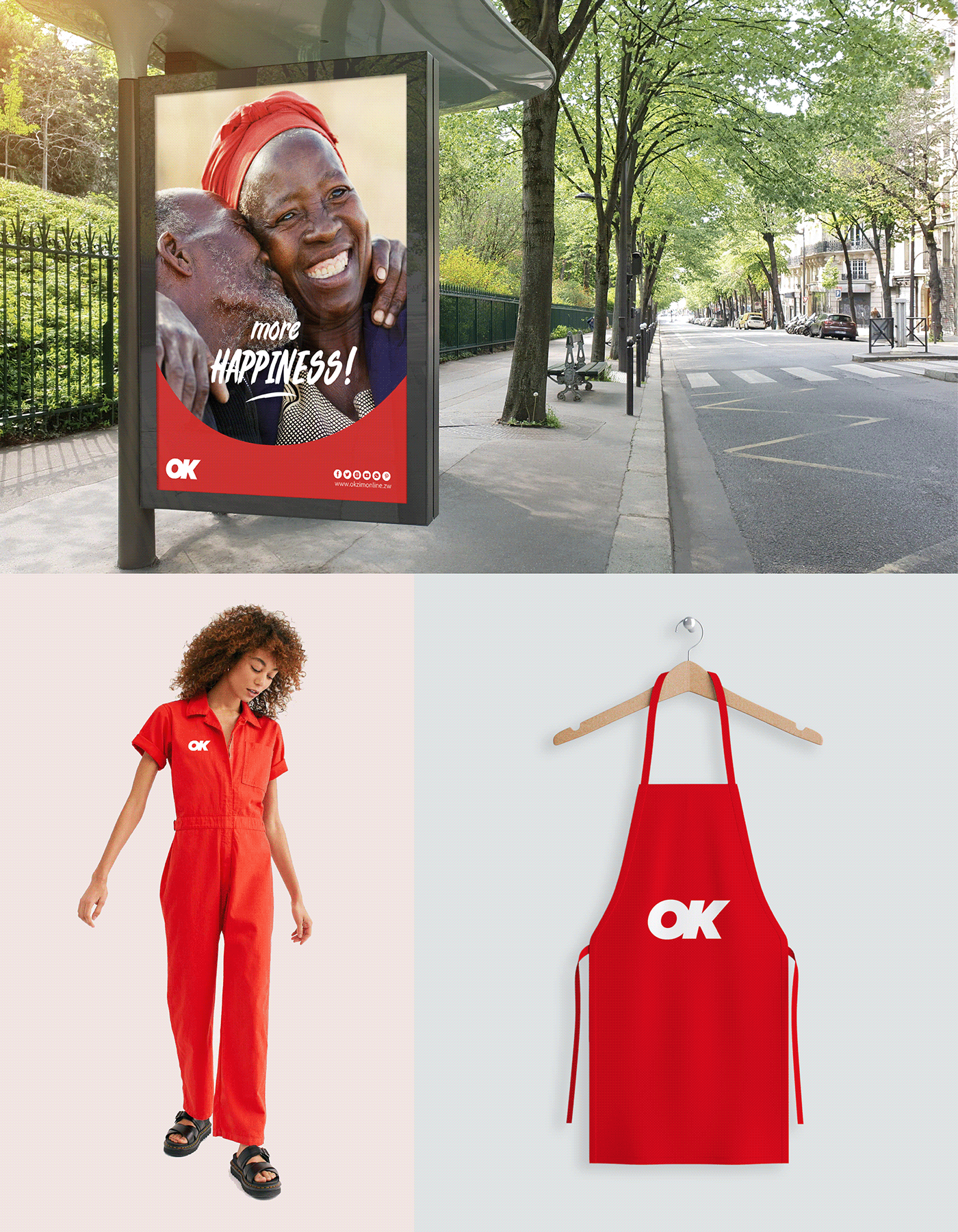
"More Happiness" became the guiding principle, infusing every brand touchpoint with joy and warmth. From fun patterns to customer-based photography and a warm local tone of voice, we aimed to bring smiles to people's faces.
Bold and Punchy
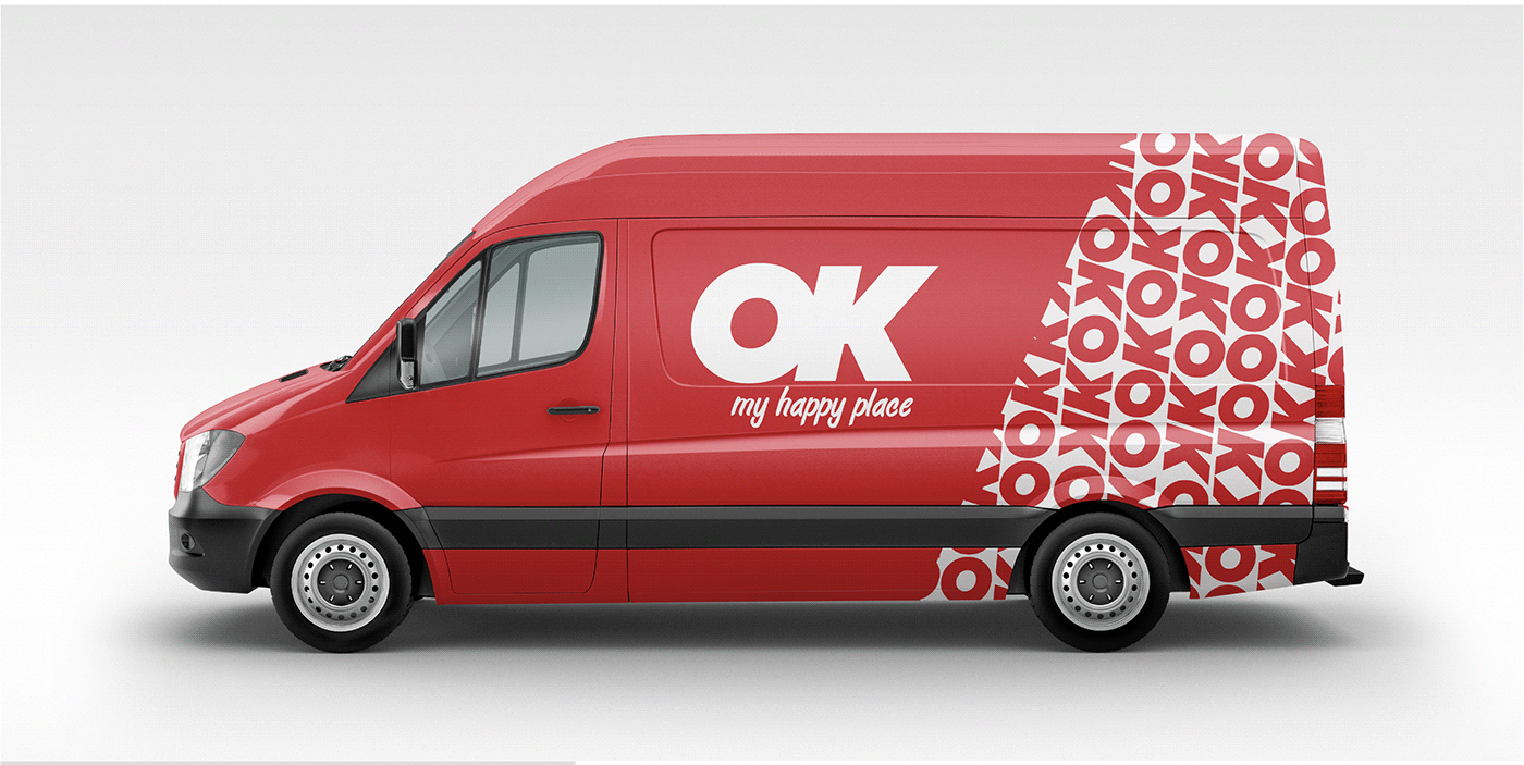
The use of only red and white on most touchpoints maintains a bold and punchy aesthetic, ensuring the brand's visibility and impact.

Updated Logo
The new logo features a modern font with forward movement, retaining the iconic red color for instant recognition.
Secondary Font
Inspired by traditional signwriting, the secondary font adds character and depth, complementing the modern typography.
Brand Touchpoints
From packaging to advertising, fun patterns and customer-based photography infuse vibrancy and warmth into every interaction.
Color Scheme
The bold use of red and white creates a punchy and impactful visual identity, ensuring the brand stands out in the marketplace.


The rebranded OK Supermarket embodies a modern and independent identity while preserving its heritage and brand equity. "More Happiness" serves as the driving force behind every brand touchpoint, creating memorable and joyful experiences for customers. With a vibrant color palette, modern typography, and warm tone of voice, OK Supermarket emerges as a destination that not only provides quality products but also brings happiness to the communities it serves.


The uniform range for OK Supermarket ensures consistency across all staff levels, from general employees to managers and specialized roles. Each garment is designed with attention to detail, reflecting the brand's essence of vibrancy and warmth.
The basic uniform includes golf T-shirts, aprons, skirts, jeans, and retro bomber jackets. These elements provide comfort and versatility for general staff while maintaining a cohesive look that aligns with the brand's identity.
The OK Supermarket uniform range strikes a balance between professionalism and playfulness, reflecting the brand's essence of "More Happiness." From basic elements to specialized attire, each garment is designed to embody the brand's values and create a cohesive look across all staff levels. With the hero red color and classy yet fun design details, the uniform range enhances the brand's visual identity and reinforces its presence in the marketplace.


