About company:
Reggat is an innovative financial technology company that provides reliable, high-tech digital infrastructure for financial flows both domestically and internationally. The company serves a wide range of clients, including traders, exchange players, individuals and businesses. Whatever your financial needs, Reggat provides solutions to help you achieve your goals.
"We're committed to simplifying finance and making it accessible to everyone. We believe everyone deserves to be in control of their financial future."
The target audience:
We target men aged 25 to 60 who lead an active lifestyle and strive for financial success. Our clients have business experience, are interested in investing and want to improve the quality and comfort of their lives. We strive to simplify finance and make it accessible to everyone. We believe everyone deserves to be in control of their financial future.
Task:
The brand must reflect a commitment to quality, reliability and innovation. The logo and corporate identity are minimalist, without unnecessary details or complex ornaments. The unique font, texture and shape of the logo should be memorable and recognizable. Simplicity and elegance should reflect our commitment to providing clear and convenient financial services.
———
CONCEPT 1
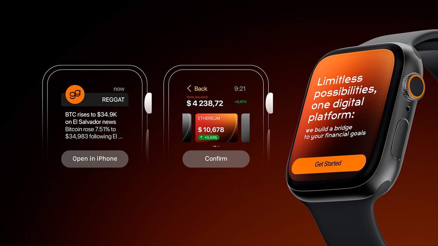
Since the name contains two letters g, and the company’s activities involve operations related to currency, the decision was made to combine them into a ligature. This combination of letters gives rise to the image of folded stacks of coins.


CONCEPT 2
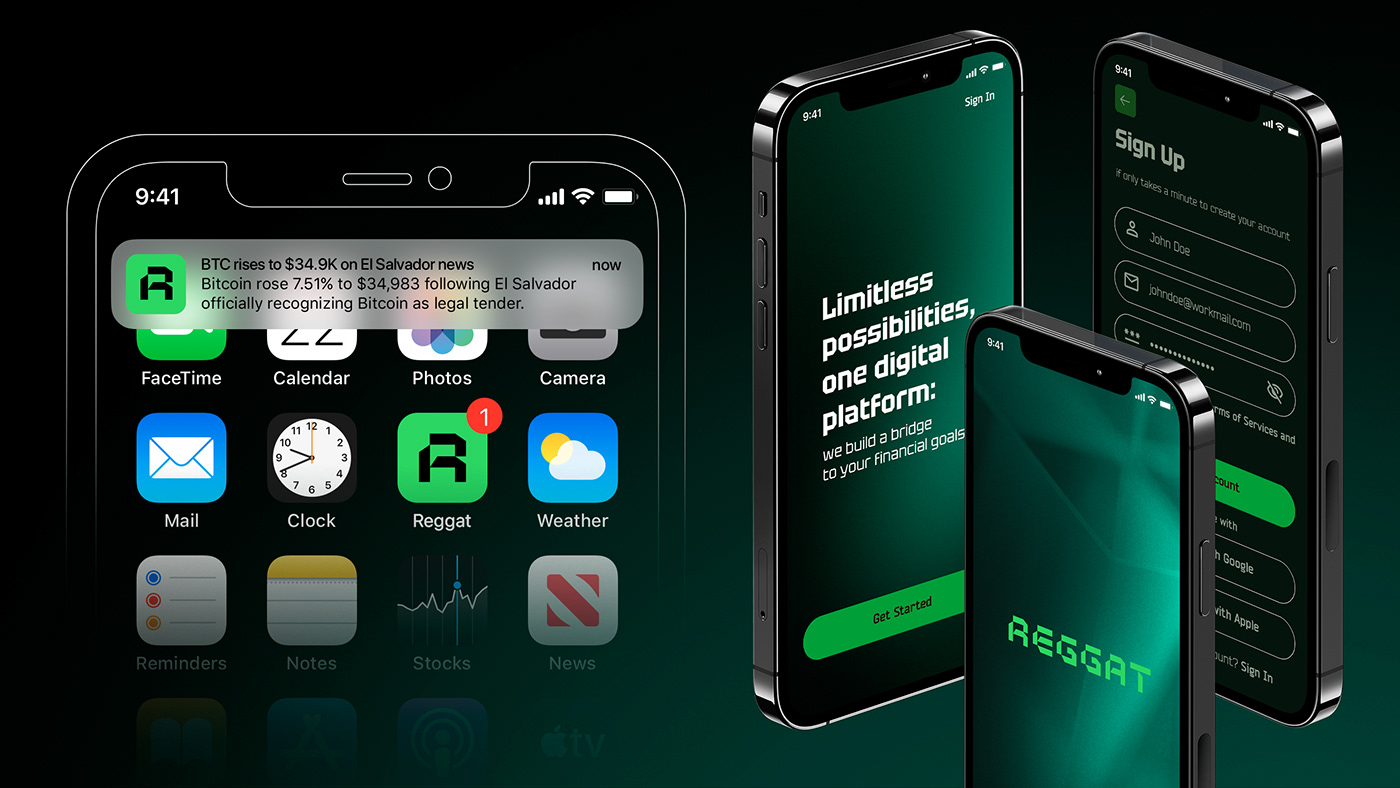
The concept is based on unique typography. The company's main activity is digital currency transactions. Square shapes symbolize high-tech digital infrastructure. A confident, massive font creates a feeling of stability and reliability. This style is inspired by stock chart tables.


CONCEPT 3
The idea of the option is to combine the old metal with the new digital economy. The image of the old one is a circle, the new digital one is a square. By combining them, we get a familiar coin symbol. In many countries, it is believed that a coin with a hole brings good luck and protects from misfortune. According to Feng Shui, money loves red, so it does not "run away" from wallets of this color. The font part of the logo also follows the logic of the idea, both round and square elements are present in the letters.


Thanks for watching.
Write in the comments which of the concerts you liked the most
Write in the comments which of the concerts you liked the most


