
Prestige Tower logo & identity
Business Center class "A". The task was to stand out so that at the first contact, the client immediately understood that this was not the same business center that he had been to before.
In the city, the signs of this segment are massive, rigid and geometric. A contrasting solution was required. At the stage of searching for ideas, we remembered that no business can do without documents and signatures.
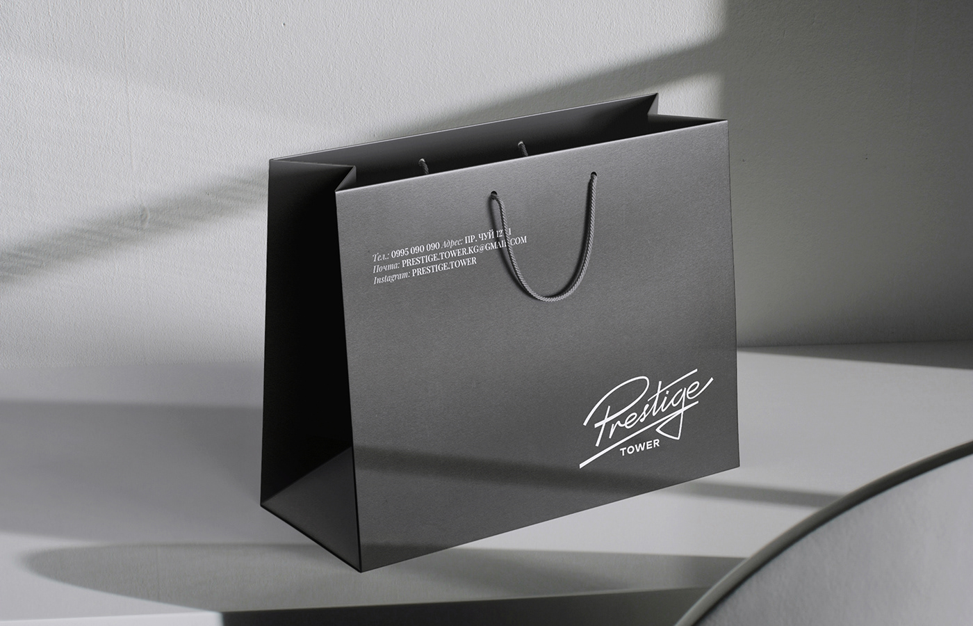
We decided to develop a logo in lettering style. The result is a plastic logo that stands out against the backdrop of massive and rigid signs.
In our corporate identity, we reinforced the idea of a signature. The entire identity is built on font blocks. We placed them at the top of the carrier. And the logo is in the lower right corner.


Typography & color
The basis of the corporate style is text blocks with variable font style: Regular/Italic. And in variable colors: graphite black/white/gray.
To emphasize status and modernity, a combination of antique and grotesque was used.
The main color of the brand is the rarely seen color of black graphite, which speaks of uniqueness and high cost. Gray is as hard as concrete or metal. And white is pure and inviolable.
The main color of the brand is the rarely seen color of black graphite, which speaks of uniqueness and high cost. Gray is as hard as concrete or metal. And white is pure and inviolable.


