


The meaning of Casta
A casta was a hierarchical system of race classification created by Spanish elites in Hispanic America during the eighteenth century. The system de castas or the societies with castas was used in 17th and 18th centuries in Spanish America and Spanish Philippines to describe as a whole and socially rank the mixed-race people. Created by European elites, the sistema de castas or the societies de castas, was based on the principle that people varied largely due to their birth, color, race and origin of ethnic types. The system of castas was more than socio-racial classification. It had an effect on every aspect of life, including economics and taxation.
1. Animal or vegetal species.
2. Quality.
3. Generation.
4. Breed.
5. Nature.
The Company
Casta was a company of passionate people. Passionate about looks, about communication, about strategy. Relying on a multidisciplinar team, it offered such a level of dedication, that made each project unique. Aware of the fact that each client was a different client, Casta was focused on offering each one of them, not just the best solution, but the more suitable to their requirements.
The Concept
This branding is based on this social rank of mixed-race people, explained previously on the work meaning. The diversity, different perspectives and creative thinking. It’s a brand that tries to be multicultural, dynamic and contemporary.
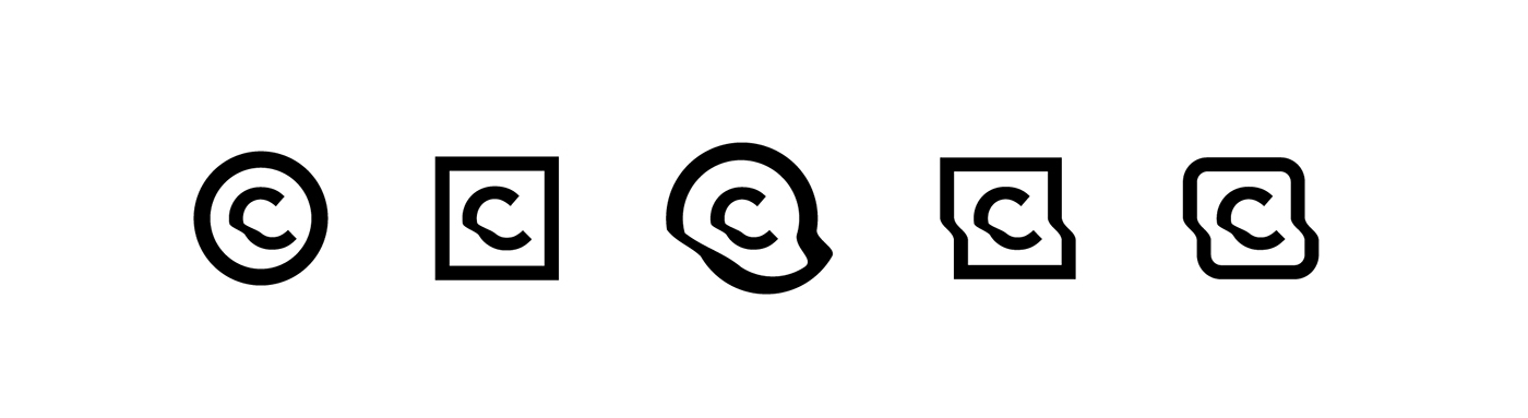

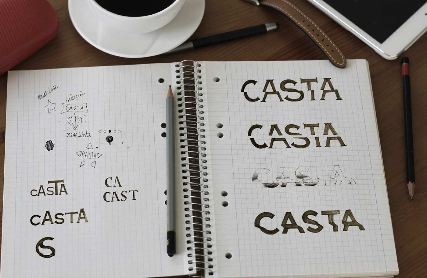
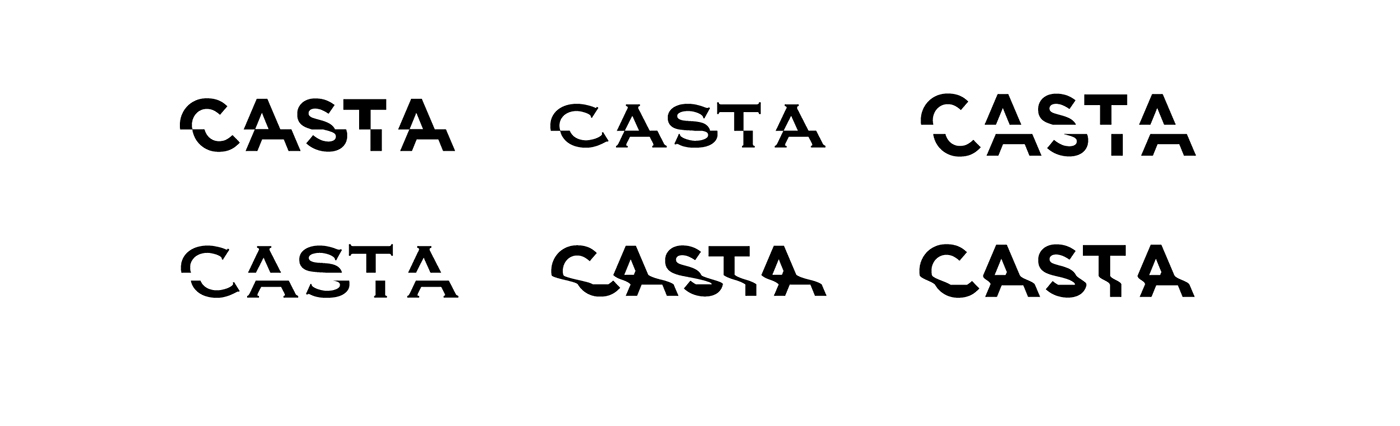
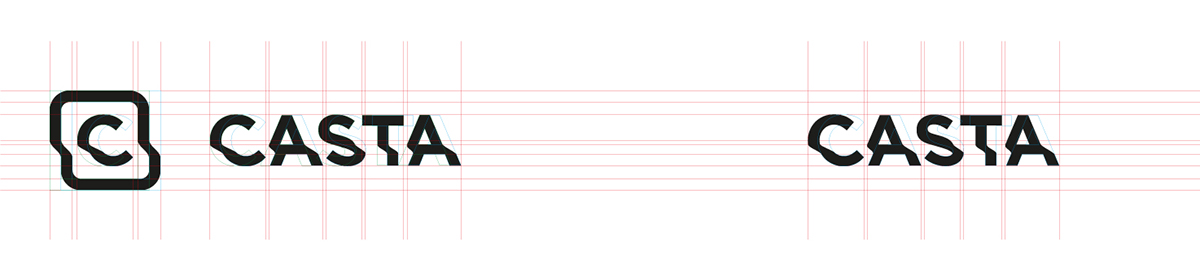
Final Solution
Inspired on clean forms and dynamic shapes. Casta has now a logo.


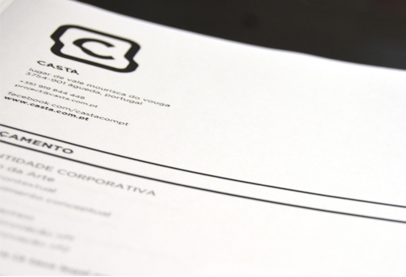
Stationary
All the stationary, such as business cards, documents, flyers and catalogue were created and invigorated with the new branding. I’ve tried to explore this brand giving it an unique look and strong visual.

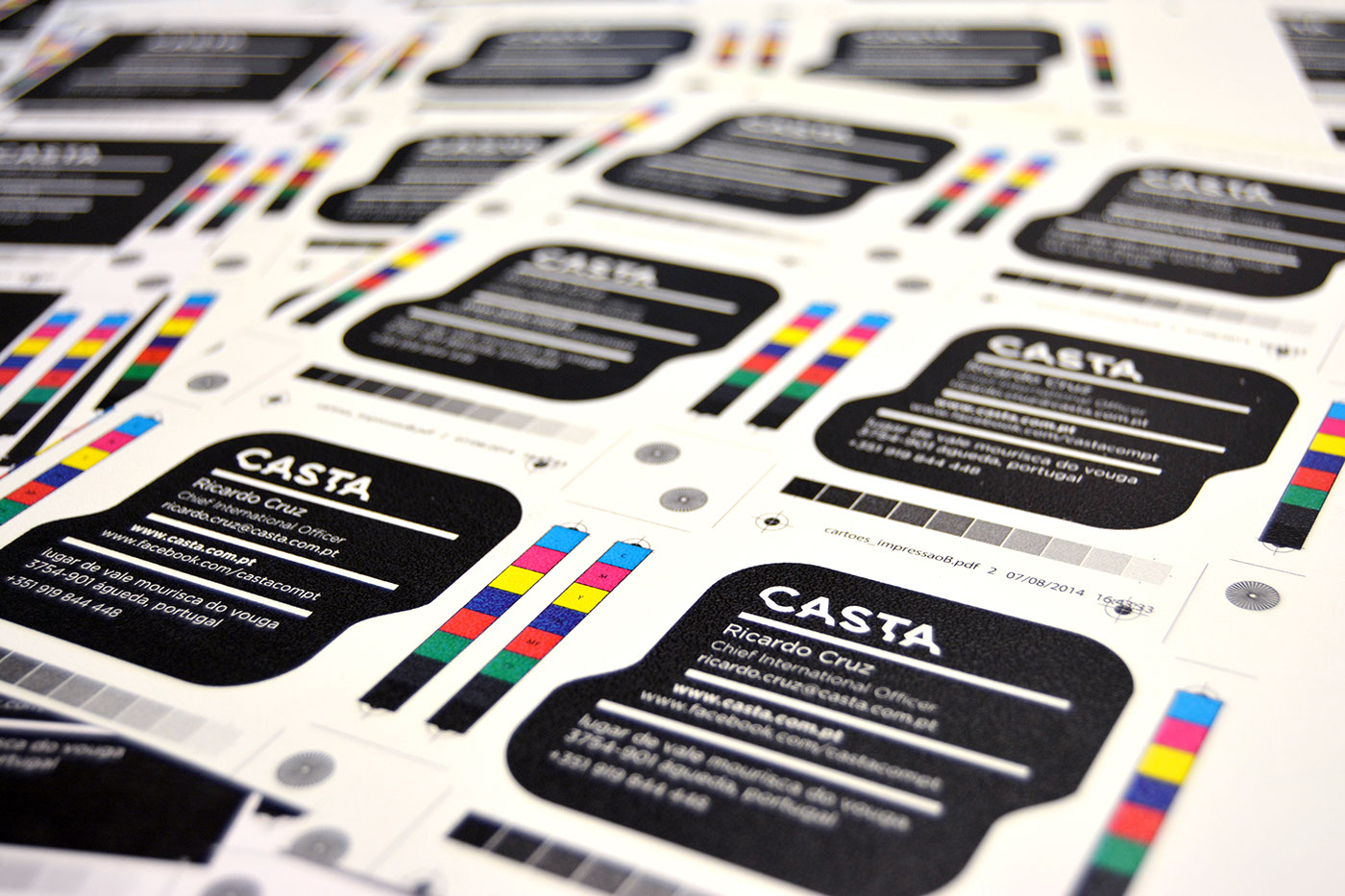
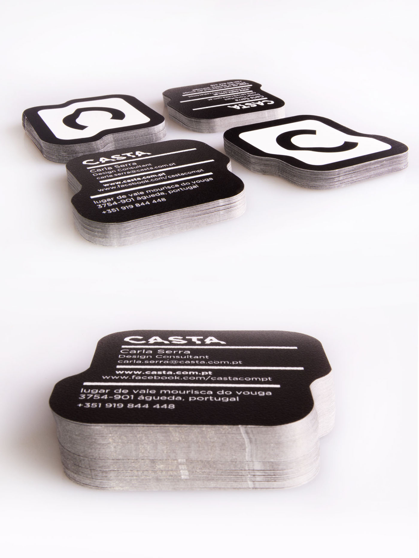
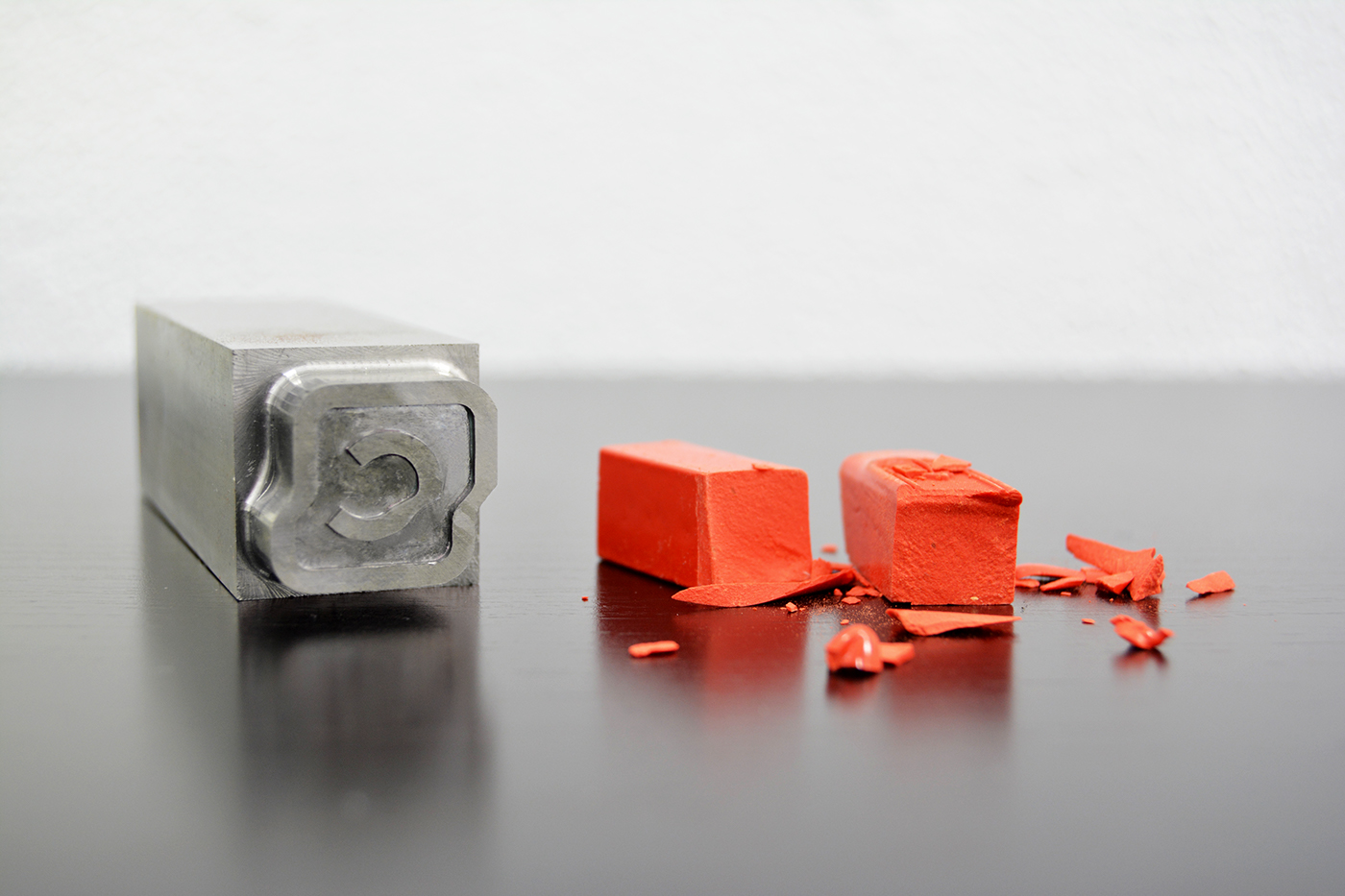
Business Cards
Casta's business cards were a very important detail of this branding. The cards have a simple and unique design, reflecting the company’s work. Using only black allowed Casta to reduce the business cards production costs and the textured paper gave them a very pleasant touch. The cards are molded by a special made shear with the shape of Casta’s logo improving the brand recognition.


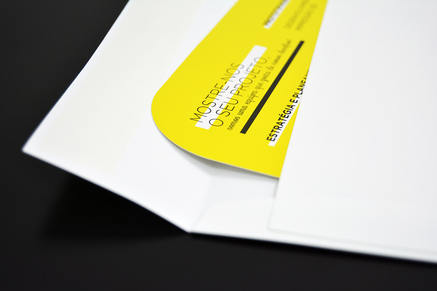
The Golden Ticket
The Golden Ticket was part of Casta’s marketing campaign. It was created to show the company's services to their target audience. It was a way of inviting future clients to work with Casta.


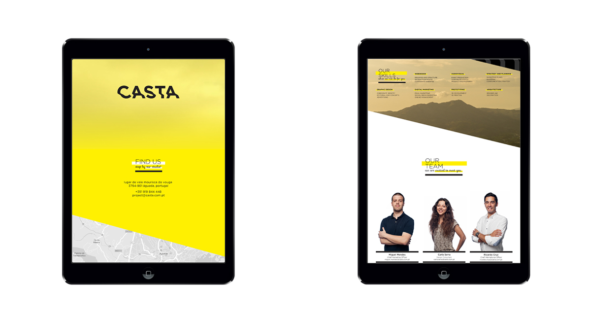
The Website
Casta’s website, where the company could show case some of their projects and concepts. This website was fully responsive, adjusting to every mobile and tablet device.
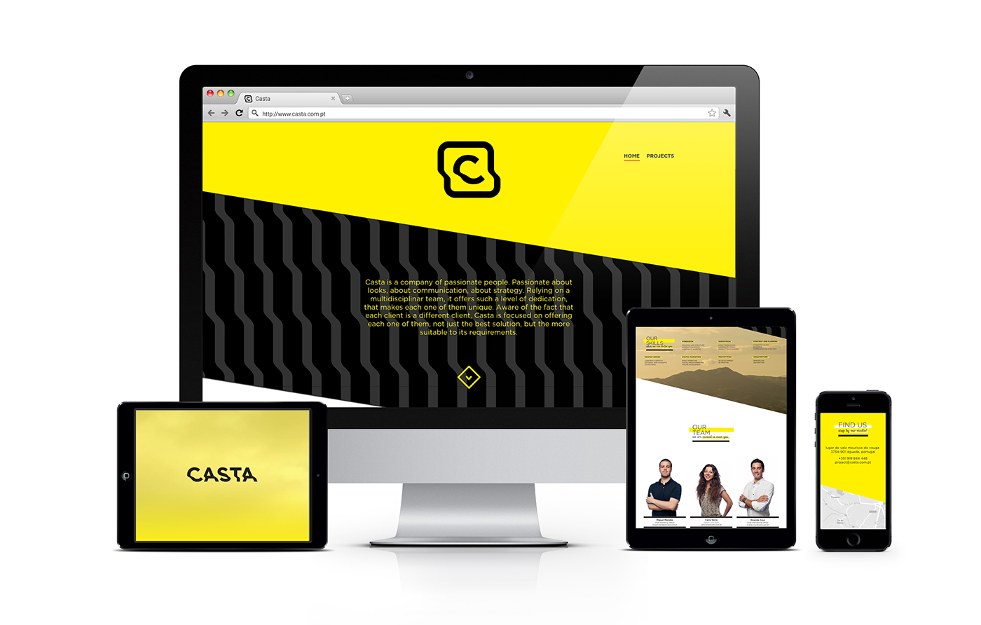
Desktop Version
--------------------

Tablet version
-----------------
Mobile version
-----------------

Home page design
----------------------

Find Casta here:
Design Carla Serra
Art Direction Casta
Thanks for watching.
Please fell free to give some feedback.


