
Typographic Poster
The objective of this project was to create typography printed poster that premoted a font. It needed to contain a few things:
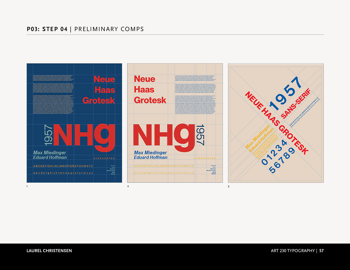
-Size: 16 x 20
-Name of the font
-Brief history/information about the font
-Samples of all weights available
-Use a minimum of three colors
These parameters really forced me to be creative and spend some quality time with my sketched. The font I was assigned was Neue Haas Grotesk. Through out the course of this project, I wanted to make sure that I did all of my research on this font. Whenever I start a project, especially when there is a form of history attached, I find it incredibly important to be through and know all I can.
What intrigued me about the most about Neue Haas Grotesk was that it was designed by Max Miedinger, a Swiss designer, to compete with the German-designed Akzidenz Grotesk. I then dove deeper into what Swiss design style was. I learned that Swiss style is where art and math meet. Grid systems are often used and help set and create visual hierarchy. In my first digital sketches, I was trying to create a blueprint look, because it feels very mathematical and well structured.
My Favorite Digital Sketches:
Color Variation of Best Digital Sketch:

Digital Mockup:


