


ADLER
Branding / Brand Strategy / Copywriting / Packaging / Illustration
Adler Kombucha is a proudly crafted beverage, born from the heart of kombucha culture. Adler isn't your average drink; it's a homage to tradition, a celebration of community, and a commitment to wellness — to being fresh and flavorful.
Our meticulously brewed kombuchas blend hand-selected organic ingredients with a touch of magic to create a symphony of taste and vitality. Unlike conventional beverages loaded with artificial additives, Adler Kombucha offers a natural and invigorating alternative that will leave you craving another sip and feeling great about it.
The result is a sparkling elixir that delights your palate and nourishes your body, leaving
you refreshed and revitalized with every sip.


Design Assets
We have carefully selected and prepared design assets representing the main ingredients of the beverage. Each asset is a high-quality illustration created using vector graphics.
The illustrations showcase the ingredients in their original forms, allowing consumers to better understand the composition of the beverage.
The visual style of the assets is designed with sharp edges, emphasizing the brand's brutal character. The combination of bright colors, contrasting elements, and fonts creates a sense of power, energy, and authenticity.
All illustrations are created by hand by professional artists, using advanced vector graphics techniques and the brand's signature color palette.


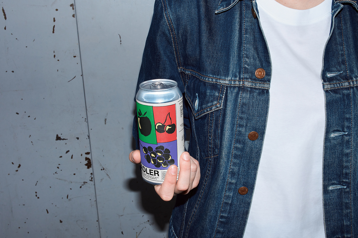
Label Design
Having completed the development of the main design elements and identified the visual style's core direction, we proceeded to design the can's label.
To unify all elements, we incorporated lines and created frames between them. The frames feature a rough texture, emphasizing the visual elements and uniting them into a cohesive style. Objects are positioned at angles, creating a dynamic composition that remains clear and focused.
The foreground prominently features an illustration, immediately capturing the potential buyer's attention. The bottom of the label features a block with the logo, slogan, and ingredients, which helps to divide the composition into clear and distinct sections. The size of the illustrations and their borders directly correspond to the ingredient percentages, establishing a clear and intuitive association for potential customers.

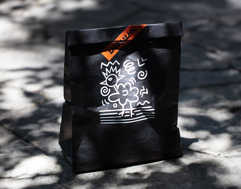
Merchandise
After finalized the design of the label, we continued its logical development by creating merch that will become not just an accessory, but a reflection of your taste and style.
We chose a t-shirt and tote-bag as the merch items.
We applied our signature visual style to them, using the brand logo and identity assets. At the same time, we made some changes by combining different icons in one design. This allowed us to create an interesting solution that significantly the brand's recognition and its visual variation.


Client: ADLER
Art Direction: Matthew Jerso
Design: Matthew Jerso
Assistant: Jana Elpvih
Photo: Adobe Stock
matthewjers@gmail.com
matthewjers@gmail.com


