

The visual identity of a marketing agency zeon ads should reflect professionalism, consistency, and expertise. The arrow, which moves from the white diamond-shaped blocks to the purple one, symbolizes the gradual achievement of goals and the work towards the final result.

We create highly flexible logo style, as it can be displayed in one, two, or three lines without losing its recognition.


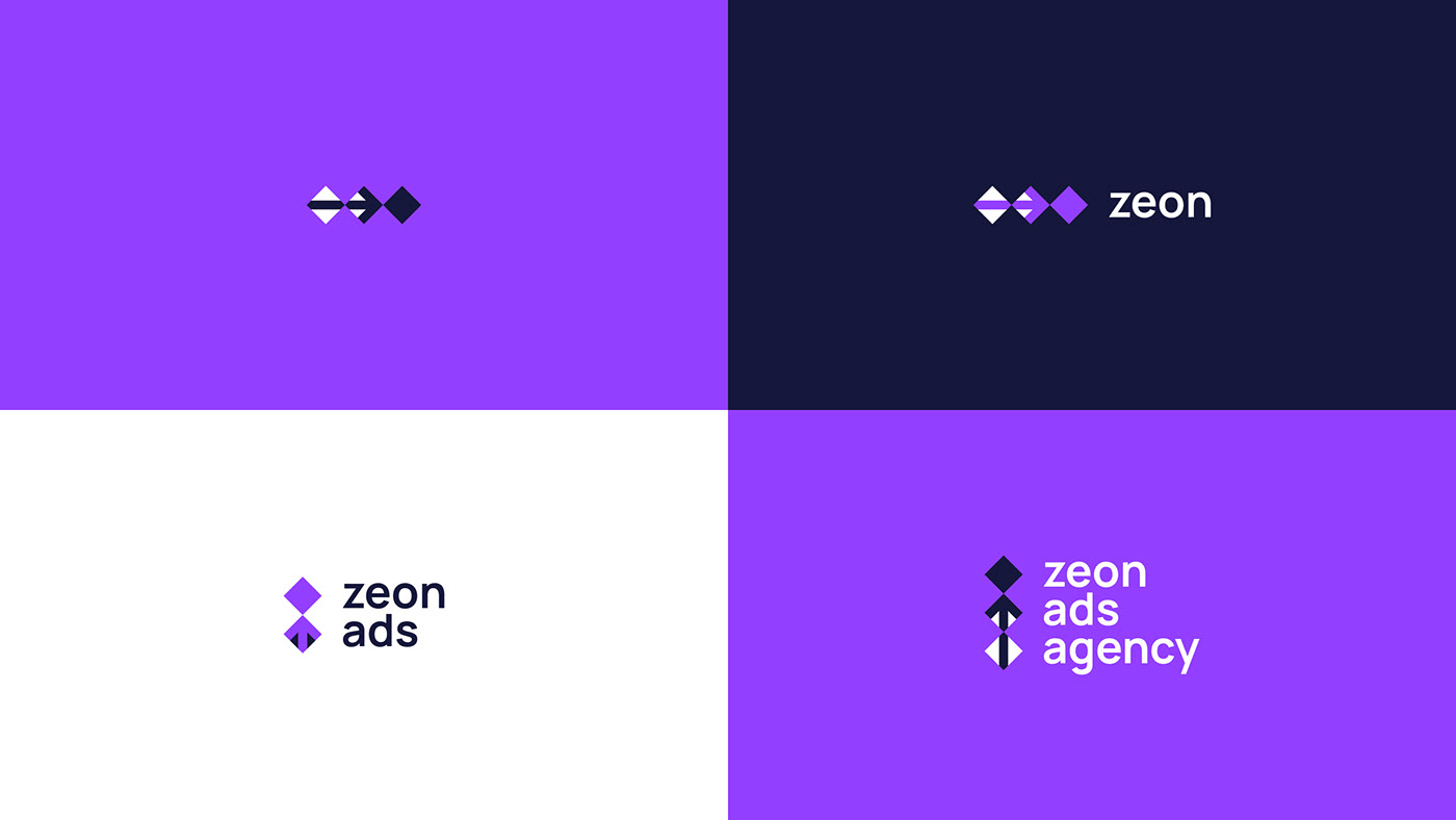
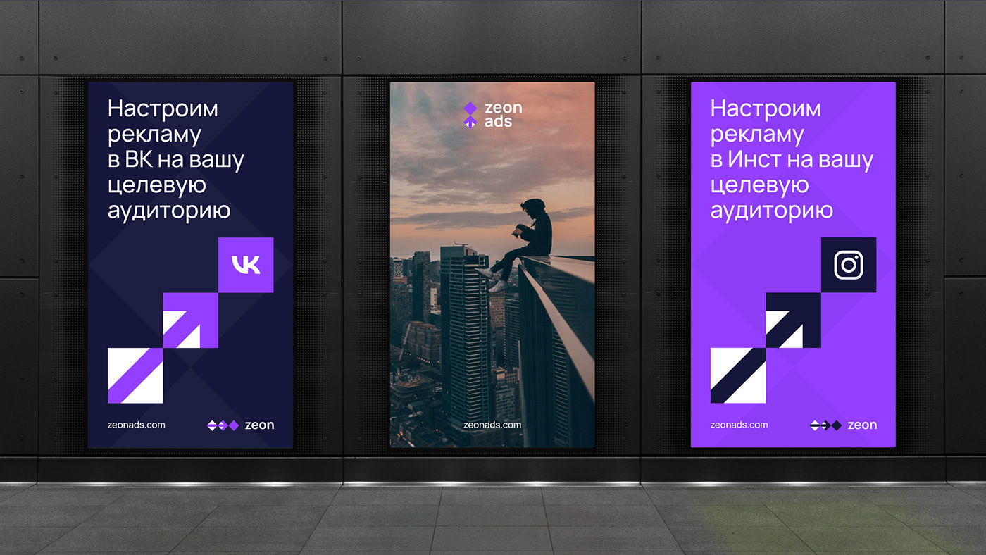
The structure of the logo is visible in all corporate identity materials, which makes it easy for customers to identify a marketing agency.


Credits:
Design: Kolyas Ivanov
©2024 grafdesigna studio
grafdesigna.ru


