


The Objetive: The objective of this project is to create a cohesive and compelling branding strategy for PAEMPO, the athletic apparel brand focusing on maternity and postpartum wear. This strategy aims to effectively communicate the brand's core values of strength and sensitivity, celebrating the unique journey of motherhood and empowering women during pregnancy and beyond. Additionally, the objective is to develop brand collaterals and visual communication designs that resonate with the target audience, highlighting the brand's offerings and fostering a strong connection with mothers seeking quality athletic wear tailored to their needs.
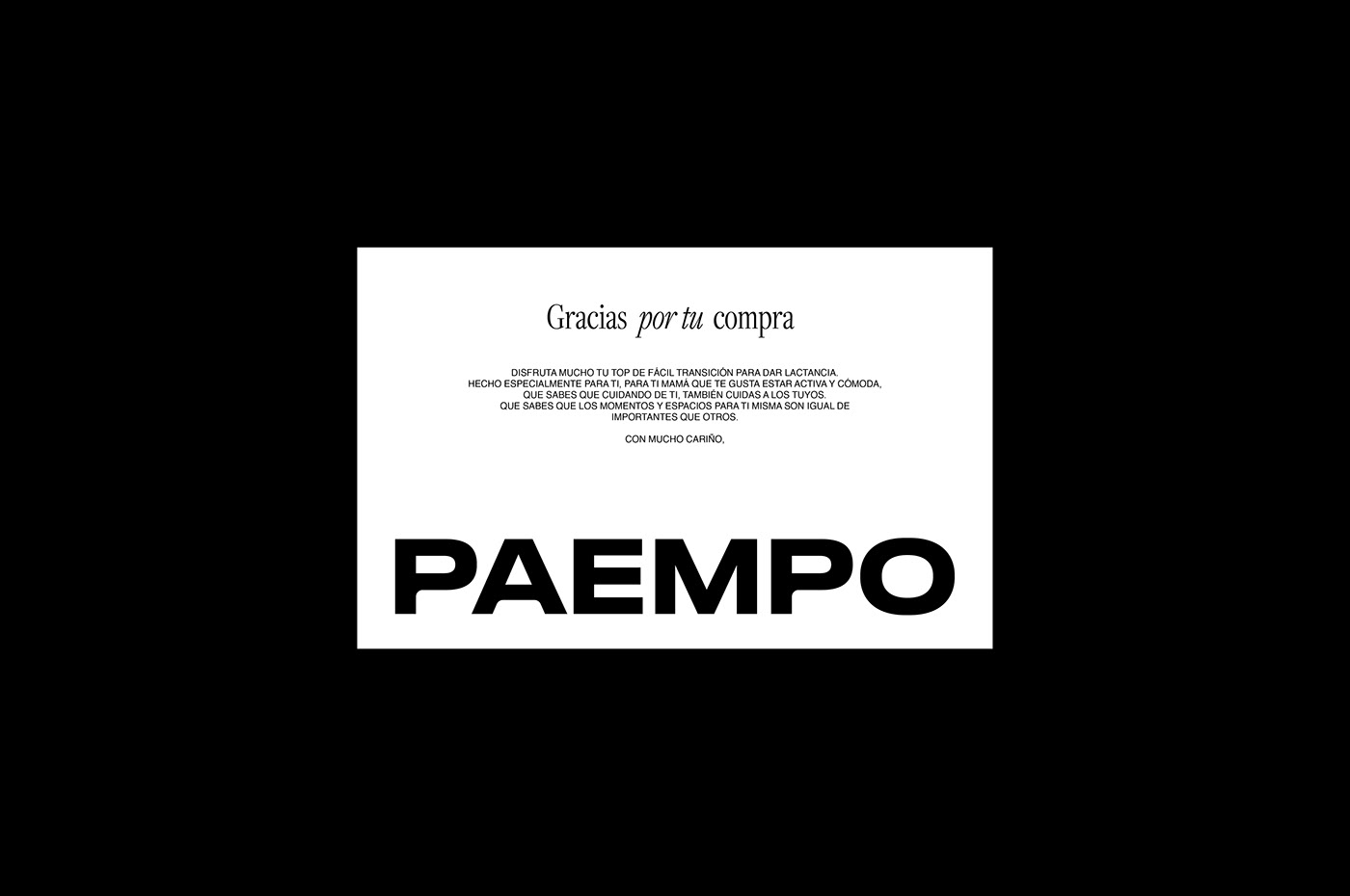
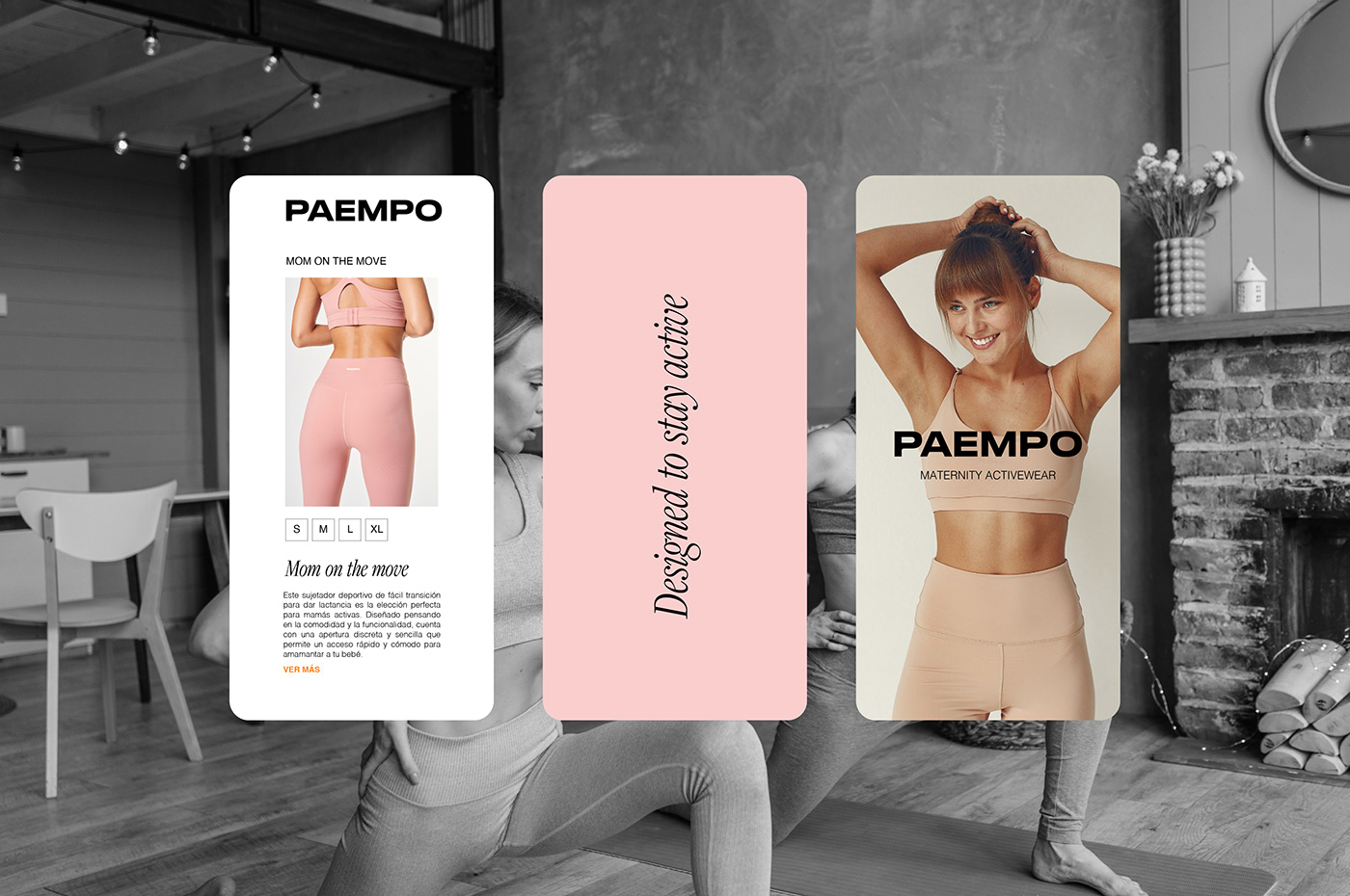
The Solution: We developed the brand name by drawing upon one of its most distinctive and vital features: exercise attire tailored for Postpartum and Pregnancy. And for the tagline: Maternity activewear. To transition from the conceptual phase to the graphic phase, modifications were made to the typography in the logo. The hard angles in the letters "P" and "A" were softened, infusing the bold and robust typography with curves that evoke sensitivity and the natural curves of a woman's body. In the color palette, pink was chosen to symbolize sensitivity, beauty, and delicacy, while orange represents activity and strength. Additionally, a family of icons was created to distinguish between different garment categories:
- An abstract representation of a breast to signify the postpartum phase. - An abstraction of the belly to signify pregnancy.
- A general icon derived from drops of breast milk, symbolizing the postpartum period, while incorporating a flower
to signify the blooming process during pregnancy.
Creative Direction: CON H STUDIO
Branding: CON H STUDIO
Naming: CON H STUDIO
LET’S WORK TOGETHER
FOLLOW US ON INSTAGRAM


