JUPE VI Rebranding
TIME: 2024/03
TIME: 2024/03
平面設計接案近五年,至今仍會因為設計悸動與興奮,
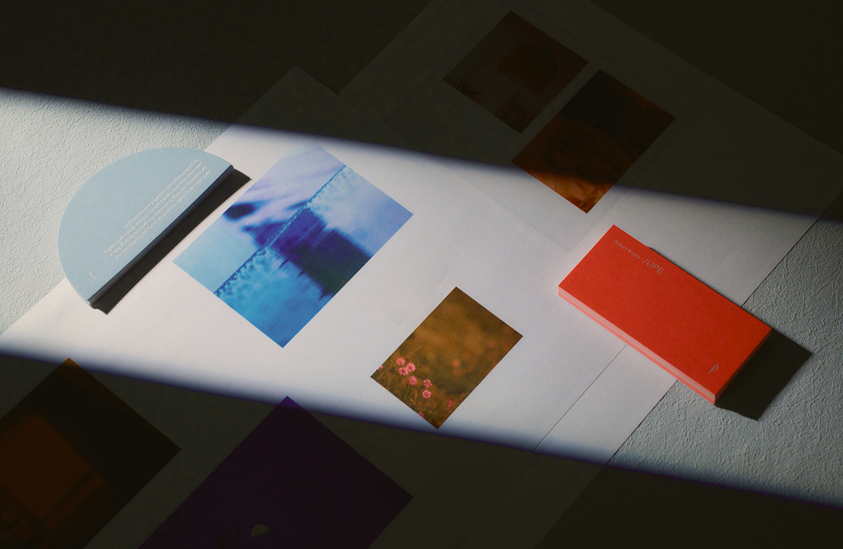
讓人心滿意足,因此我們決定跟隨著這幾年的改變,創作JUPE識別的新面貌💖
讓人心滿意足,因此我們決定跟隨著這幾年的改變,創作JUPE識別的新面貌💖
新的圖標、新的名片,更沈穩且堅定的橘色與藍色,
是我們一起隨時光邁進的足跡,也是對未來的盼望。
是我們一起隨時光邁進的足跡,也是對未來的盼望。
After nearly five years of engaging in graphic design projects, we still find ourselves filled with excitement and passion for design, leaving us thoroughly satisfied. Therefore, we have decided to embrace the changes of these past few years and craft a fresh identity for JUPE,With new icons and revamped business cards, we introduce a more poised and resolute combination of orange and blue. These colors symbolize not only our journey through time but also our hopeful anticipation for the future.
J:「隨機、不可預測的事情,難道不更令人著迷?下筆之前,甚至不知道也許新的奇蹟正要發生。」
Random, unpredictable events, aren't they fascinating? Before putting pen to paper, one may not even realize that a new marvel is about to unfold.
P:「理性與感性的結合體,女性的力量讓我著迷,那是只有女性才能散發出來的,是排列整齊、但部分散亂、活力與沈靜並存的能量。」
The fusion of rationality and emotion, the power of femininity captivates me. It's something unique to women, a blend of orderliness and partial chaos, where vibrancy coexists with serenity.