


CONCEPT
Inspired by the animation "Spider-Man: Across the Spider-Verse," I crafted the UI in a cartoon rendering style. My goal was to utilize PostProcess Material and camera direction that interacts with the UI, capturing the process of solidifying intentions and concepts. Using Unreal Engine, I applied character and background resources and incorporated a cartoon rendering style with PostProcess Material.
The UI structure draws from Marvel's Spider-Man: Miles Morales game, and external resources used in the project are listed below.
MOOD BOARD
Drawing from keywords such as Comics, SpiderMan, Cartoon, Hand Drawing, Rotoscoping, Benday effect, Vintage, Newspaper, I combined colors, fonts, shapes, and direction.
Especially in areas requiring attention, I employed techniques reminiscent of comic books, utilizing textures and contrasting colors to make elements stand out.

COLOR
POINT COLOR
POINT COLOR
Drawing inspiration from characters and backgrounds, I used a variety of vibrant colors.

BASE COLOR
I used black and white as the base in areas where it contrasts with the point color and where text readability needs to be high, and in parts that occupy a significant portion of the screen.

FONT
EMPHASIS FONT
EMPHASIS FONT
Based on keywords, I adopted a distorted and carefree scrap font as the emphasis font.
This font is used in parts requiring attention.

MAIN FONT
To contrast with the emphasis font, I selected a normal font, opting for a narrow typeface for space efficiency.

SHAPE
Dot patterns, hexagons, torn paper

MOSTION / TEXTURE
I created dot patterns, glitches, and death effect presentation materials.
I created dot patterns, glitches, and death effect presentation materials.
Glitch effects were transformed from character glitches into UI materials.

I created a circle pattern and adjusted the pattern size based on the Circle Scale value.

Combining vignetting and textures, I created it using PostProcessMaterial.


HUD
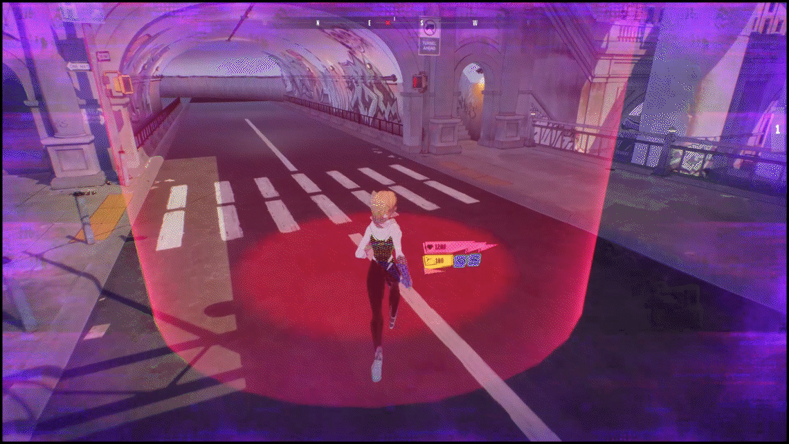
While playing Spider-Man games, I found it inconvenient to check stamina or skill cooldowns during combat as the HP, Energy, and Skill UI were placed on the top side.
In response, the UI was moved next to the character to allow for easy data recognition during battles. The implementation method involved adding HP, Energy, and Skill widgets to the character's BP.
These were created with a Billboard to adjust the Pivot to the center of the character and ensure they always face the camera. The Compass UI is placed at the top, considering that the user's focus remains at the top, primarily because the characters move above the buildings.

I divided the screen into three zones and categorized the UI based on importance, ensuring that elements outside the central area wouldn’t diminish focus.
Because it can be difficult to pinpoint what appears in the surrounding view when you stare at the center, the size of the [TIER 3] UI is 1.2 times the size of the [TIER1] UI.

TIER 1 HP / ENERGY / SKILL TIER 2 Combo TIER 3 Levelup / Compass / Message / Mission
FNSM APP
I added frequently accessed pages such as Social Feed, DataBase, and Mission to the FNSM App category in the OutGame tab menu so that they can be quickly accessed even while playing.
The app icon is designed in a cartoon style, inspired by the phone screen, to make it easy for users to identify.
*thumbnail were designed using the image generated by AI.


OUTGAME
In the OUTGAME UI, I worked on the SUITS and SKILLS pages.
I changed the font to provide users with a stronger reverse feeling when the tab is clicked. Additionally,
I set the page to move when the tab is clicked.

When a user clicks on a skin item, the camera zooms in on the character.
By switching between dot patterns and background colors on the thumbnail, it helps users directly recognize what they clicked.


SCENE MOTION
This is the death scene presentation.
To convey tension when entering dangerous areas, I applied PostProcess Material using glitch effects on the character and vignetting and painting textures on the screen edges.

The reference link for character glitch effects is provided at the bottom.
Upon the character's death, a 2D effect sequence is displayed, followed by a transition to a top-down view to visually showcase the character's death state before displaying the UI.
The 2D effect sequence used external resources.
QUIT POPUP
I placed the UI on the right side of the screen to avoid obstructing the character, and it was created using paper textures and materials.

Thank you
Source
Character : https://artstn.co/m/JwpOq
Character Animation : https://www.mixamo.com/#/
Character Glitch Material : https://youtu.be/t0hktndC_Lg?si=3xurlSEn9xOi0Ak0
2D Effect : https://zrr.kr/ITAC
Extraoin Zhurdlyou Total War Missing Font: https://www.dafont.com/extraoin-zhurdlyou.font
PP Formula Font : https://www.behance.net/gallery/70085477/Formula-Consensed-Free-Font


