KOMO Design Store
Visual Identity
Visual Identity
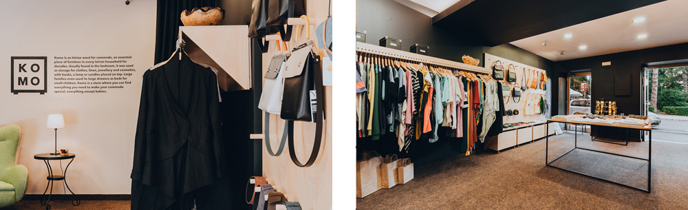
Komo is an Istrian word for commode, an essential piece of furniture in every Istrian household for decades. Usually found in the bedroom, it was used as storage for clothes, linen, jewellery and cosmetics, with books, a lamp or candles placed on top. Big families even used its large drawers as beds for small children. Komo is a store where you can find everything you need to make your commode special. Everything — except babies.
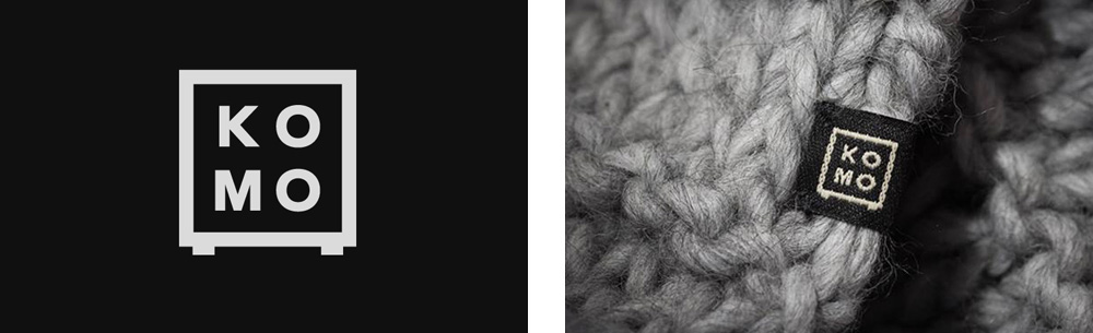
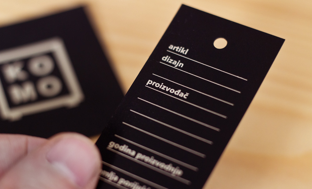
A wordmark placed inside of the square is a common graphical treatment in logo design. However, by adding two small "feet" at the base of the square, the Komo logo instantly became a different, very recognizable commode symbol, giving it wit and uniqueness. The logo had to be extremely simple, so it would be easy to apply on woven clothes tags. To keep costs down it was silkscreened on a fine black paper, for use as business cards, invitation materials, etc.
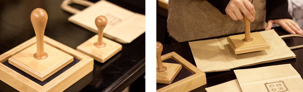
We also made two ridiculously large stamps which the owner can use to stamp her logo on paper bags and other applications, as needed.
Agency: Manasteriotti DS
Art direction/Design: Igor Manasteriotti, Mia Marić
Interior design: Iva Stojković
Photography: Manasteriotti DS, Jan Stojković Photography
Photography: Manasteriotti DS, Jan Stojković Photography


THANK YOU
www.facebook.com/ManasteriottiMaric
www.manasteriotti.com
www.facebook.com/ManasteriottiMaric
www.manasteriotti.com


