
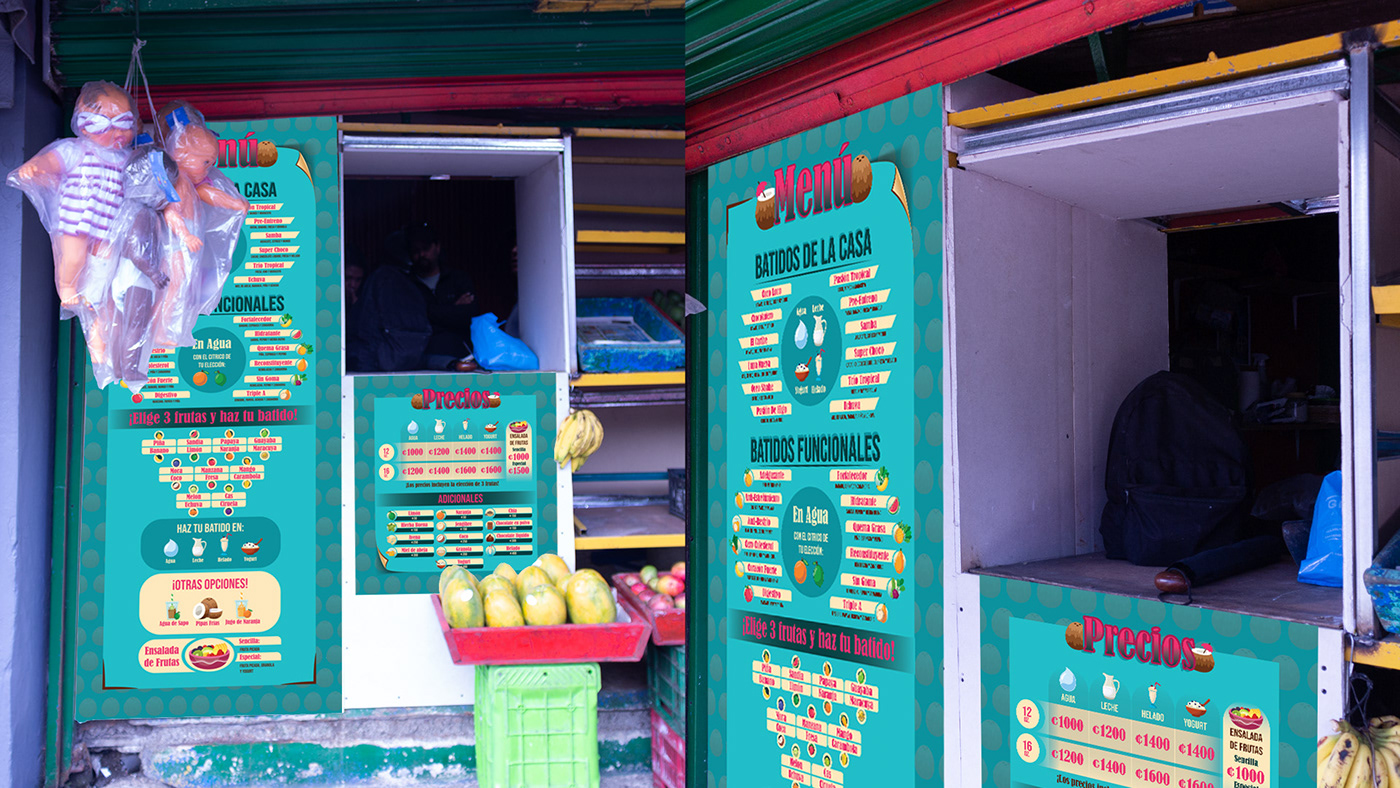
Mock up menu visualization for a smoothies windows in the central market of Cartago, Costa Rica.
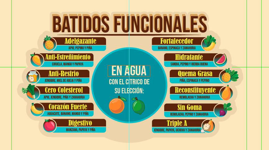
Testing menu item composition of smoothie name, ingredients and a representative icon.


Testing color pallette with a set of menu items, the first one is the selected pallette.


First approach was to use two columns with the house menu, it was lacking some design and had to add some information about this specific section, so I used a circular distribution, to make the design more attractive and to add a focal point in the center of important information that you can see at the end result.


One of my clients for this job, wasn´t too confident with the use of the palette at the first image, usually the color process comes when you have all the items with their specific design, but at this point that was the only feedback I had, so I flipped the color use tyo make turquoise the main color and added an accent with some magenta.


Final result of the main menu and a price menu that goes with the support on the design of the first one.


Modification to the prices menu after a month of the opening.

I reused the content of the menus and made this flyers for my clients and added some information for address and numbers.


This design is specificly to make a hanging sign to read "Batidos" in both sides of it, and with the shape of an arrow pointing to the smoothies window.


A variation of the last sign in another format, this one was to print it in adhesive paper.


