Colour & Repeat - Remembrance
FSN 221 - Design Literacy II
Vio Lin


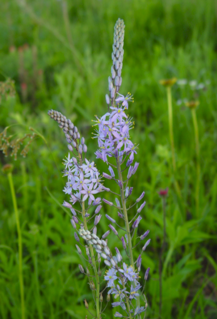
Reference Image used for Motif
sourced from iStock Images
Motif Process Work

I started by placing my photo (all photos sourced free from iStock images), into Illustrator and dimming the opacity down. Then I started to slowly outline the motif with the pen tool and stopping in between sections to organize layers and fix any errors with the direct selection tool. I made sure to capture as much detail so possible without being too overbearing as lace does have limits.

apologies for the quality these are direct screenshots from my laptop, please bare with me.
Once the motif was outlined in full and I was satisfied with my line weight, I copied and saved an extra for backup. Then copied the motif again and positioned them to look visually appealing. Next, I used repeat>radial to create this star looking shape (keeping in mind that hyacinths have 6 petals, repeat 6 times). I forgot to take screenshots of this, but I played around with the positioning quite a bit until I got the shape I liked.

After deciding on a colour (chosen from the selection provided in my research portion), I went on to freehand a few hyacinth leaves and coloured them the same as my motif. I hand placed these since my star shape isn't completely symmetrical. Our hyacinth motif is complete!
^^you may be thrown off by the lack of colour, but due to the complexity of my design I found it easier to add colour using the background instead of in the actual motif itself which you will see in a moment.
Final Design Process

Here I'm adding basic shapes, careful to place them behind the motif so the colours show through, to mimic an ancient greek discus.

At this point I really wasn't happy with the look. Originally I had picked out more than 10 different colours for this design, but I'm now realizing that having so many colours didn't really look quite right. I was also struggling to figure out how I want to colour block my motif to best showcase the hyacinth flower shape without it turning into a star shape.


Trying out other colour combinations. Looked tacky and too graphic in a sense? No longer looking like a design created for lace so I trashed this.

In the end I scrapped the colour blocking all together and decided to fill in the spaces with more line work. I created V shaped lines that stem from the middle of each 'petal' to resemble sunbeams or rays. Next, I freehanded these swirly shapes inspired by hyacinth roots (reference used from my collage), and placed them between each petal.

Lastly, I freehanded a rectangular box shape, commonly seen on the borders of ancient Greek pottery (referenced in my collage). Then repeat>radical and placed it behind our 'discus' and that's it! I added my title and colour swatches/codes soon afterwards.
Artist Statement
In this piece I wanted to convey that nostalgic feeling when you find little trinkets that remind you of people or events of long past. This design is heavily inspired from the myth of Hyacithus and Apollo.
Shortened version of the myth in case you aren't familiar*
Hyacithus was a very handsome and beautiful man who attracted the attention of the God Apollo (God of Music, Dance, Prophecy, Medicine, Poetry, the Sun etc. depending on what version you believe or grew up hearing), and Zephyros (God of the West Wind). One day while Apollo and Hyacithus were playing discus (round metal discs, think of them like ancient deadly metal frisbees), Zephyros, fueled by jealousy, blew the discus off course causing it to hit Hyacithus in the head killing him instantly. Apollo, grief stricken, transformed his body into a pale blue plant with star shaped flowers carrying his namesake, hyacinth.
Hyacithus was a very handsome and beautiful man who attracted the attention of the God Apollo (God of Music, Dance, Prophecy, Medicine, Poetry, the Sun etc. depending on what version you believe or grew up hearing), and Zephyros (God of the West Wind). One day while Apollo and Hyacithus were playing discus (round metal discs, think of them like ancient deadly metal frisbees), Zephyros, fueled by jealousy, blew the discus off course causing it to hit Hyacithus in the head killing him instantly. Apollo, grief stricken, transformed his body into a pale blue plant with star shaped flowers carrying his namesake, hyacinth.
It was only fitting to have the 'discus' decorated with hyacinths in a radial pattern to resemble sunrays. My little easter egg for people who recognize the myth, if you look closely you will notice that the hyacinth linework was that of a young budding hyacinth with only about 75% of their buds bloomed. I chose this to symbolize the start of spring and new life just as Hyacithus was granted when Apollo transformed his dying body into the flower we know today as Hyacinth.
Symbolism and design choices aside, I did originally design this art piece to be created into a lace textile geared towards the younger generations. However, the direction I took with this piece quickly became very complex and a bit old fashioned looking. I still think the design will resonate with lots of people from all walks of life, but I think the design is now more suited to be used on big surface area items such as tablecloths, curtains, bedding, piano covers, etc., to better showcase my design. So it'll be more catered towards individuals 40+ if I'm being generous. I don't think it'll show up as well on smaller items like handkerchiefs, gloves, or hair pieces.
All in all, I had a lot of fun taking on this project and I genuinely think I've learned more about how to use Illustrator in this one semester alone than I have in the past 4years of being an avid user. I'm not completely happy with my design as I do think I needed a bit more time to really finetune it to something I love. My favourite piece from the whole is surprisingly my little collage. It's funny because it was the piece I spent the least time and effort on, but I just loved how it turned out. I spent the most time on creating the linework for my motif to not only hate how it ended up looking and almost scrapped it after 5 hours of work. Luckily, I remembered the repeat>radial trick and it really saved the day. Given the circumstances I'm happy with how it turned out, but given the chance to redo this design I'd definitely take a much different approach.
All in all, I had a lot of fun taking on this project and I genuinely think I've learned more about how to use Illustrator in this one semester alone than I have in the past 4years of being an avid user. I'm not completely happy with my design as I do think I needed a bit more time to really finetune it to something I love. My favourite piece from the whole is surprisingly my little collage. It's funny because it was the piece I spent the least time and effort on, but I just loved how it turned out. I spent the most time on creating the linework for my motif to not only hate how it ended up looking and almost scrapped it after 5 hours of work. Luckily, I remembered the repeat>radial trick and it really saved the day. Given the circumstances I'm happy with how it turned out, but given the chance to redo this design I'd definitely take a much different approach.


