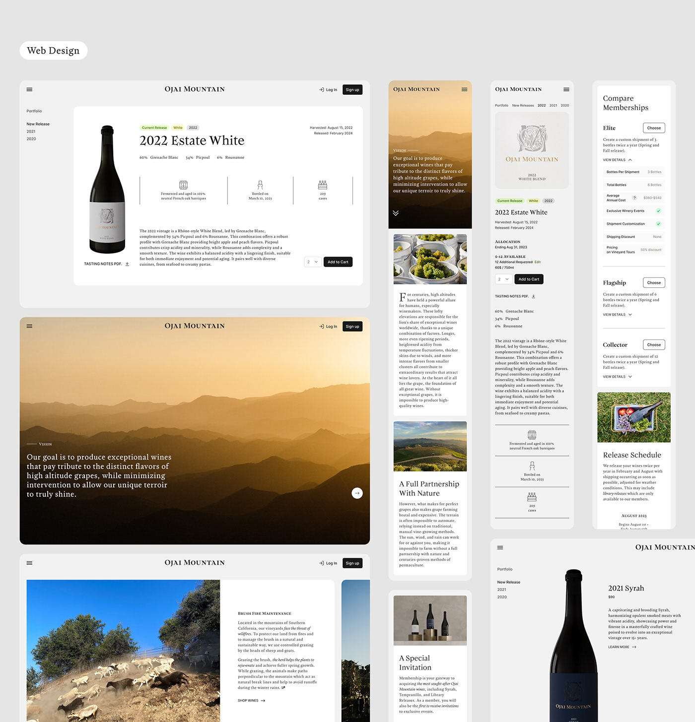
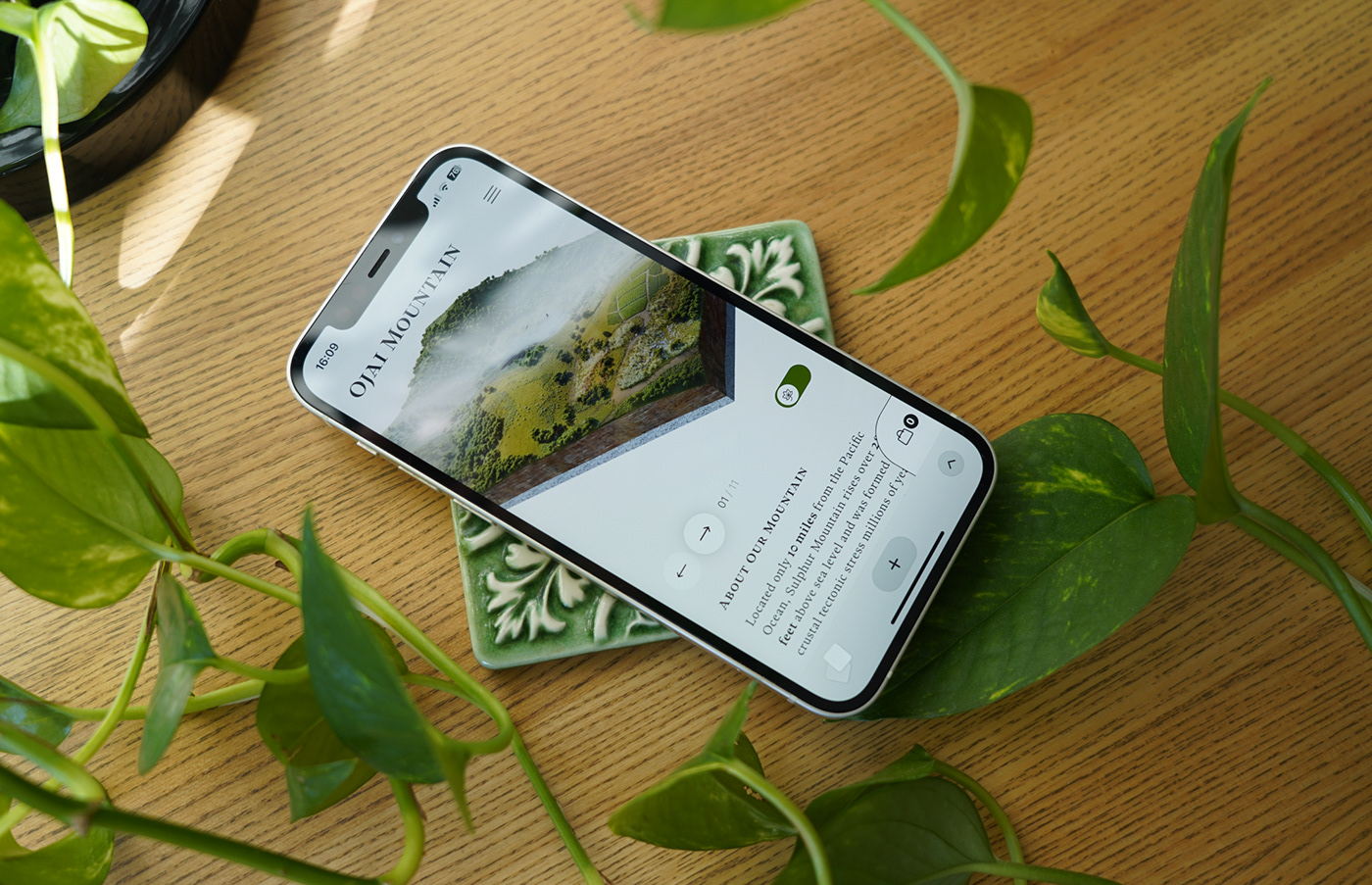
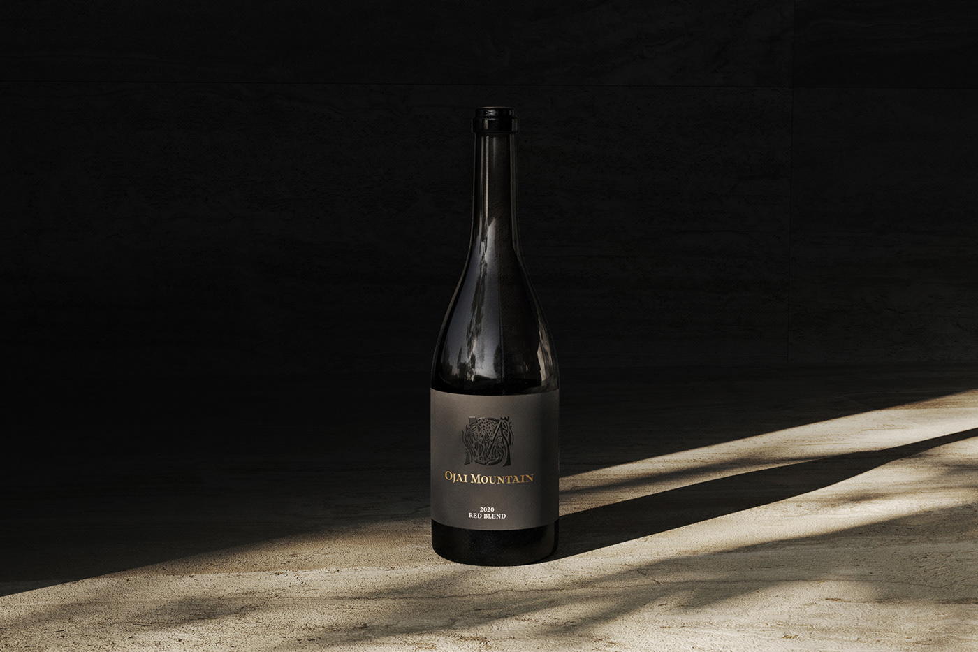
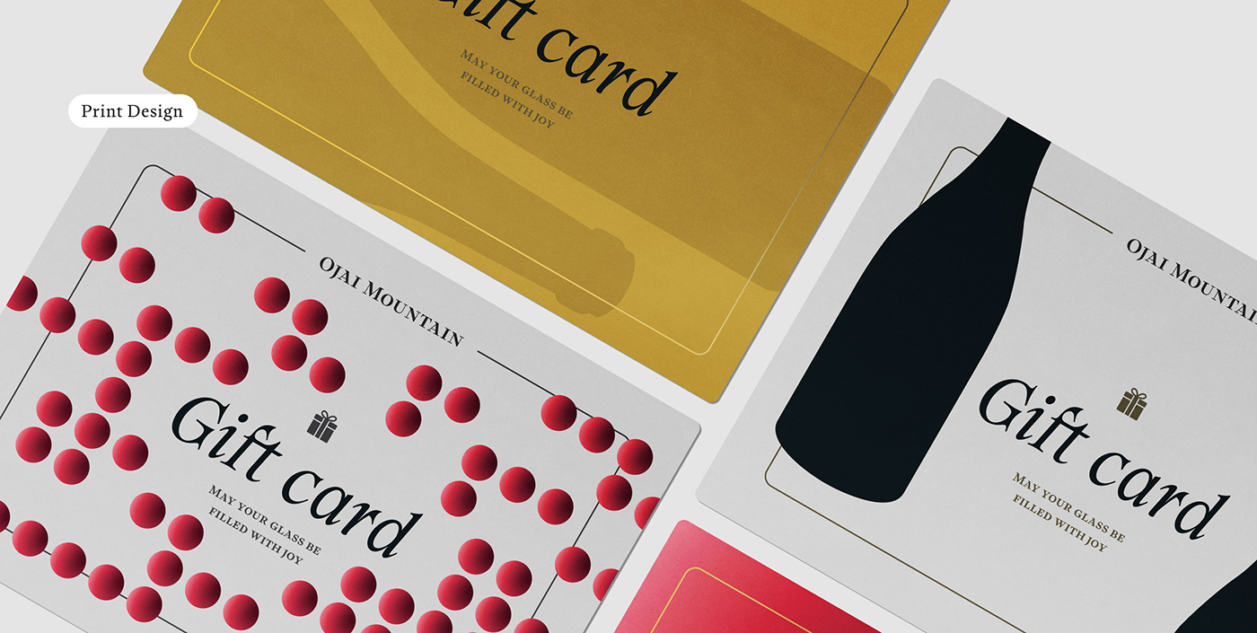
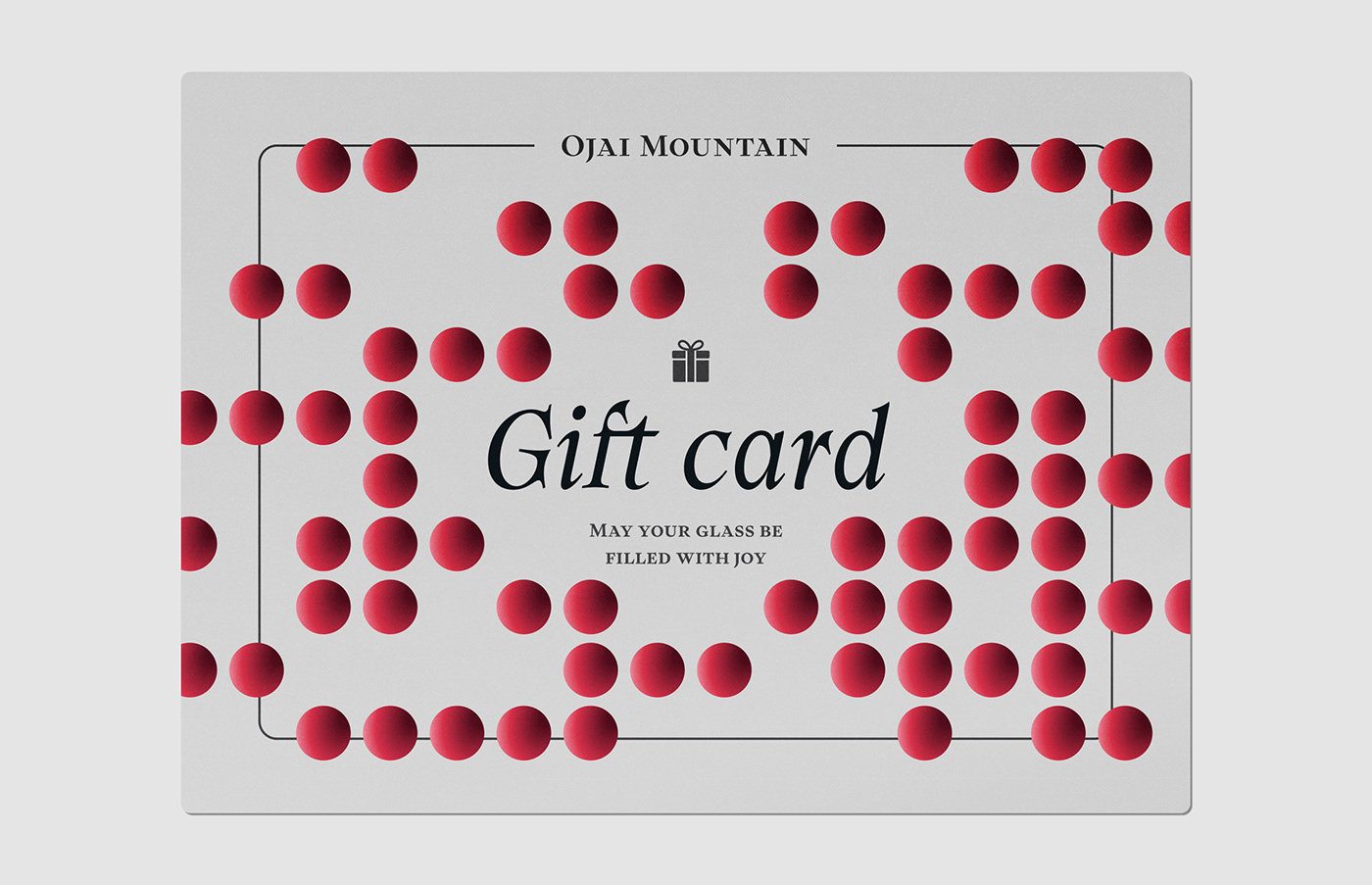
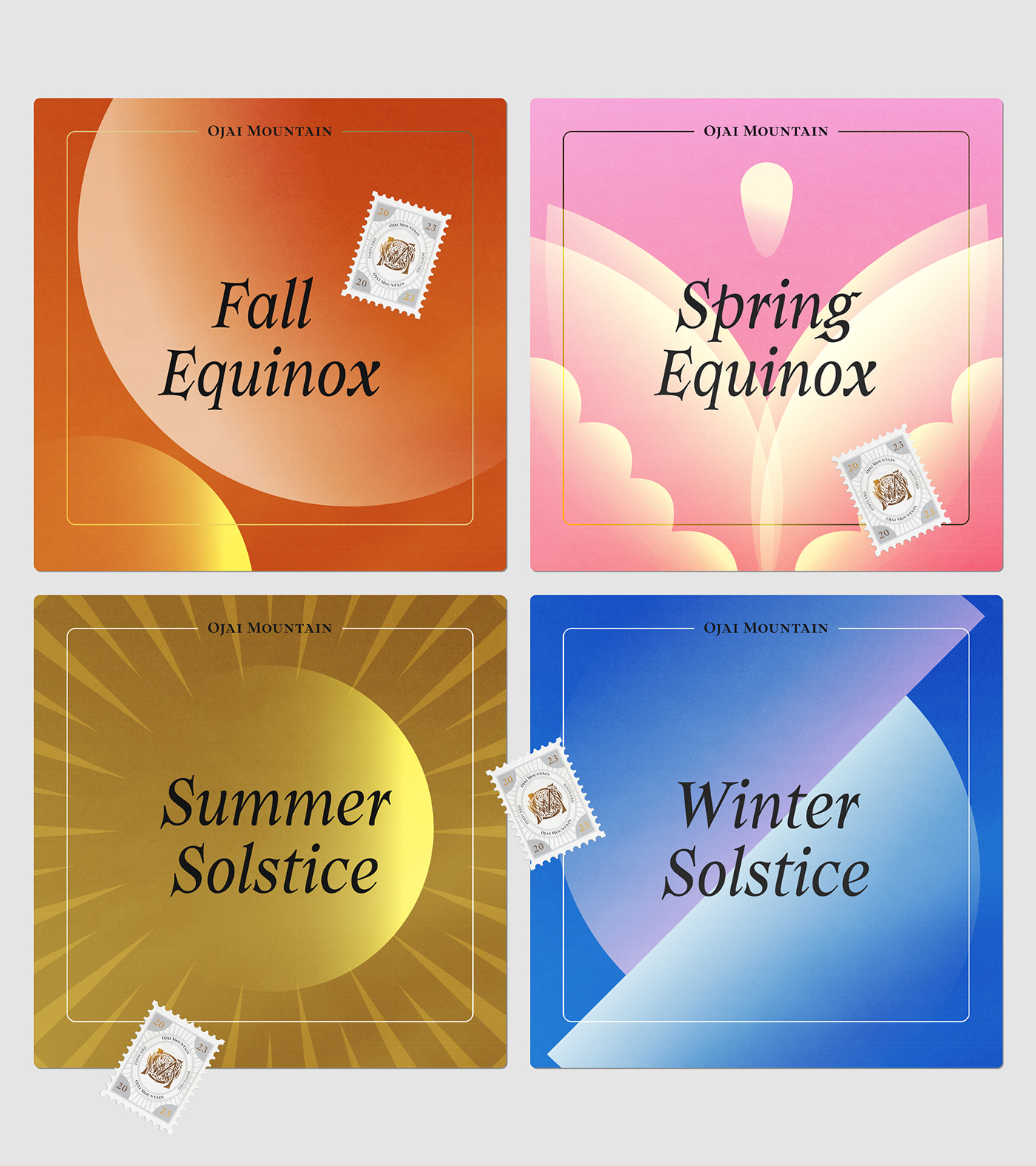
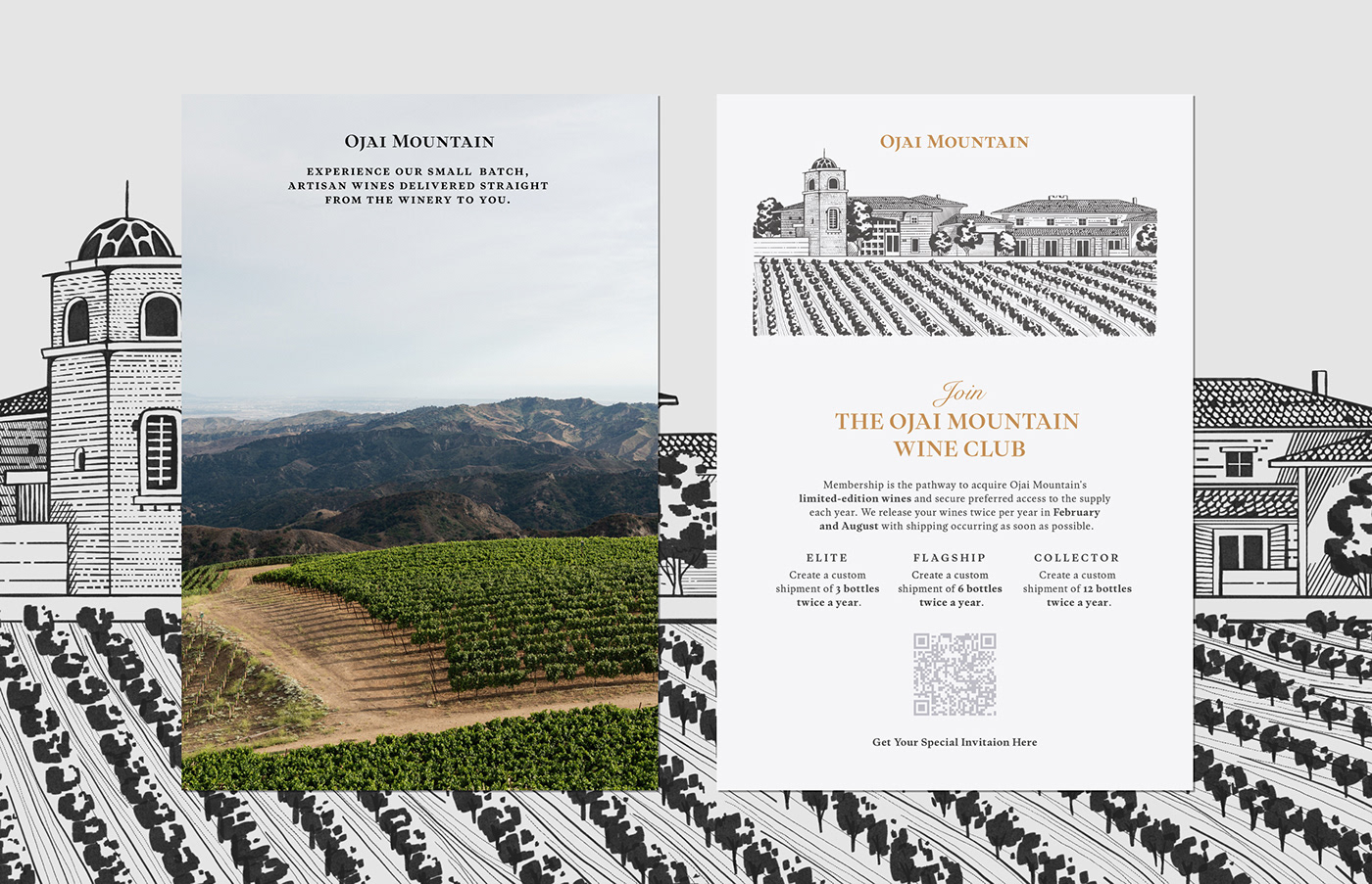
Ojai Mountain is a high-altitude winery known for its artisanal wines nestled in the picturesque Ojai region. The brand's identity strikes a balance between tradition and modernity, featuring elegant typography with traditional elements like end marks, small caps and beautiful true italics, as well as a strict contemporary gray and golden color palette. Stunning 3D imagery and infographics play a significant role in the brand's packaging and social media presence. Сarefully crafted print materials ensure seamless customer communication.
Lesia Artymovych | Art Direction, Graphic Design & Illustration
Anna Yakovenko | 3D visualisation
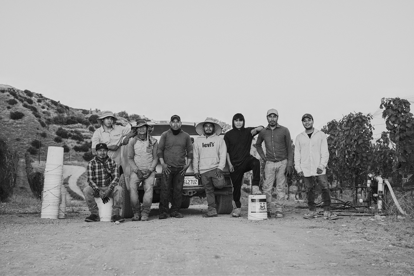
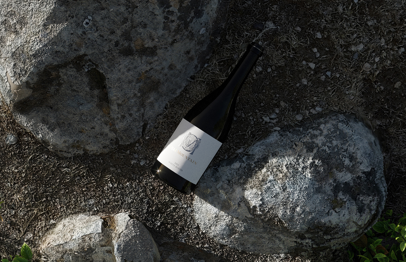
Quoc Ngo | Photography
Anna Yakovenko | 3D visualisation
Quoc Ngo | Photography
For Contact: lesiart@artymovych.com | Instagram
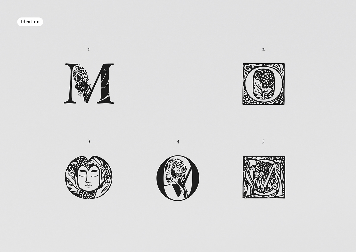
Ideation
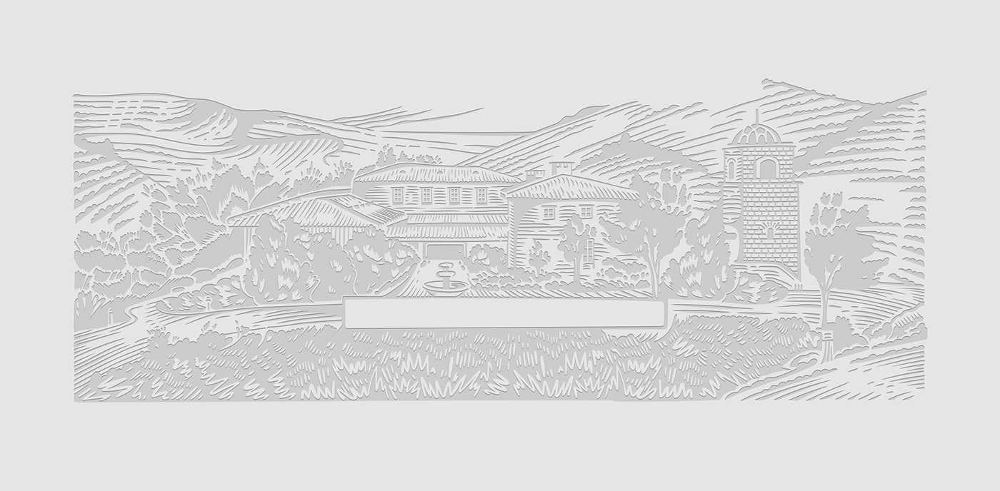
It all began with the creation of the "M," featuring intricate vines weaving through the diagonal stroke of the letter. Our founder first saw the hidden image of a woman within the grapes and vines, but we knew we needed to make her more recognisable.
That's when we turned to our other sketch, featuring a beautifully drawn drop cap letter, and realised we could merge the two designs to create something truly unique. We considered multiple designs, and after thoughtful deliberation, we chose the one that felt the most distinctive and unforgettable. However, we knew that we still had work to do to perfect it.
Through careful consideration we landed on the final design. We wanted something that would stand the test of time and truly capture the essence of our brand. The intricate details and hidden image make it truly unique, while the elegant monogram and classic typeface give it a timeless feel.

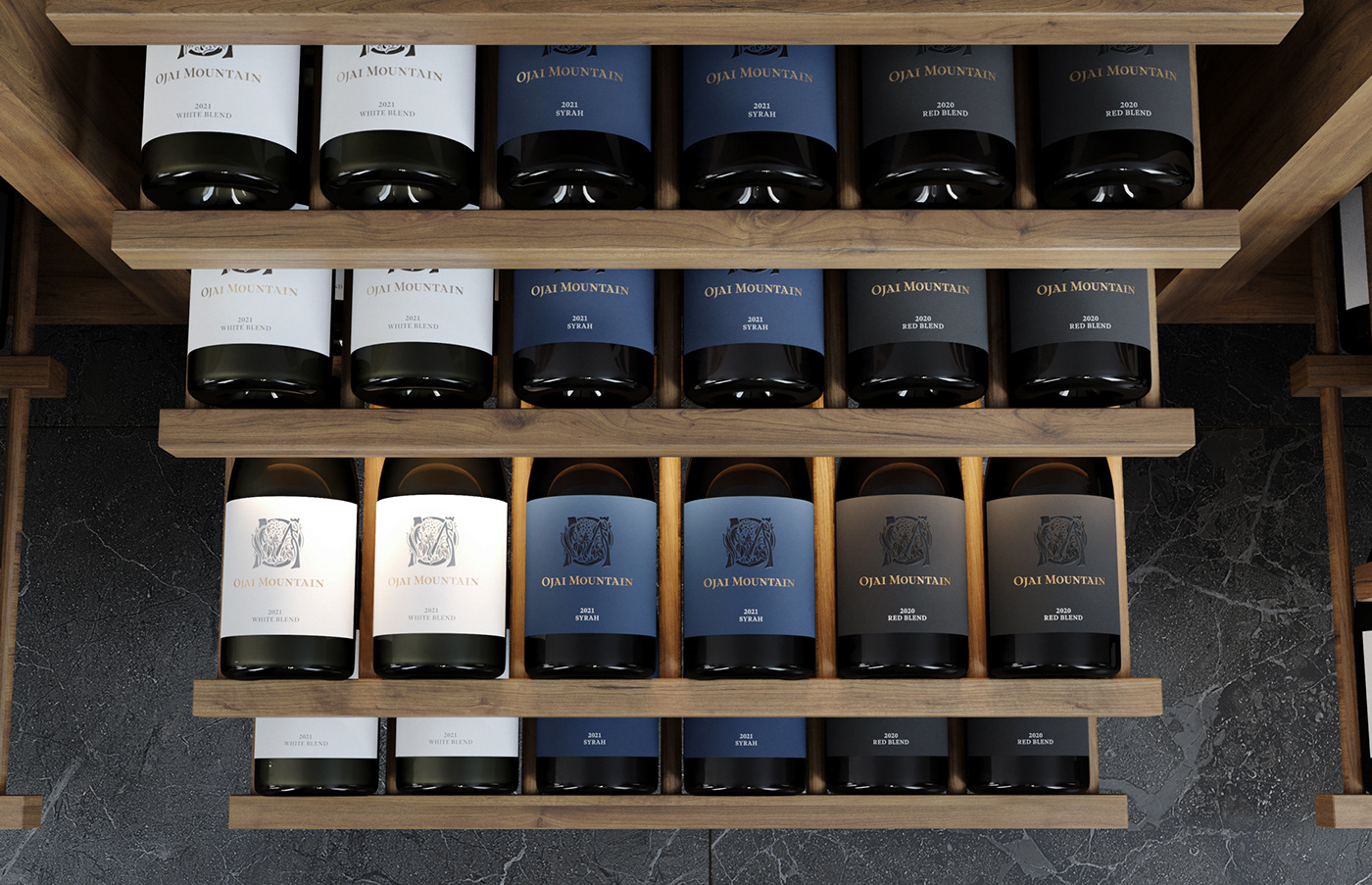
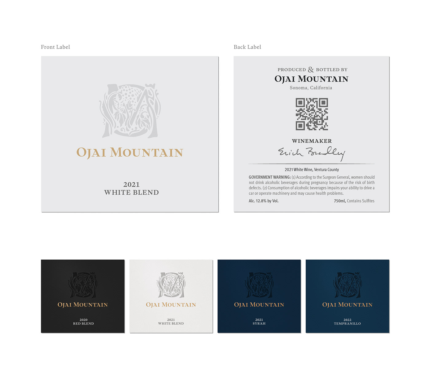
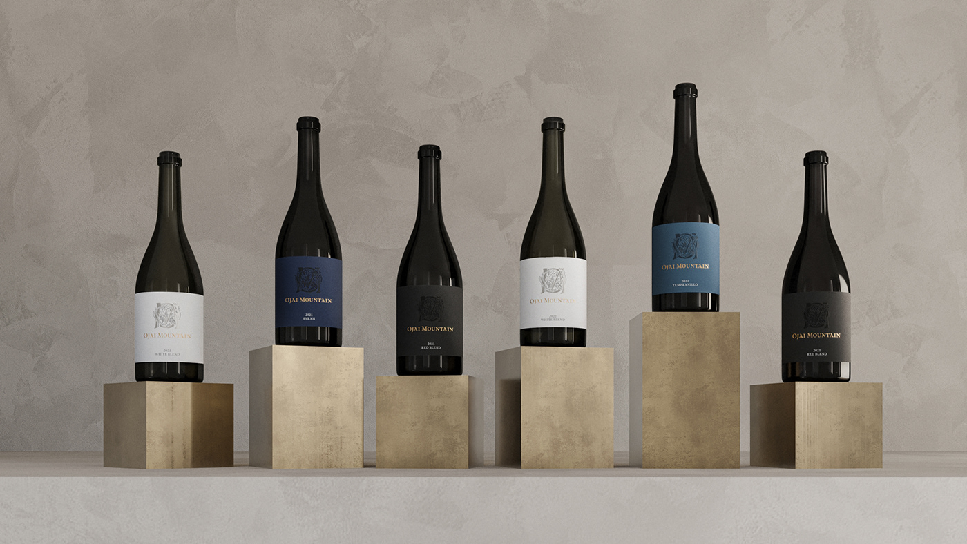
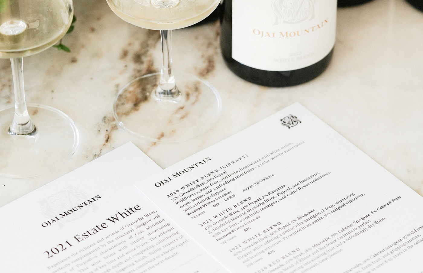
Label Design
A significant challenge in designing Ojai Mountain's wine labels was to maintain a luxurious and simple style that harmonizes with the brand's high-end image while ensuring effortless differentiation between Red, White, and Syrah vintages when displayed together in private collections and cellars.