

Magic design. Sushi Magic
Client
Sushi Magic
Services
Analytics
Design
Logotype
Task
Sushi Magic delivers rolls and other Asian dishes in Vladivostok, Artyom, Ussuriysk, and Yekaterinburg. We developed a new corporate identity and design in this project.
Design
Sushi Magic is a brand that makes every evening magically delicious. This is the idea that we reflected in the design.

Idea
The delivery market of Asian food, especially in the rolls and sushi segment, is oversaturated with standard solutions using basic references to traditional Japanese culture. But for the younger generation, Japan is no longer associated with a pagoda or samurai. It is a place of modern, bright, kawaii, and creative ideas. It was essential for us to connect the visual solution with naming, and in particular with the word “magic”.
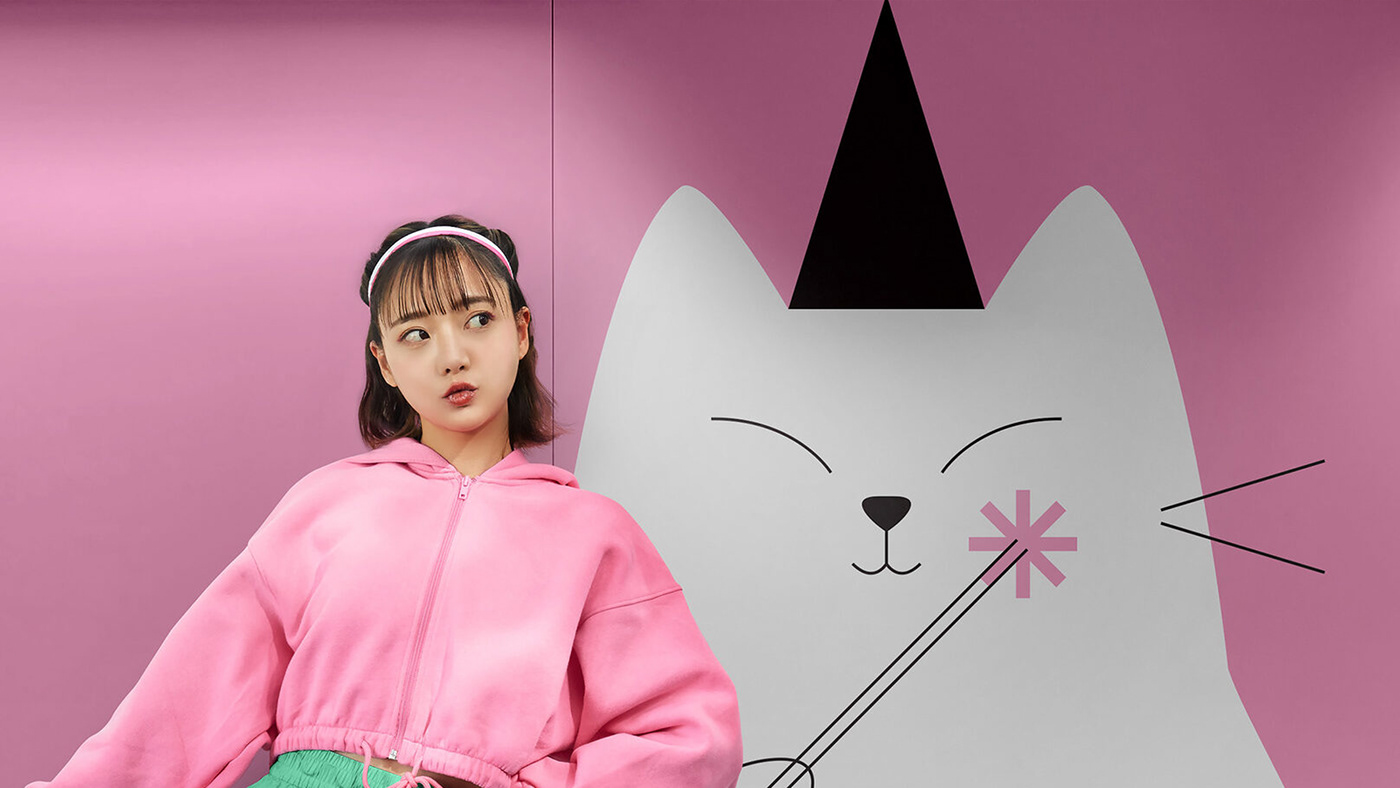
At the intersection of these tasks, we created the design inspired by the Russian meme with the wizard cat saying “Vzhukh” (“Whoosh”). This cute character is the key hero of the brand. It not only helps build more emotional communication but also reflects the idea of fast speed of delivery.

Logo
The previous logo did not reflect the idea of magic and was inconvenient for use on social networks and other media. We rethought the image. It is based on large typography. But we added new elements to the composition. The magic wands create associations with sushi sticks. This decision makes the brand more cohesive.


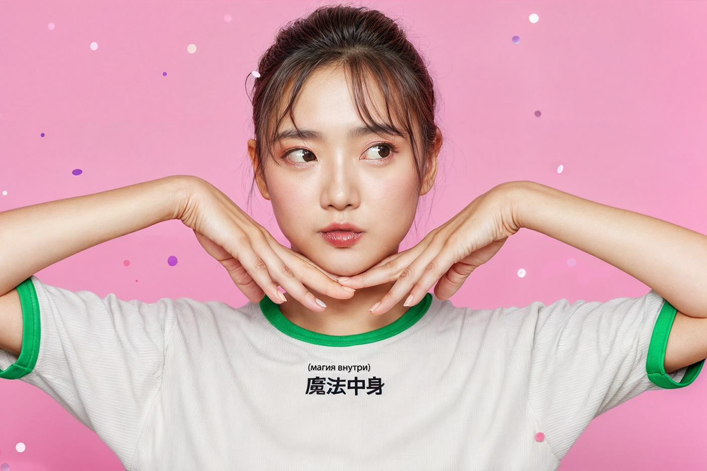
Sushi Magic is a brand that cooks magically delicious, fast, and bright food. This idea turned out to be truly kawaii. Pastel and bright colors, soft lines and shapes, and character and playful texts give the brand a sweet, emotional, and friendly character.

Illustrations
The emphasis on graphics shifts depending on the item: in image communications — the character appears in the foreground; in food communications — the forms of rolls and sushi appear.


Communications
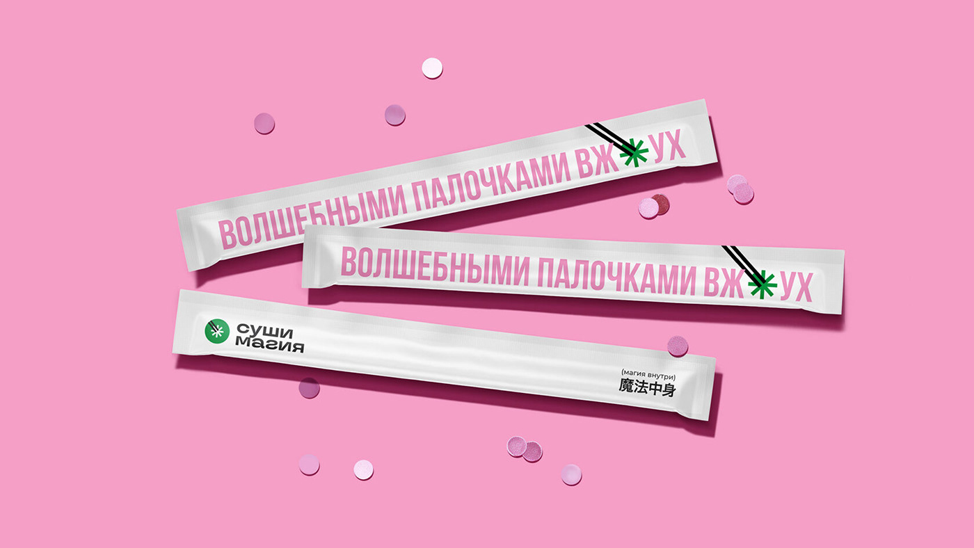
The mood of the concept develops through texts. Informal phrases reflect the brand's friendly approach. Phrases work with the idea of magic and operate in our cultural context (famous quotes and phrases from films, books, songs). The brand language is lively and authentic, with humor and slight irony.

Interior
The interior is based on design elements: hieroglyphs, illustrations, and contrasting colors. Small white tiles in a checkered pattern are used to cover the counters.


Palette
The color palette uses a combination of pink, green, and white. It looks unusually fresh and bright for this sphere of the market. On the other hand, it fully reflects the product: pink creates associations with salmon, and turquoise reminds of nori, and white — rice.
The concept is conveniently adapted to real life. The bright uniform of the couriers attracts attention, which helps to increase brand memorability.
Social network
In social networks, we presented conception in a brighter, more playful, eclectic version. This decision conveys the atmosphere of Japan with its extraordinary and sometimes crazy character.


Conception provides many frames, live photos, typography, and illustrations. Colored and white backgrounds, glitch effects, 3D models, and other techniques create a festive atmosphere.
We developed many items for the project: menus, posters, and souvenirs. Each was a logical continuation of the rules laid down in the design system.

Results
Developed a logo that reflects the brand idea.
Created a recognizable image that the environment loved.
Distinguished the brand in the market with a large margin of safety.


