2014 THE GeekFest Branding Concept:
I was thinking about the word 'amazing' and how it provides a supportive conceptual element for the visual of a 2D maze and not just a play on words. Mazes are considered difficult to solve but not for those who are smart, intelligent and sophisticated problem solvers. Mazes make us experience feelings of mystery, adventure and or design innovation in landscape engineering.
Combining the two concepts of 'amazing' and 'innovation' will target viewers but also offer the opportunity to connect collateral that relates to the concepts of treasure hunting and way finding. There was discussion about tucking the innovation concept into the text which makes sense. One of the surprises is the optical illustion effect which again hints to the visual foundation of a maze.

Logo Iterations
There was concern about the reduction limit of the maze version of the logotype. In the illustration the base percent has been reduced by 50% so the smaller version have been further reduced past the client's 25% mark.

Screen snapshot of actual size of logos displayed in the 'legibility test'.
The modular arrangement of solid parts was an original plan taken from beginning thumbnails. I think there was a subconscious need to animate THE GeekFest branding. The possibility for the creation of animated branding remains open.

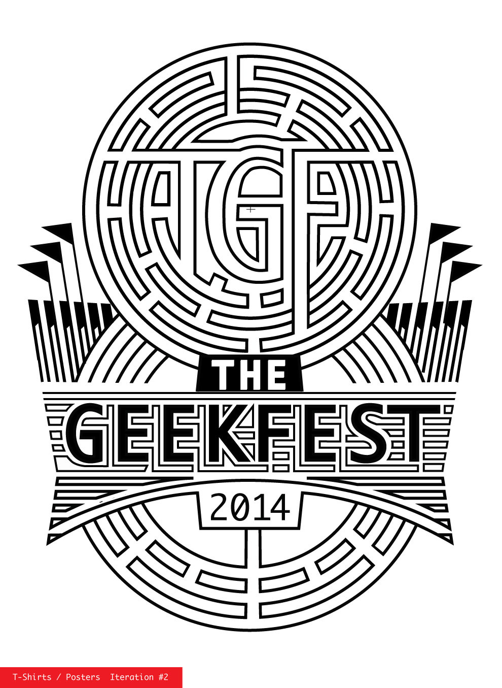
The two posters/ t-shirt iterations where created to satisfy the concern the client's desire for a clean design. The two designs offer opportunities to match better the target audiences. It will be interesting to see which design is selected as the final.

Maze logotype.


