

About Project:
Amex was looking to redesign its experience for the customer to choose the right card as per their needs. The primary goal of the project was to convert version (2.0) to (4.0) and make it responsive and also globalization and localization across the globe. The business goal was to reduce customer care calls by making it intuitive and simple.
My Role:
As a UX resource, my role was to research, provide solutions, and design screens for the app for all modules and to work on localization and accessibility required for all 22 markets.
Design Challenge:
The design challenge was to make it a local experience for 22 different markets across the globe. Localization for 22 markets required lots of research work and time and also to convert a lengthy form into easy and simple steps by keeping users engaged in the application process. Also, reduce the customer care calls for help by making it intuitive and make it a stop solution for the users.
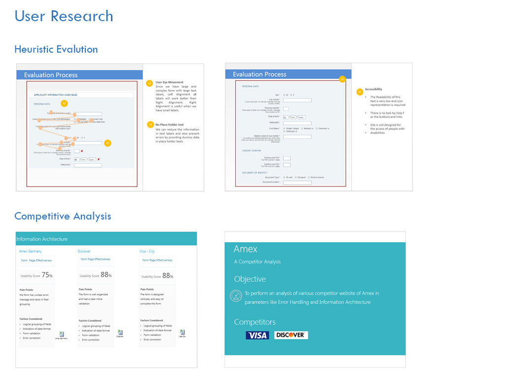
My Approach:
Analyzed the task and Conducted research on form design best practices. Performed heuristic evaluation for the client’s old application to know the pain points and completed competitive analysis for different markets. Based on that, they generated contextual grouping and task flow. And created wireframes. Then, I performed usability testing on a new design. Based on findings, made the iterations.
Hypothesis:
- Simple and intuitive for the users to complete the card selection process
- Design one application to complete the entire process without making calls to customer care
- Make it less tedious by dividing the whole process into 5 easy steps
- Recognition rather than recall approach to reduce the cognitive load
- Tooltips and specific error messages to make the process fast and easyI'd be happy to help you! Below is the revised text with corrections:
About the Project:
Amex wanted to revamp its customer experience for card selection. The main objective was to upgrade the app from version 2.0 to 4.0, make it responsive, and enable localization for 22 markets worldwide. The business goal was to reduce customer care calls by simplifying the application process and making it more user-friendly.
My Role:
As a UX professional, my responsibility was to conduct research, propose solutions, and design app screens for all modules. My work also included localization and accessibility for all 22 markets.
Design Challenge:
The challenge was to create a localized experience for 22 different markets, which involved a lot of research and time. The task was to convert a lengthy form into easy and simple steps that would keep users engaged. The aim was to reduce customer care calls by making the application process intuitive and a one-stop solution for users.
My Approach:
I analyzed the task, researched form design best practices, evaluated the client's old application for pain points, and conducted competitive analysis for different markets. Based on that, I generated contextual grouping and task flow and created wireframes. I then performed usability testing on the new design and made iterations based on the findings.
Hypothesis:
- The card selection process should be simple and intuitive for users.
- The app should be a one-stop solution for the entire process, without requiring calls to customer care.
- Dividing the process into five easy steps would make it less tedious.
- A recognition-based approach, rather than recall, would reduce cognitive load.
- Tooltips and specific error messages would make the process faster and easier.

Pain Points:
- The previous application consisted of a lengthy form that made it difficult for users to focus on the task at hand.
- The form fields were not properly grouped.
- The application did not adhere to accessibility guidelines.
- Different markets had different designs, causing inconsistency.
- Complex form fields increased customer care calls.
- Users were required to switch between different applications for certain fields, resulting in lower conversion rates.
- The application lacked helpful cues and error messages were generic.
-There was no indication of task progress on the application.


