Same but different
Our task was to rebrand Bagatelka® - an iconic product of the Kopernik Confectionery Factory. We had to refresh the brand image so as not to lose old customers and acquire new ones.
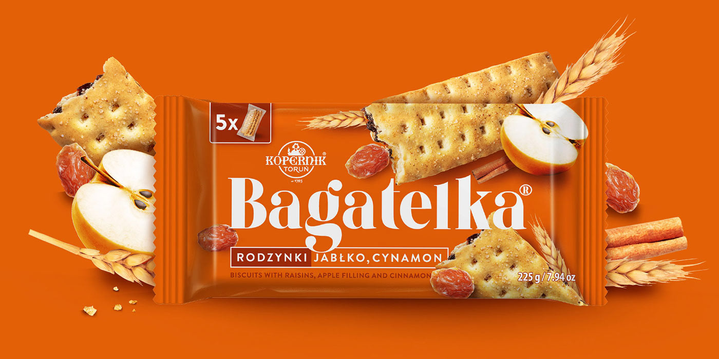
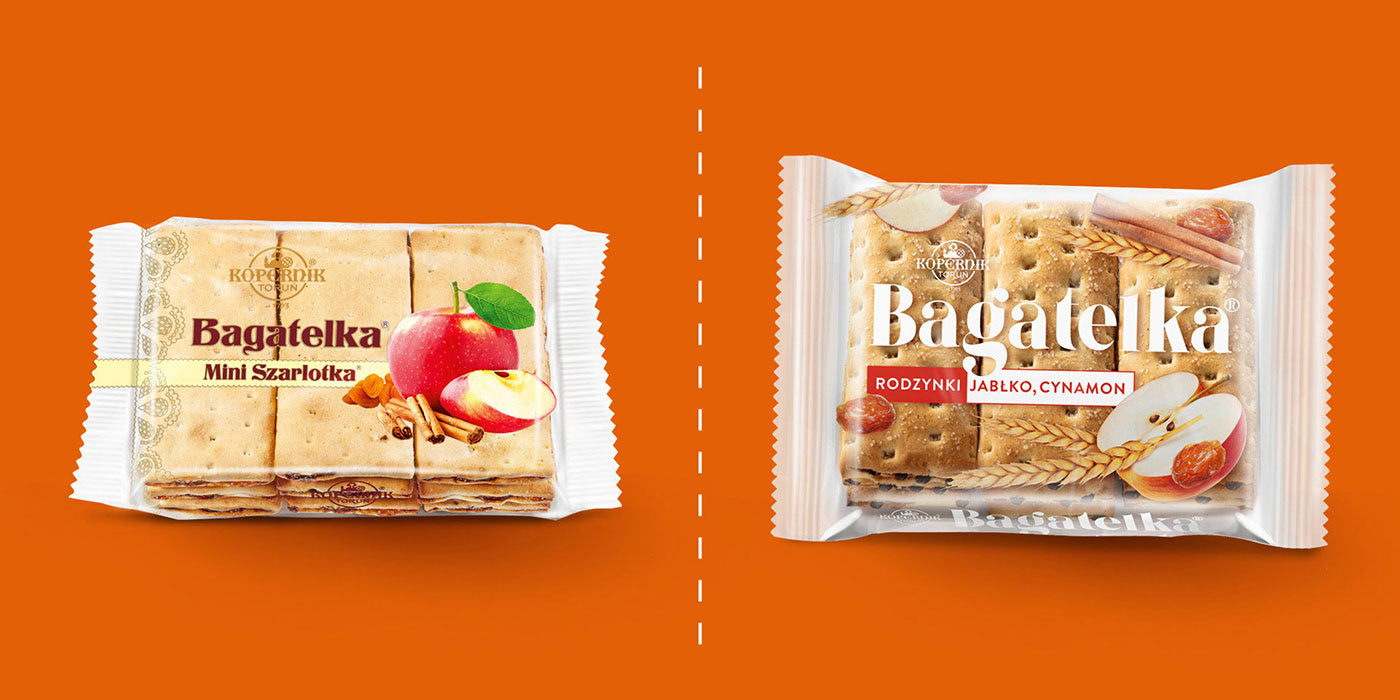
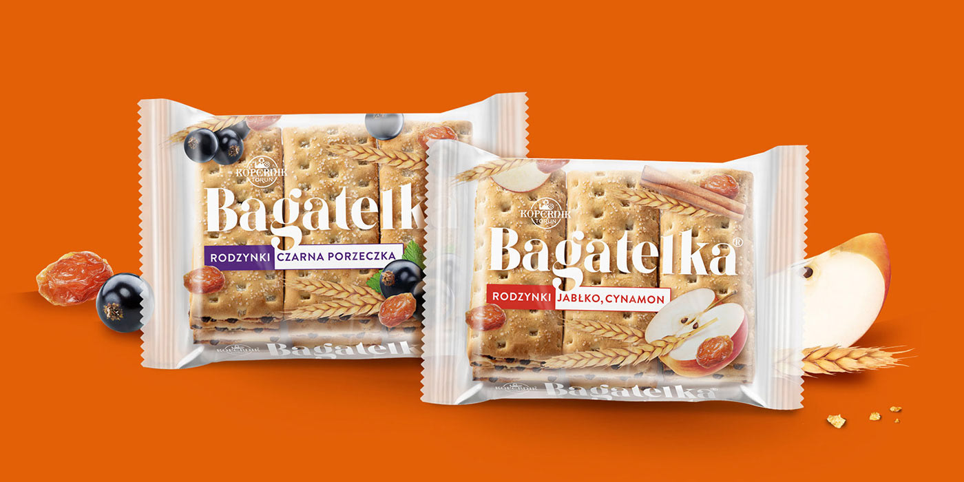
The first stage was to change the brand itself. Its character had to refer to the old one, although in a modernized form. We designed it in a similar style, in a slightly more delicate form with decorative, visible serifs.

The next step was to redesign the existing packaging without changing its basic elements. We have introduced changes that improve readability and clearly communicate the flavors and composition of the product. To accentuate them, we used strong, impactful colors and also kept the transparent foil to make the product itself visible.
Then we designed convenience packaging - small packages that hold 3 cookies. In turn, 5 such portions were placed in one collective package - a portion for each day of the week.

5x3 packaging maintains the look and feel of the product and shows all its features. We have moved away from the classic presentation of demo cookies in the central part of the package - this makes the package stand out from competing cookies.

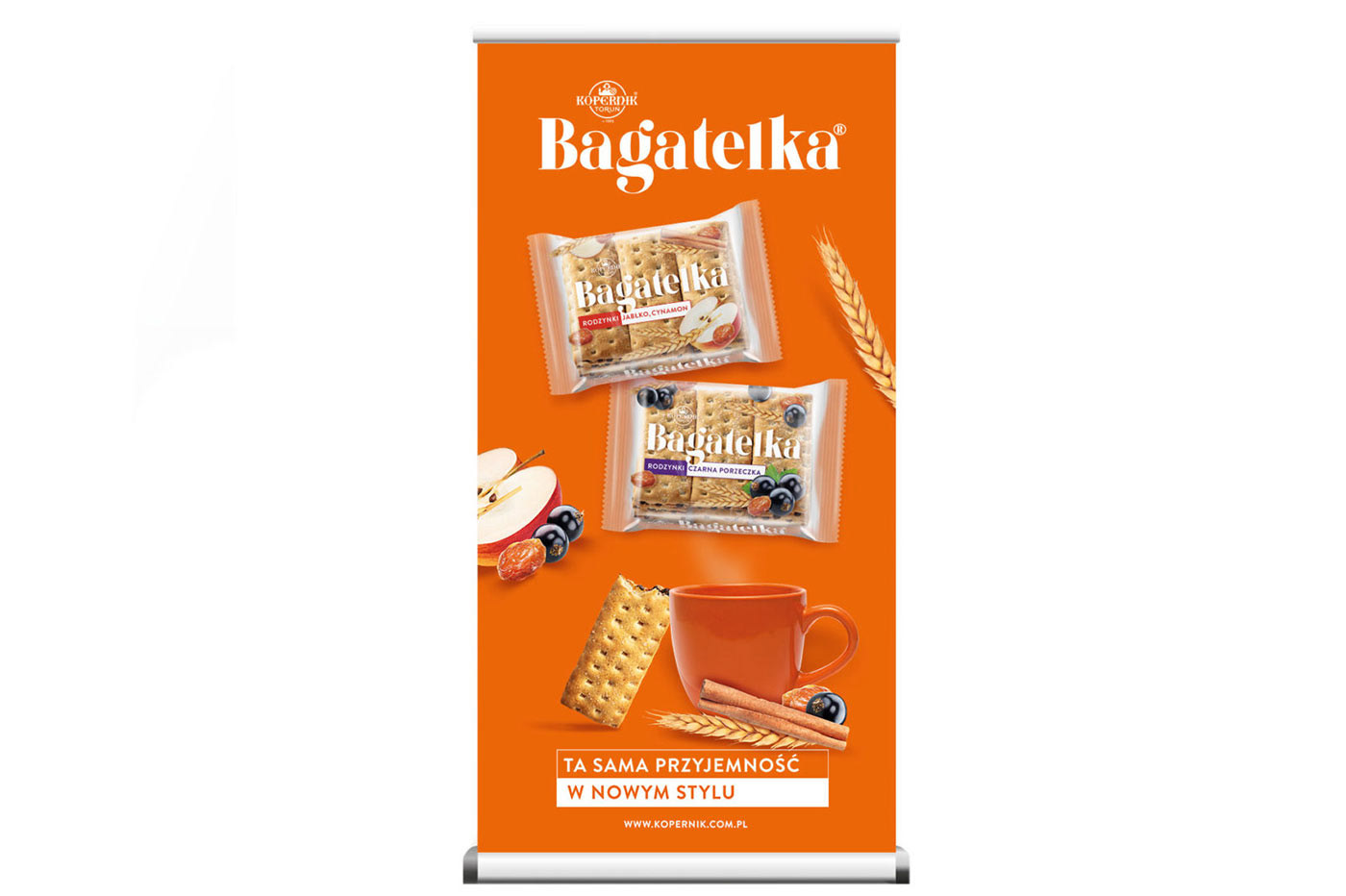
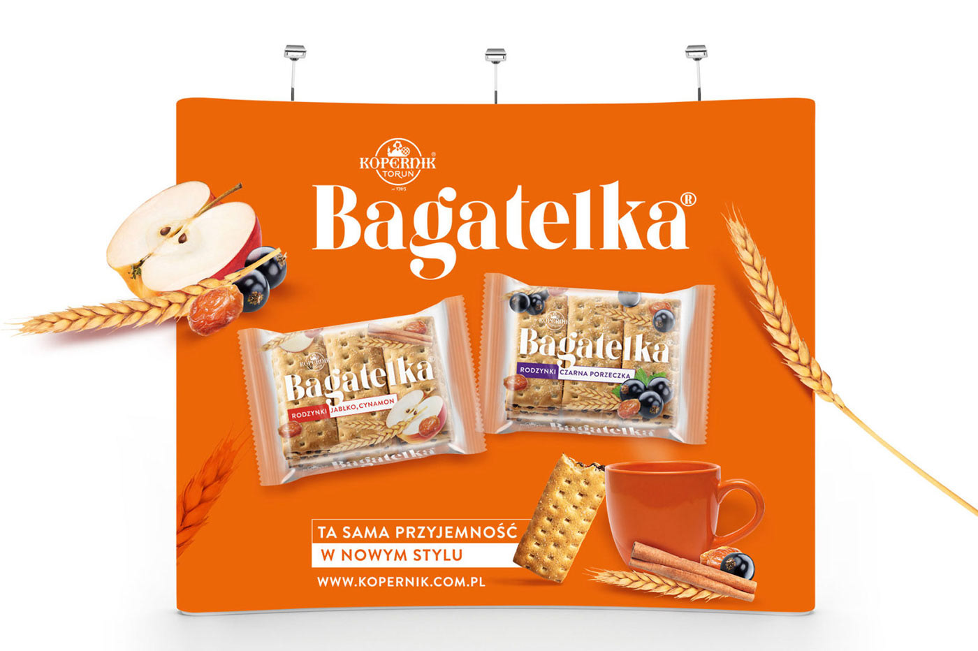
Designing the KV and developing the message introduced a new design of the old packaging to the market and promoted a new version of the product. We used legible and clear messages combined with simple graphic solutions. We have developed two KVs: showing Bagatelka® in a new edition and presenting a new 5x3 collective packaging.
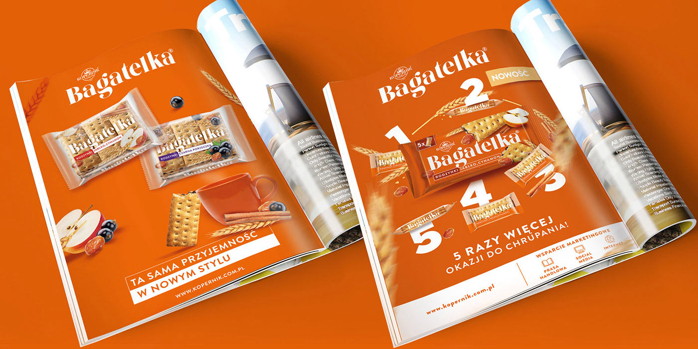
Additional materials include advertising posters, press advertisements, theater plays and POS materials. They are particularly distinguished by their colors, which definitely attract attention and do not leave you indifferent.