


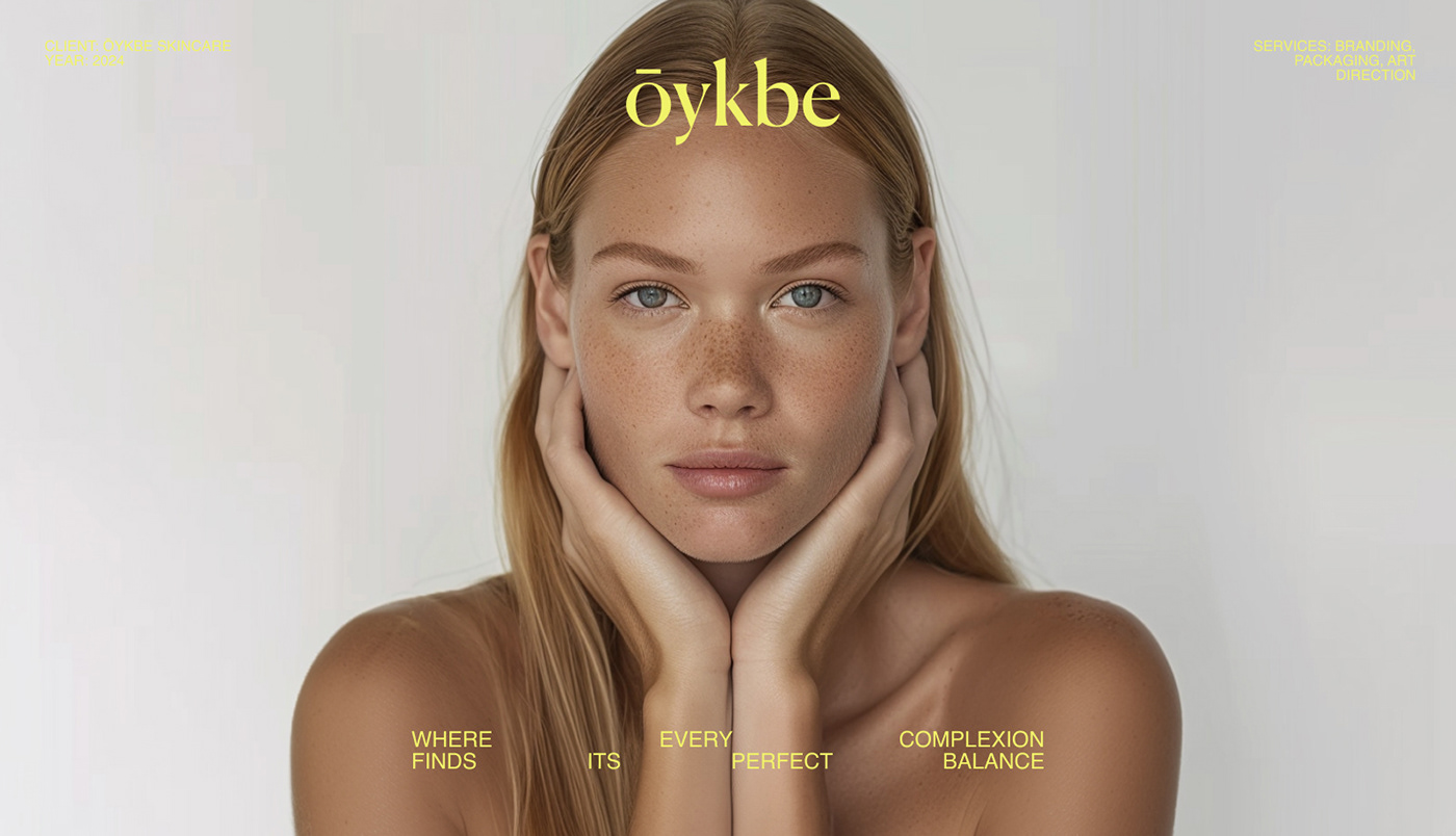
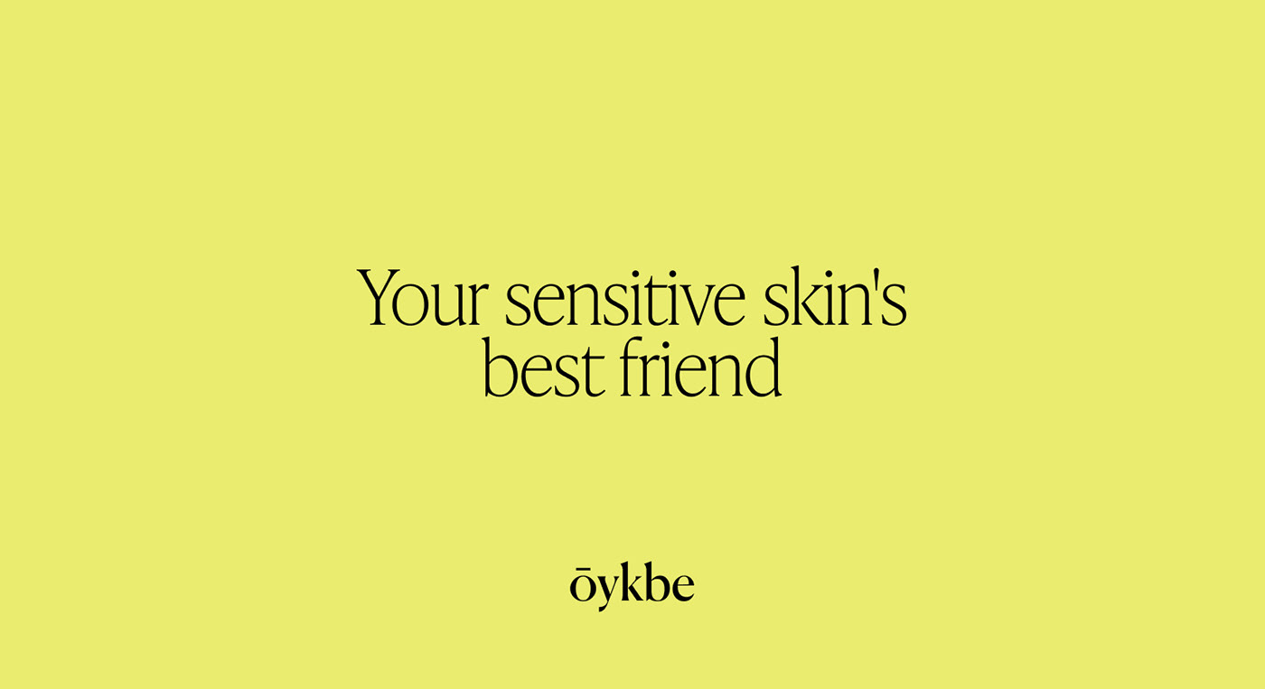
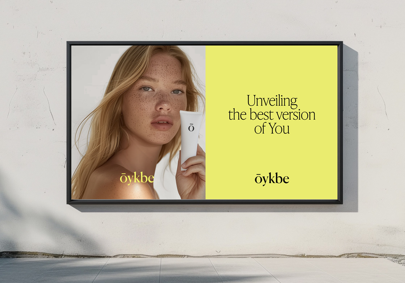
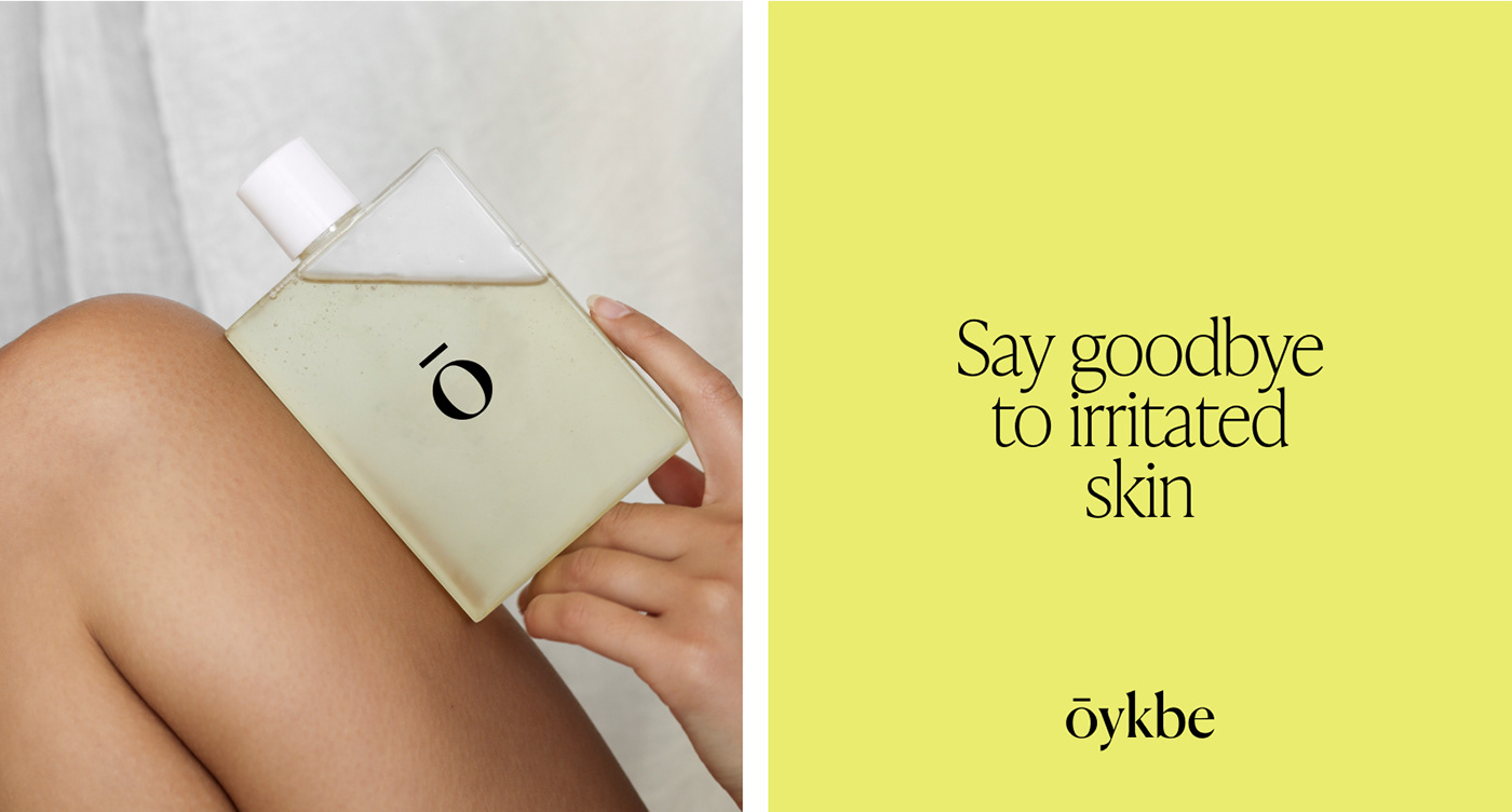
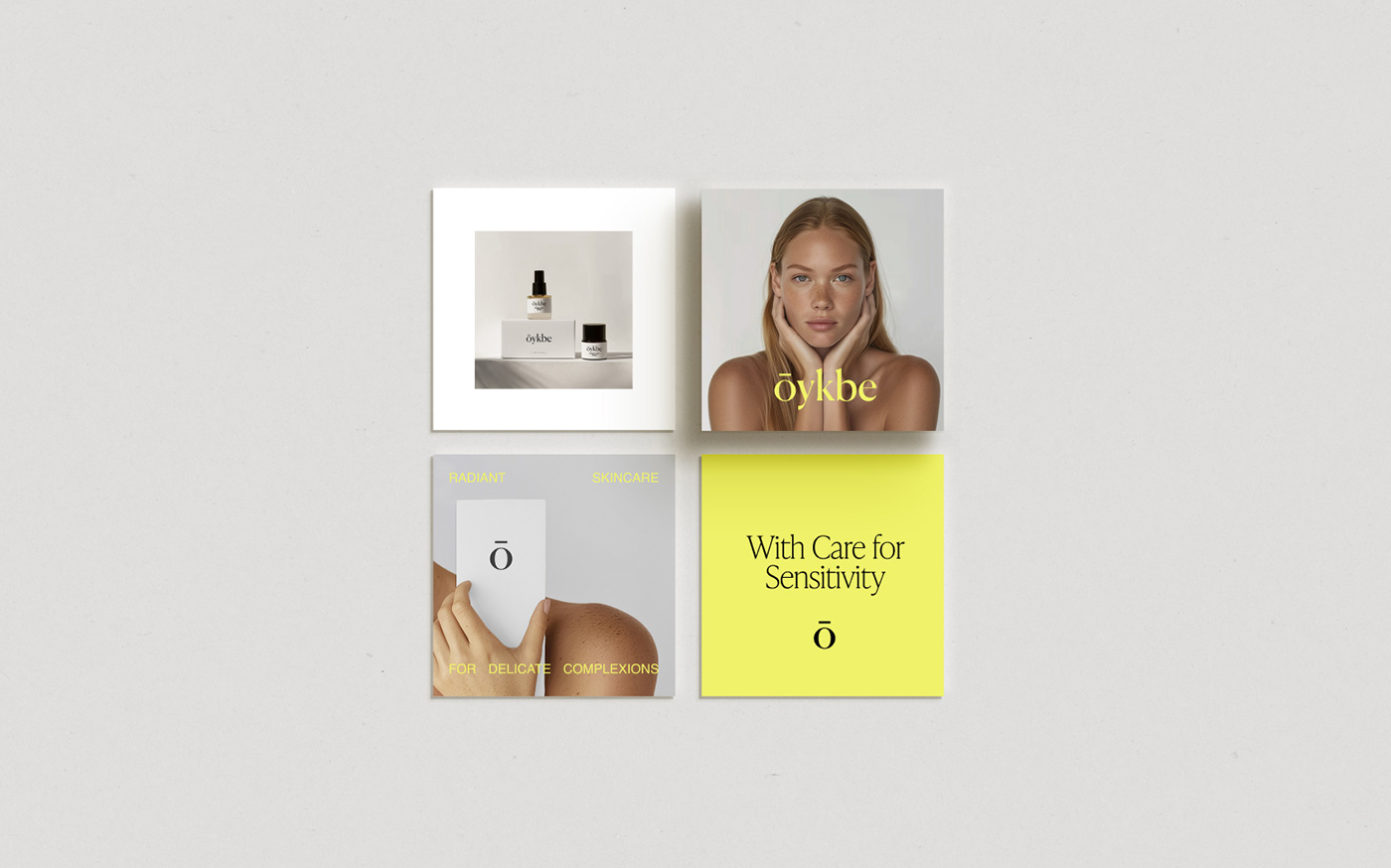
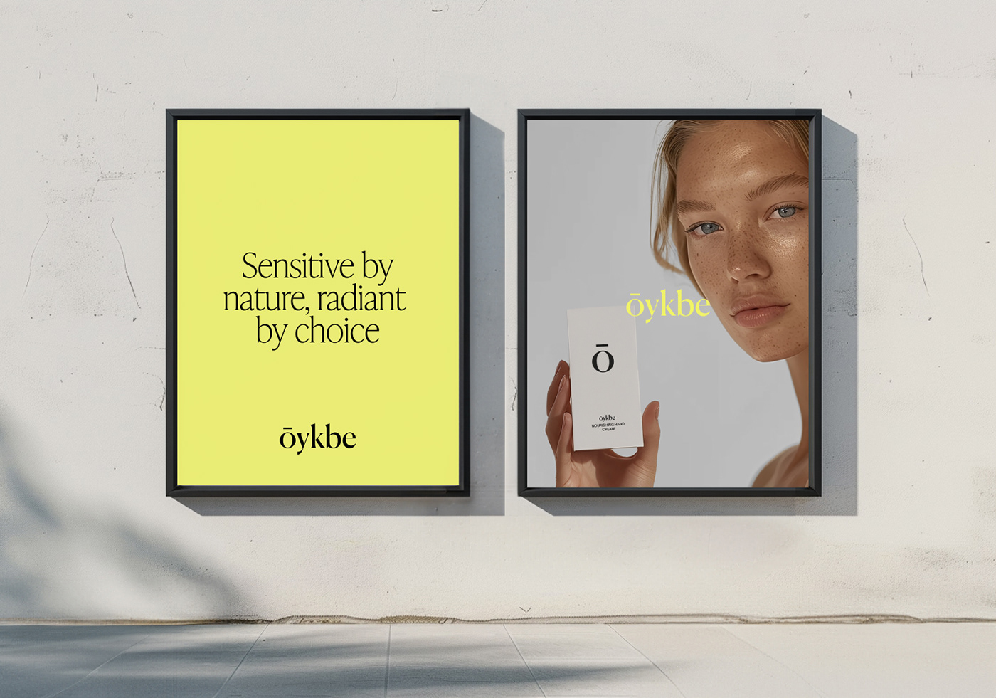

Ōykbe skincare specializes in crafting solutions tailored to the unique needs of sensitive skin. Dedicated to providing gentle yet effective skincare products, the brand aims to soothe irritation and reveal the skin's natural radiance. With a commitment to care and balance, Ōykbe invites individuals to embrace their sensitivity and uncover their best selves.
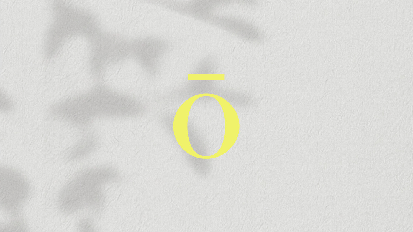
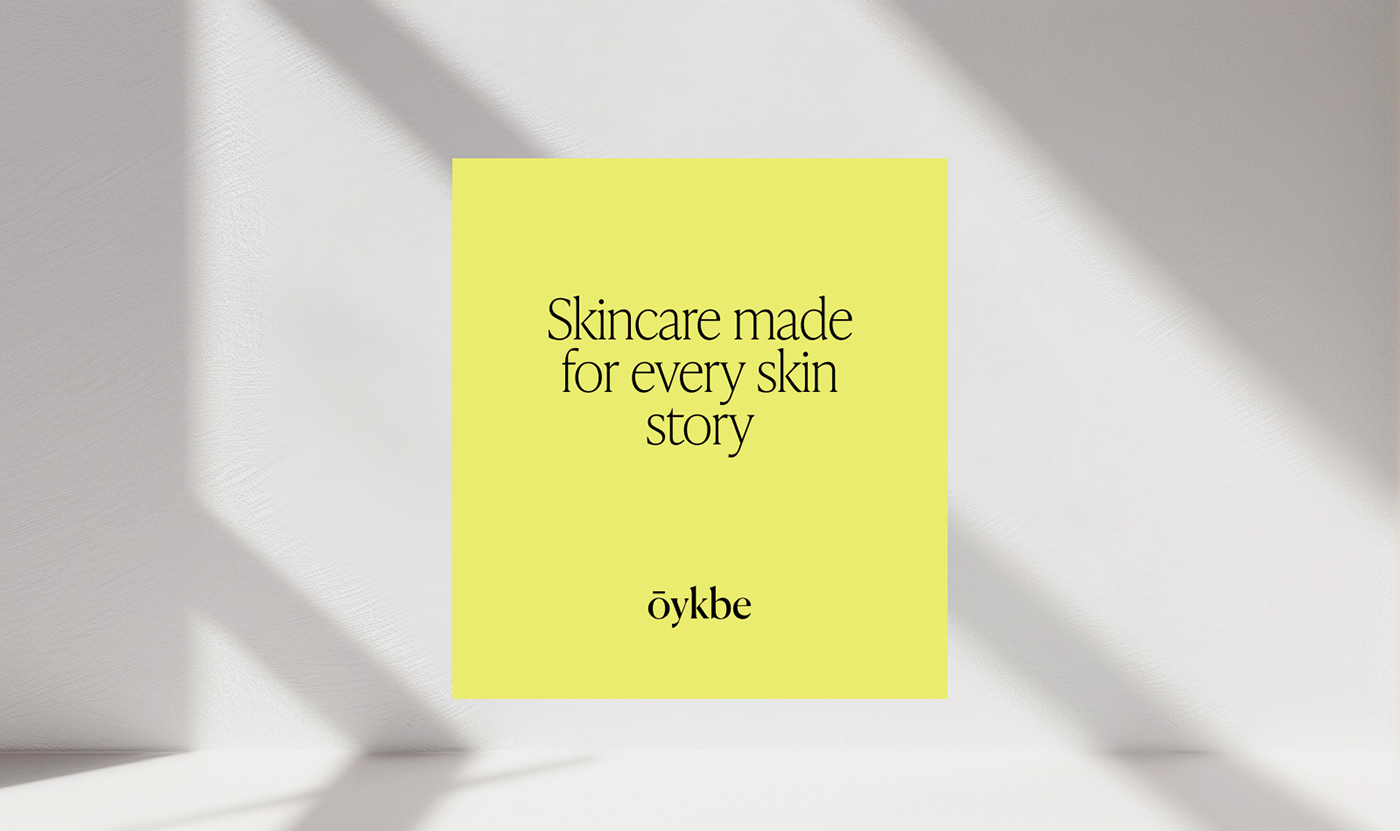
We created a modern, typographic logo design for Ōykbe, as well as full branding: a typographic system and bold color palette. Symbolizing vitality and energy, the vibrant yellow color evokes a sense of radiance and rejuvenation, aligning with the brand's mission to reveal the natural beauty of sensitive skin.
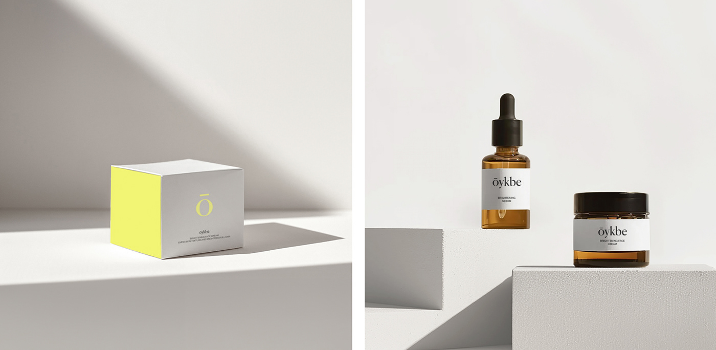
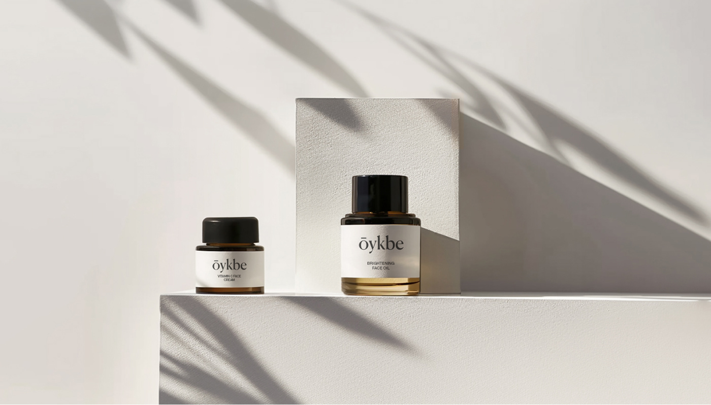
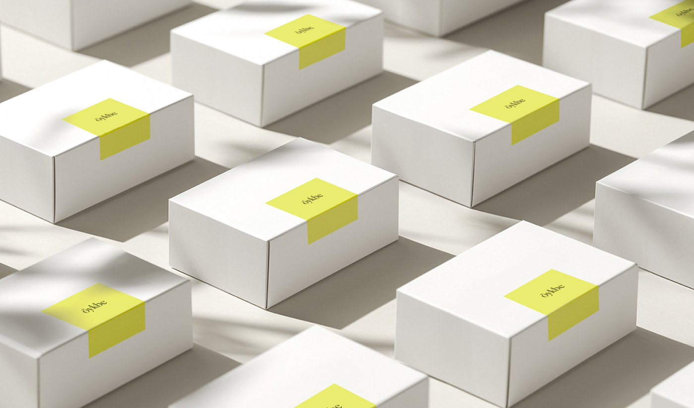
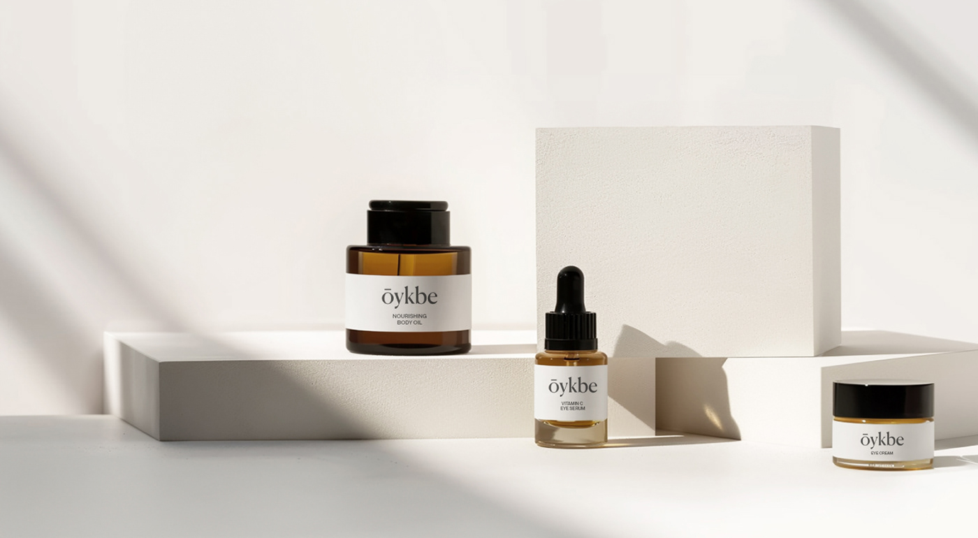
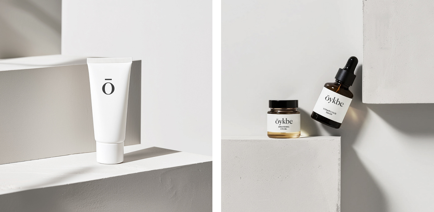
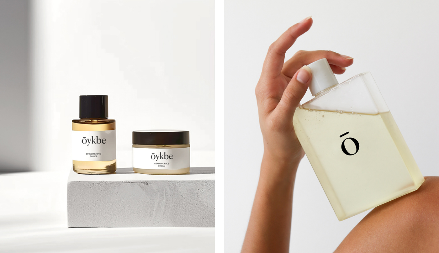
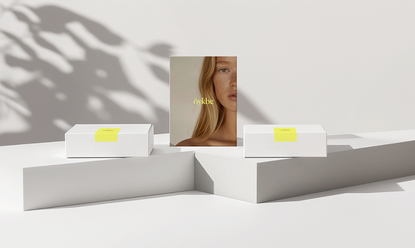
The labels and cosmetic boxes are clean and simple, mostly white with black text, showcasing the brand's dedication to purity. Each box has a subtle touch of luxury with the letter "ō" highlighted, making it instantly recognizable. For the unboxing experience, we designed a bright white box sealed with a cheerful yellow sticker featuring the logo, along with a simple thank-you card. We made sure every detail, from the paper bags to the social media posts, reflects the brand's commitment to making you feel pampered and cared for.
Follow us @


