Логотип | Нейминг | Фирменный стиль
Дизайн: Ирина Терских Связаться: Telegram
«RENÉ» – бренд украшений ручной работы. Нейминг происходит от имени мастера украшений и коррелирует с философией бренда. Имя René – один из вариантов имени Ирина, с латинского (Renatus) в значении «заново рожденный".
«RENÉ» воплощает в себе индивидуальность и уникальность, где каждое изделие рождается заново для каждого клиента, символизируя новое начало и личную связь. Целевая аудитория бренда – решительные, уверенные в себе и энергичные женщины, которые ценят стиль, качество и индивидуальность.
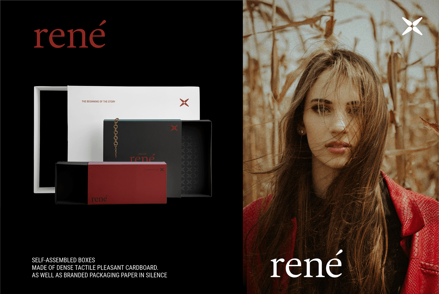
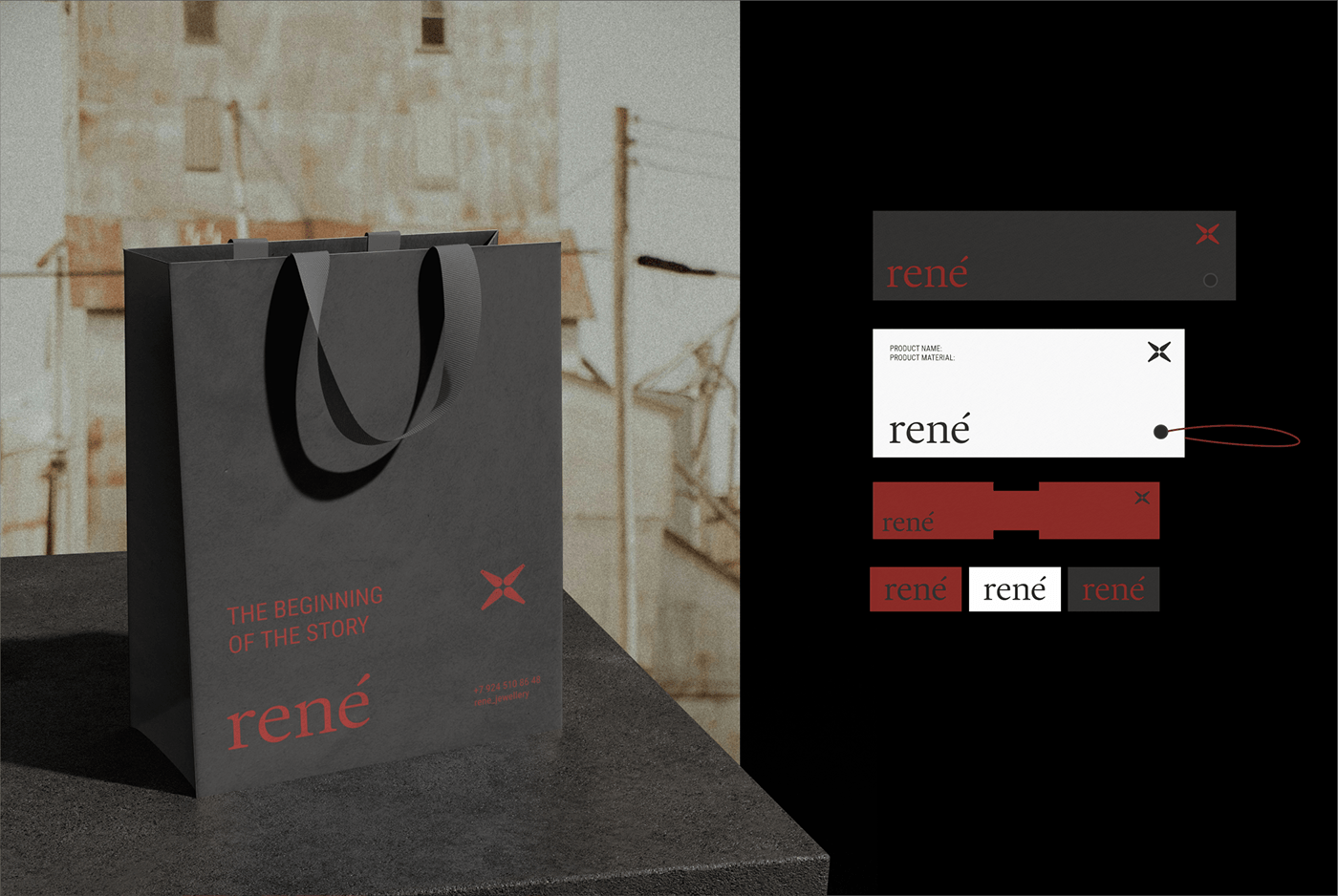
Метафора концепции – «исходная единица», начало отсчета. То, с чего все начинается – новое украшение и новая история этого украшения в руках владельца. Единица (1) интегрирована в логотип, дополнительным графическим элементом является символ импульса, как знак энергии и действия. Структура верстки предполагает размещение логотипа в углу макета, позволяя самим украшениям занимать центральное место и говорить об индивидуальности каждого владельца. Фирменный стиль бренда продолжается в цветовой палитре, где белый символизирует начало, чистый лист, красный – энергию, мотивирует к действиям и привлекает внимание, черный – глубина и эстетика.
Метафора концепции – «исходная единица», начало отсчета. То, с чего все начинается – новое украшение и новая история этого украшения в руках владельца. Единица (1) интегрирована в логотип, дополнительным графическим элементом является символ импульса, как знак энергии и действия. Структура верстки предполагает размещение логотипа в углу макета, позволяя самим украшениям занимать центральное место и говорить об индивидуальности каждого владельца. Фирменный стиль бренда продолжается в цветовой палитре, где белый символизирует начало, чистый лист, красный – энергию, мотивирует к действиям и привлекает внимание, черный – глубина и эстетика.
---
RENÉ is a brand of handmade jewelry. Naming comes from the name of the jewelry master and correlates with the philosophy of the brand. The name René is one of the variants of the name Irina, from Latin (Renatus) meaning "reborn". RENÉ embodies individuality and uniqueness, where each product is born anew for each customer, symbolizing a new beginning and a personal connection. The target audience of the brand is determined, self–confident and energetic women who value style, quality and individuality.
The metaphor of the concept is the "initial unit", the beginning of the countdown. What it all starts with is a new piece of jewelry and a new story of this jewelry in the hands of the owner. The unit (1) is integrated into the logo, an additional graphic element is the symbol of momentum, as a sign of energy and action. The layout structure involves placing the logo in the corner of the layout, allowing the decorations themselves to take center stage and speak about the individuality of each owner. The brand's corporate identity continues in the color palette, where white symbolizes the beginning, a clean sheet, red – energy, motivates action and attracts attention, black – depth and aesthetics.