

Toplica is a carpentry installation company on the French Riviera with 30 years of experience. They are craftsmen with great precision and attention to detail, installing all types of closures "door, shutter, window, blind..." To better communicate and stay up-to-date, they needed a visual identity that reflects them.

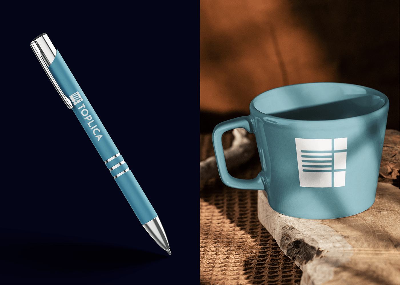
After creating a brief, I really wanted to reflect the profession while remaining modern. I designed a rather minimalist logo so that it could be placed on any type of medium. It reflects the areas of expertise in a rather discreet way; it was challenging to match a door, a blind, and a shutter while keeping it simple. What a victory!


For the typography, I wanted to stay with something featuring sharp edges to match the square shape of the logo. For the colors, I leaned towards blue because I understood they liked to highlight their French Riviera side but also their reliability, showing that one can trust in their expertise. I complemented it with blue colors that complete the palette and offer more options, and a gray that adds a touch of professionalism and lightens these dark shades.
Here are some words from Toplica:
"I had the pleasure of working with Enzo for the creation of my company's graphic charter, and I highly recommend him for his exceptional professionalism and creativity. From the beginning, Enzo was attentive to our needs and ideas, while bringing his expertise and innovative suggestions to bring our vision to life.
The collaboration process was smooth and efficient, marked by clear and regular communication. Enzo showed great adaptability, responding to our requests for changes quickly and with a special attention to detail. The final result exceeded our expectations, giving our company a visual identity that is both modern and perfectly aligned with our values."


