Client: A coffee shop, warm place with a retro twist, where one can rest with a cup of a delicious coffee.
Umbra (umber) is a natural brown earth pigment, similar to the color of coffee.
My client needed a visual identity for the brand.
Project: Inspired by Pantone samples I have created a logo focused on the umbra color and combined
a letter U with a shape of a cup.
Type it is a combo of Brittanic - which gives a retro feeling, and a simple sans Acumin for the balance.
For packaging design, I have created a pattern made of elements from logo. There is a pop of yellow, white and shades of brown - all to evoke warmth of the place and with a retro touch.
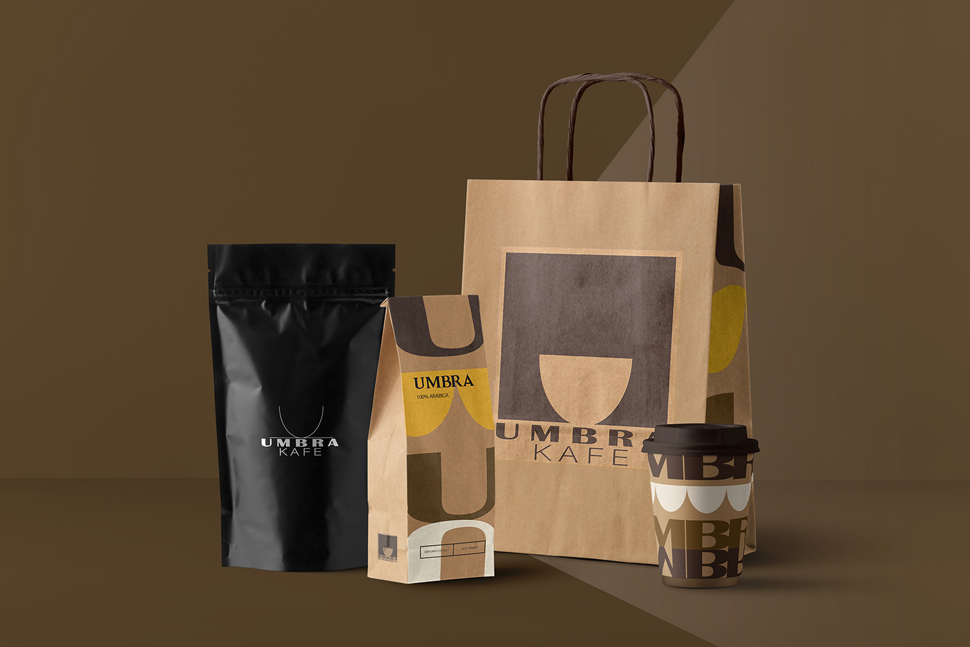