WALKING ANTS
Urban Content Brand
BX / Graphic Design
Walking Ants is a brand specializing in urban content,
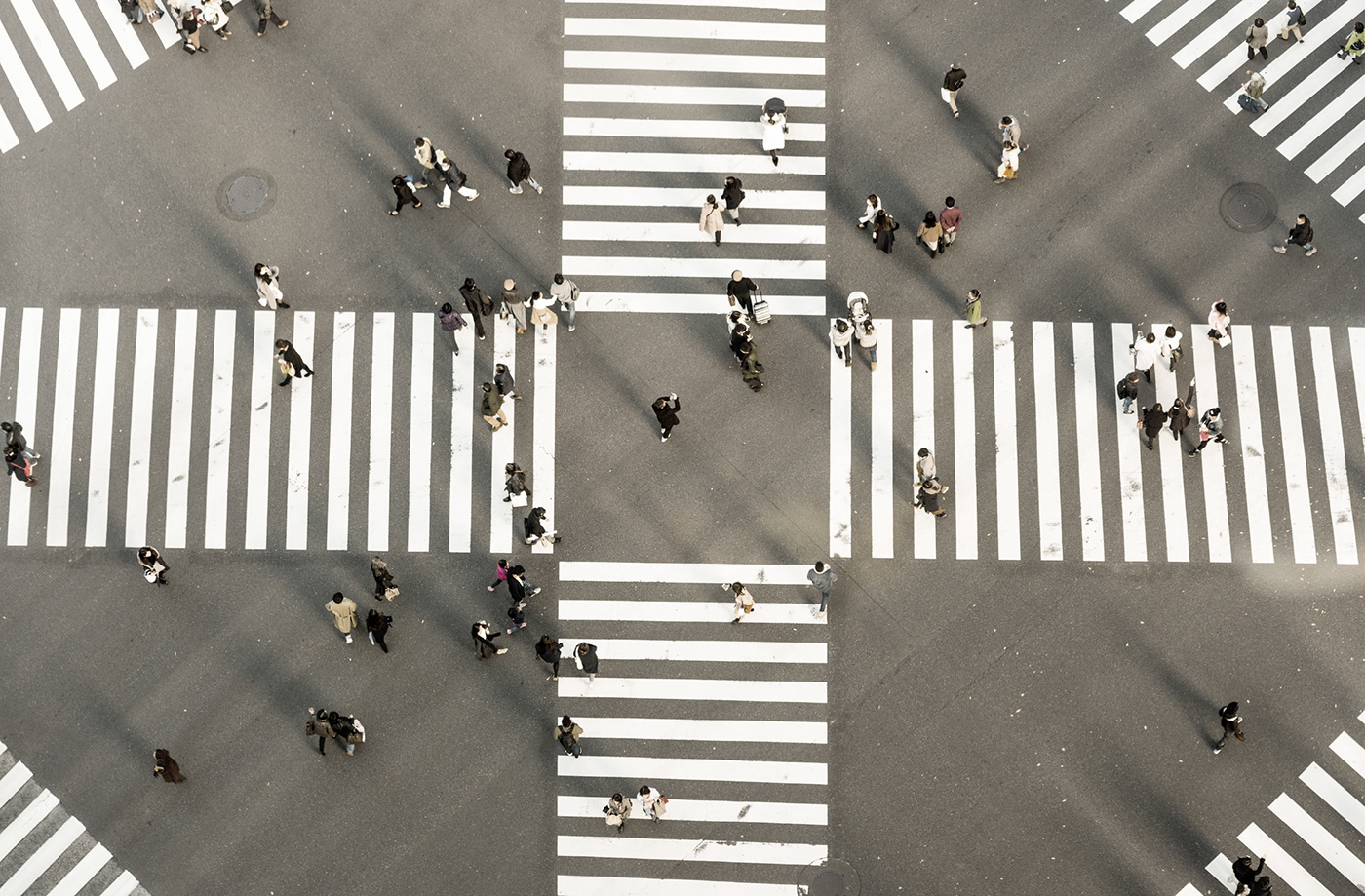
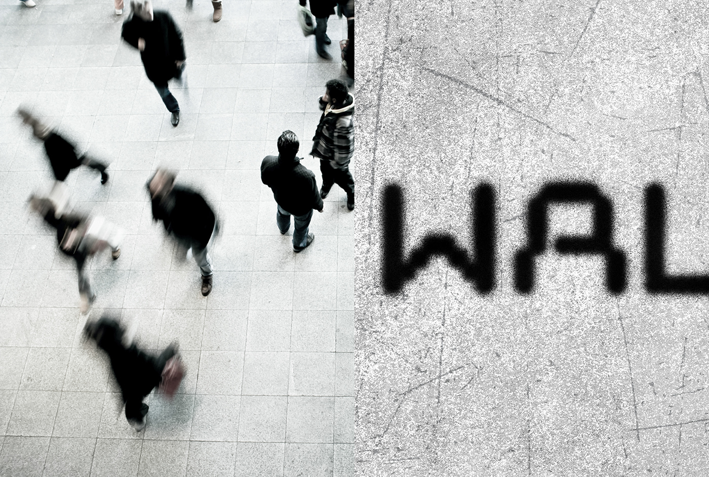
remembering that people are small beings from a distance, and it means that we are like little ants.
It aims to develop diverse urban content and bring diversity and vitality to the city with local residents.
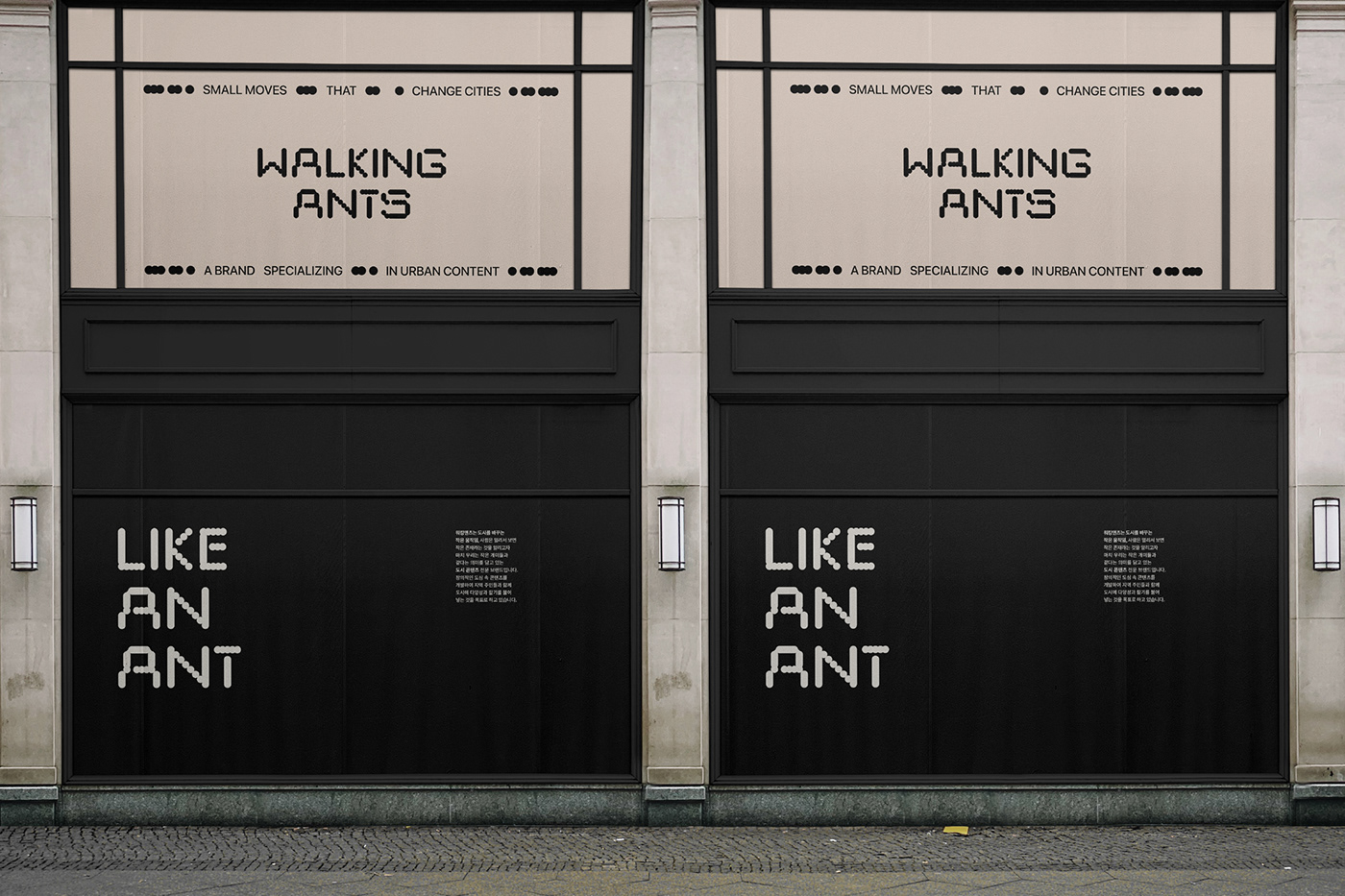
This project was carried out with the concept of "small movements that change cities, people are small beings from a distance" in the concept of people in the city being like small ants.
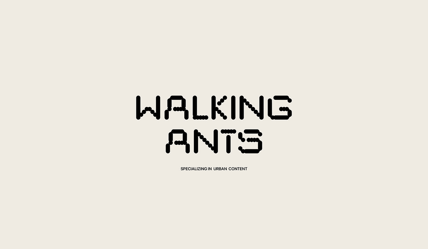
The logo expresses the feeling of ants lining up in a wordmark shape in which a circle is repeated.
Graphics also sought to show consistent brand identity by utilizing the shape of the recurring circle
taken from typo as the main.
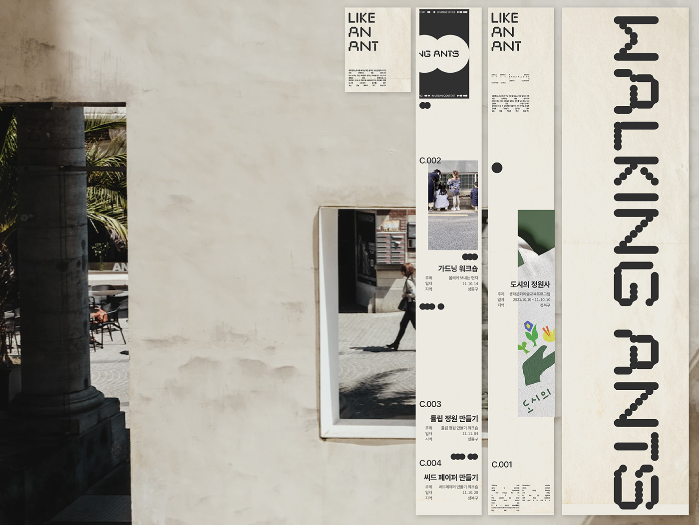
In addition, in the color part, we tried to show a soft and luxurious mood by setting it in green,
brown, and black colors in pastel tones, respectively, symbolizing natural land, grass, and ants.
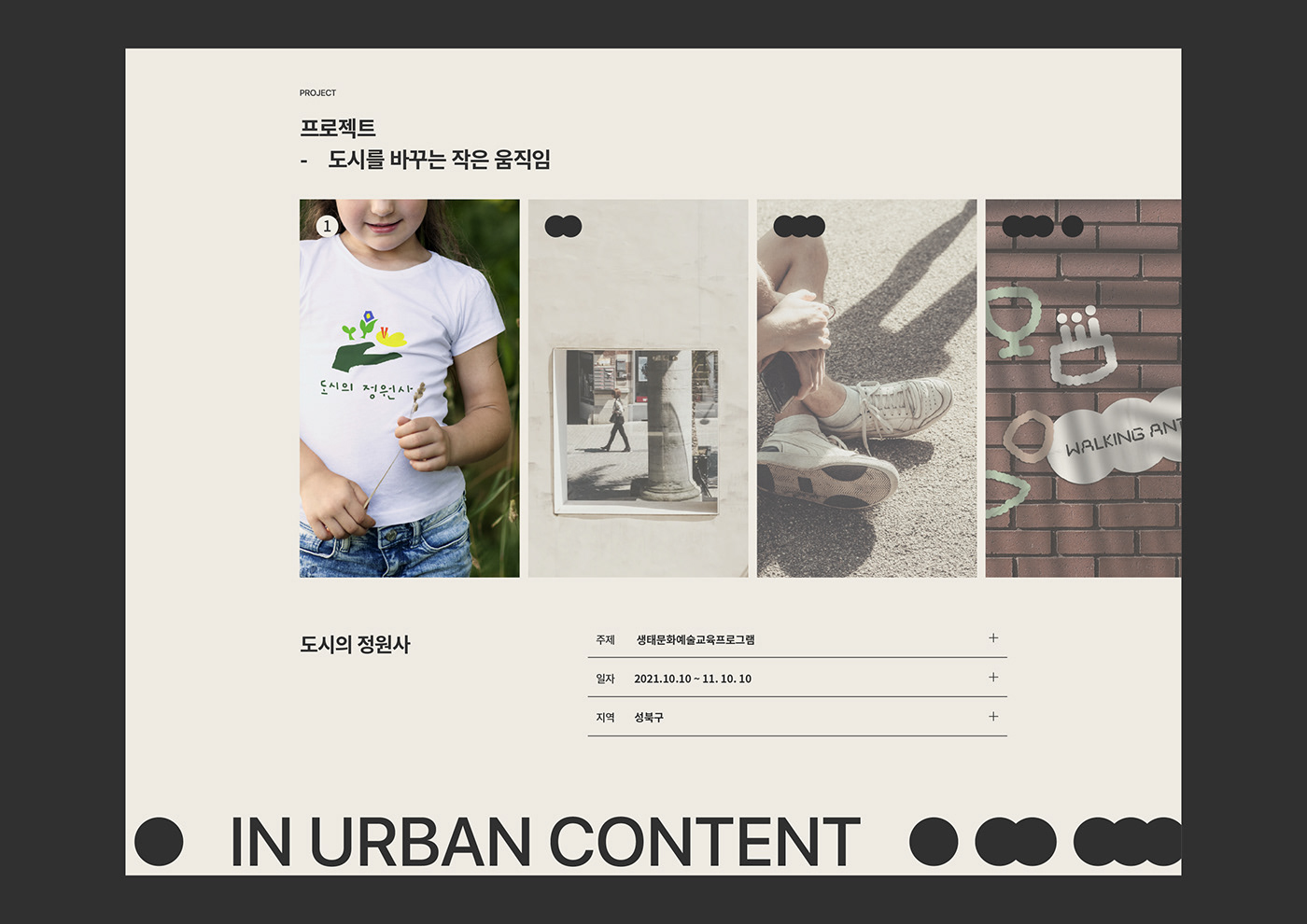
워킹앤츠는 도시 콘텐츠 전문 브랜드로서 브랜드명에서 도시를 바꾸는 작은 움직임, 사람은 멀리서 보면
작은 존재라는 것을 보여주며 마치 우리는 작은 개미들과 같다는 의미를 담고 있습니다.
또한 다양한 도심 속 콘텐츠를 개발하여 지역 주민들과 함께 도시에 다양성과 활기를 불어넣는 것을 목표로 합니다.
워킹앤츠가 담고 있는 ‘도시를 바꾸는 작은 움직임, 사람은 멀리서 보면 작은 존재’라는 뜻을
도심 속 사람들이 마치 작은 ‘개미’ 와 같다는 컨셉으로 진행한 프로젝트입니다.
로고는 개미들이 줄지어가는 느낌을 원이 반복되는 워드마크형으로 풀어냈습니다.
그래픽 또한 타이포에서 가져온 반복되는 원의 형태를 메인으로 활용하여
일관된 브랜드 아이덴티티를 보여주고자 했습니다.
또한 컬러적인 부분에서는 각각 자연의 땅과 풀, 그리고 개미를 상징하는
파스텔톤의 그린, 브라운, 블랙 컬러로 설정하여 부드러우면서도 고급스러운 무드를 보여주고자 하였습니다.