About project
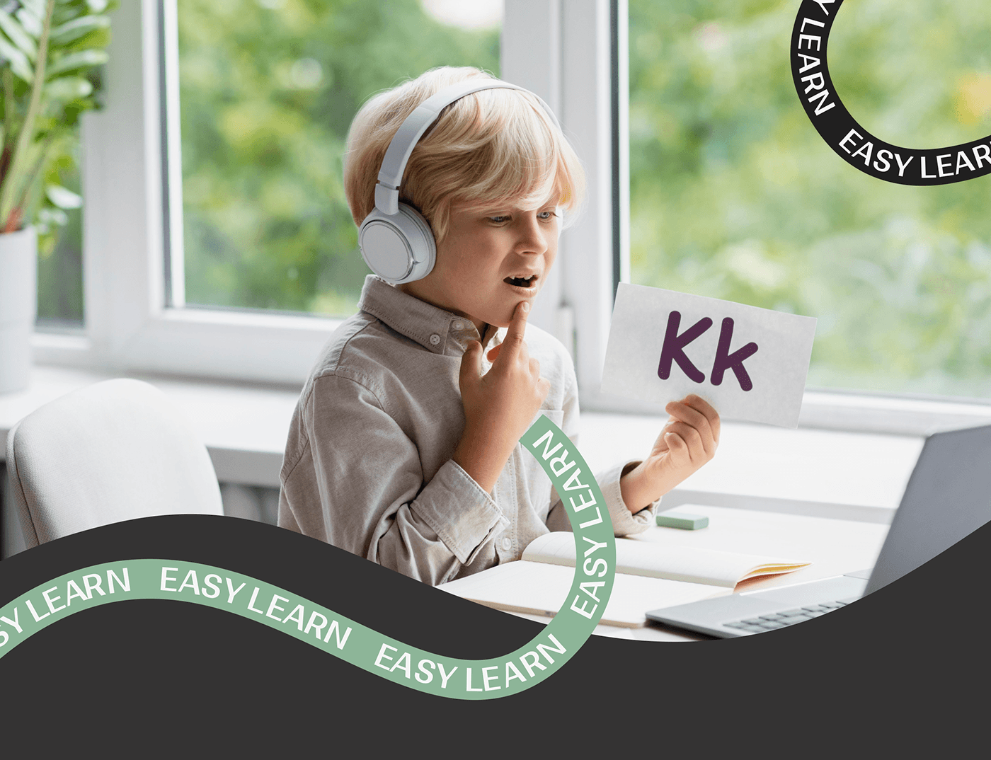
“Easy Learn” is a modern school for children where every little student gains skills and confidence in communicating in English. Here, games, interactive lessons, and caring teachers create an inspiring atmosphere, fostering full and enjoyable language learning. Easy Learn is not just a school; it's a path to language development filled with adventures and new discoveries for every child.
For this project, a website and branding were created. Everything was done in one style and mood, and many analysis stages were passed to achieve the best result.
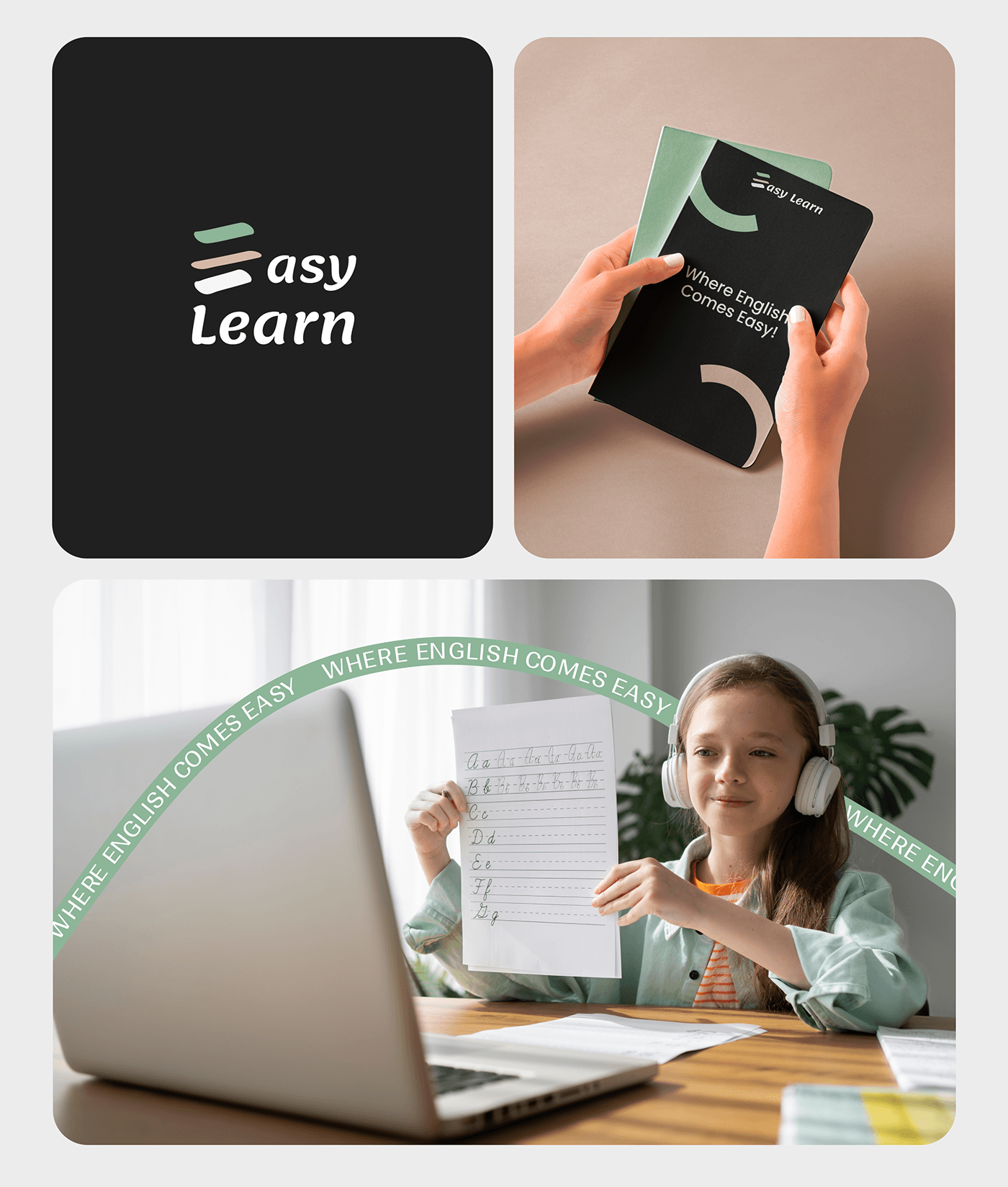
Brand Logo
"The logo for Easy Learn is more than just an image; it tells a story. In its first letter 'E', there are multiple meanings and symbolism embedded. The loosely drawn letter 'E' resembles a pencil sketch, evoking playfulness and creativity, perfectly reflecting the school's approach to learning. It also visually associates with a stack of books, symbolizing education and knowledge. The use of green, orange, and black colors emphasizes the vibrancy and diversity of the learning process. This logo not only captures attention but also evokes feelings of comfort, joy, and a thirst for knowledge — all of which are important to us at Easy Learn."
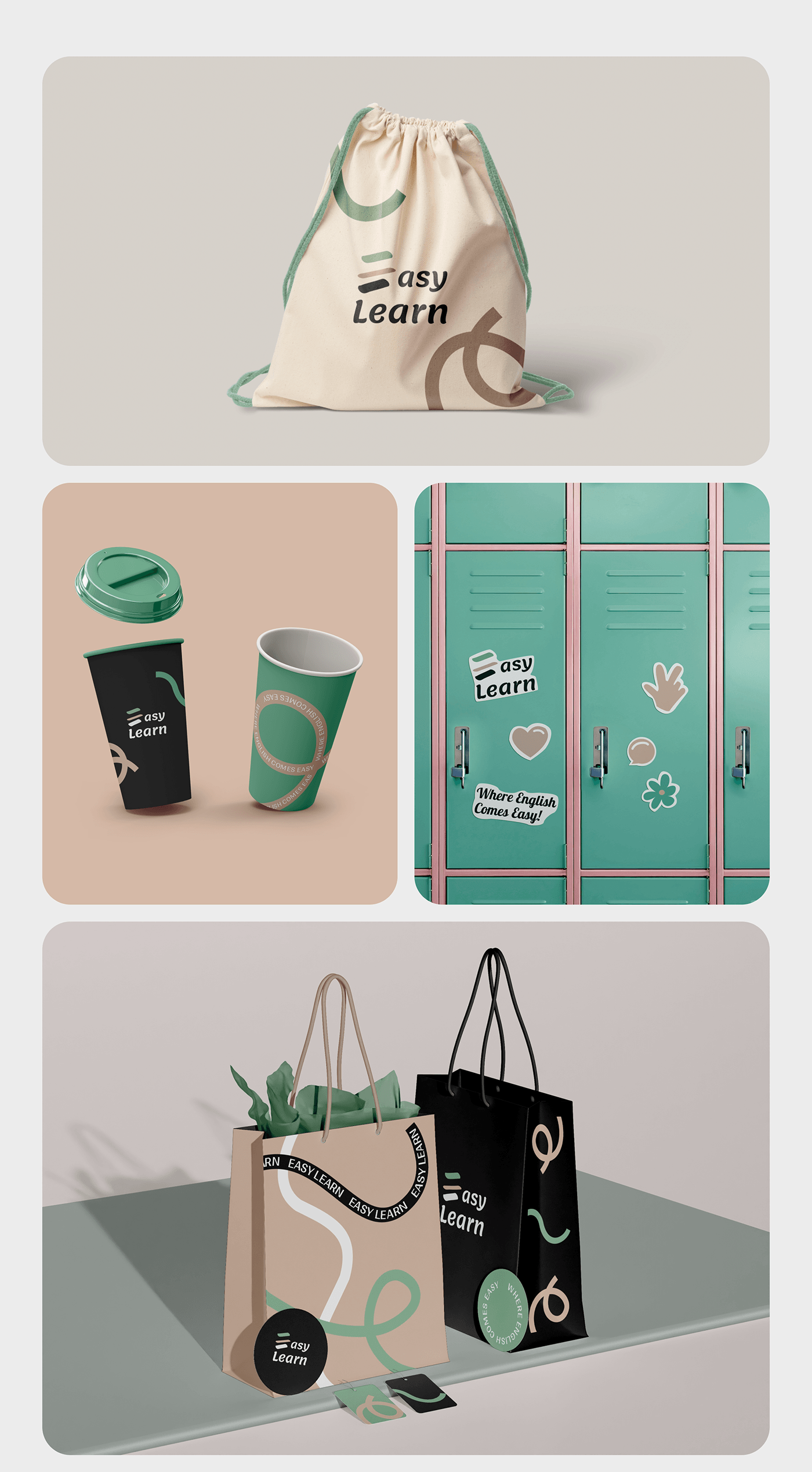
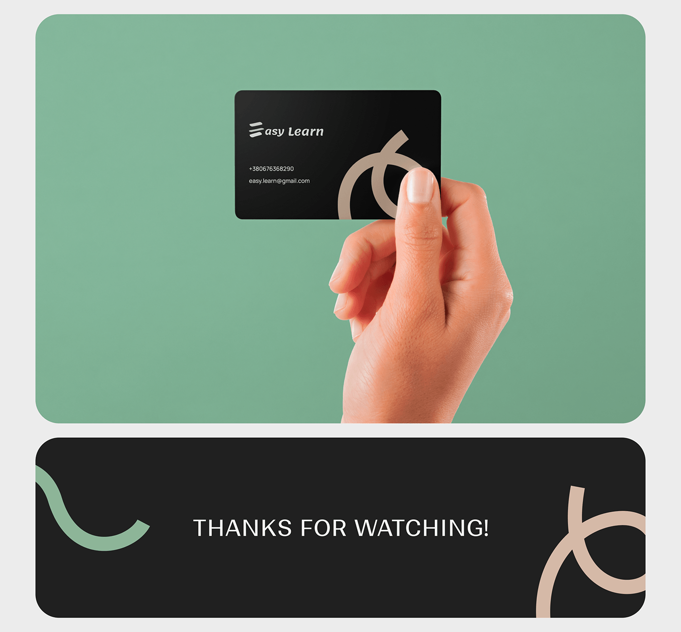
Additionally, a branding package has been crafted to adorn the brand, ensuring a cohesive visual identity that resonates with values and ethos.
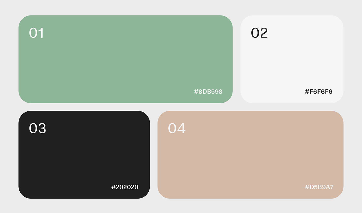
Colors
For this project, the design was developed with consideration for the needs and interests of children. The main goal was to create an attractive and friendly educational environment that stimulates an interest in learning English.
The use of four main colors - black, white, soft mint, and soft pink - helped create a calm and harmonious atmosphere conducive to concentration and comfortable learning. Black and white colors give the design restraint and clarity, while soft mint and soft pink add playful and soft touches.
The use of four main colors - black, white, soft mint, and soft pink - helped create a calm and harmonious atmosphere conducive to concentration and comfortable learning. Black and white colors give the design restraint and clarity, while soft mint and soft pink add playful and soft touches.
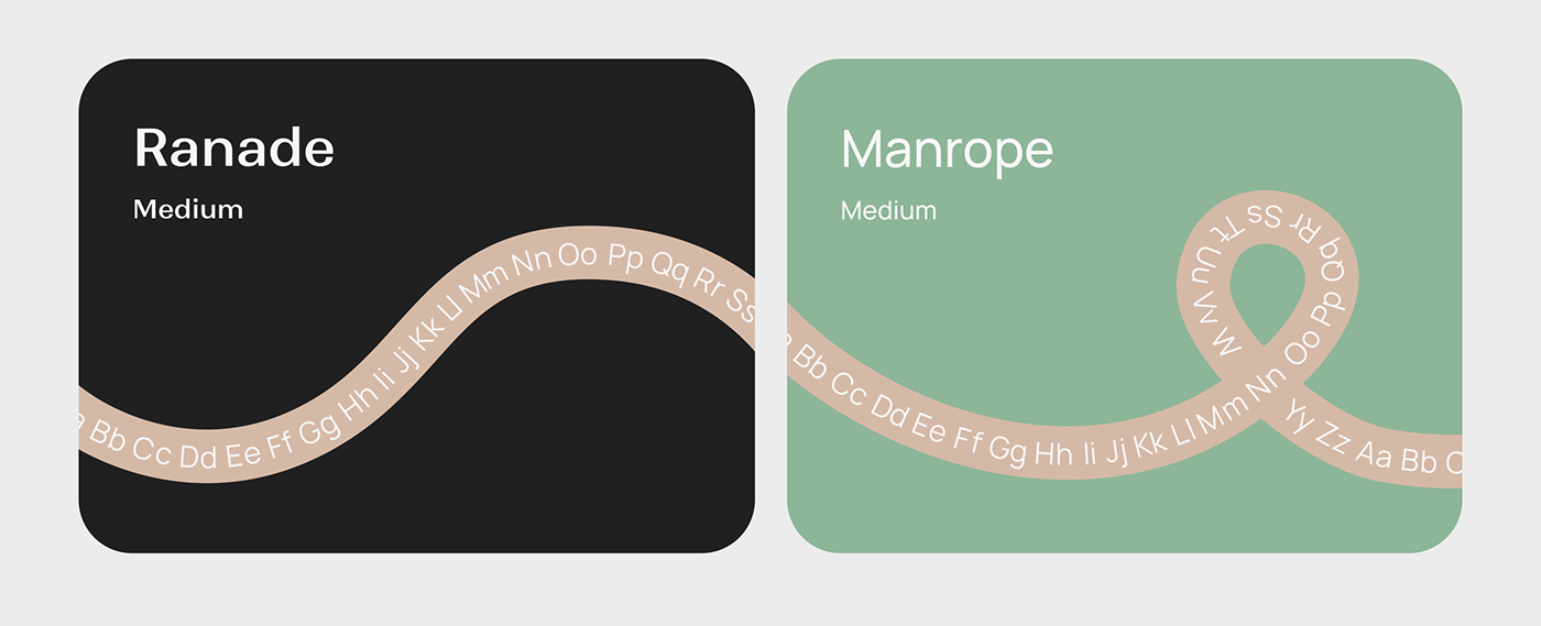
Typography
The choice of Ranade and Manrope fonts complements the overall design concept. Ranade is a creative and energetic font that emphasizes the dynamism and interactivity of the educational process. On the other hand, the Manrope font combines cleanliness and readability, making it an ideal choice for educational materials.
All design elements were carefully selected with the needs of the target audience and project goals in mind, creating a balanced and appealing visual concept for the children's English language school.
All design elements were carefully selected with the needs of the target audience and project goals in mind, creating a balanced and appealing visual concept for the children's English language school.
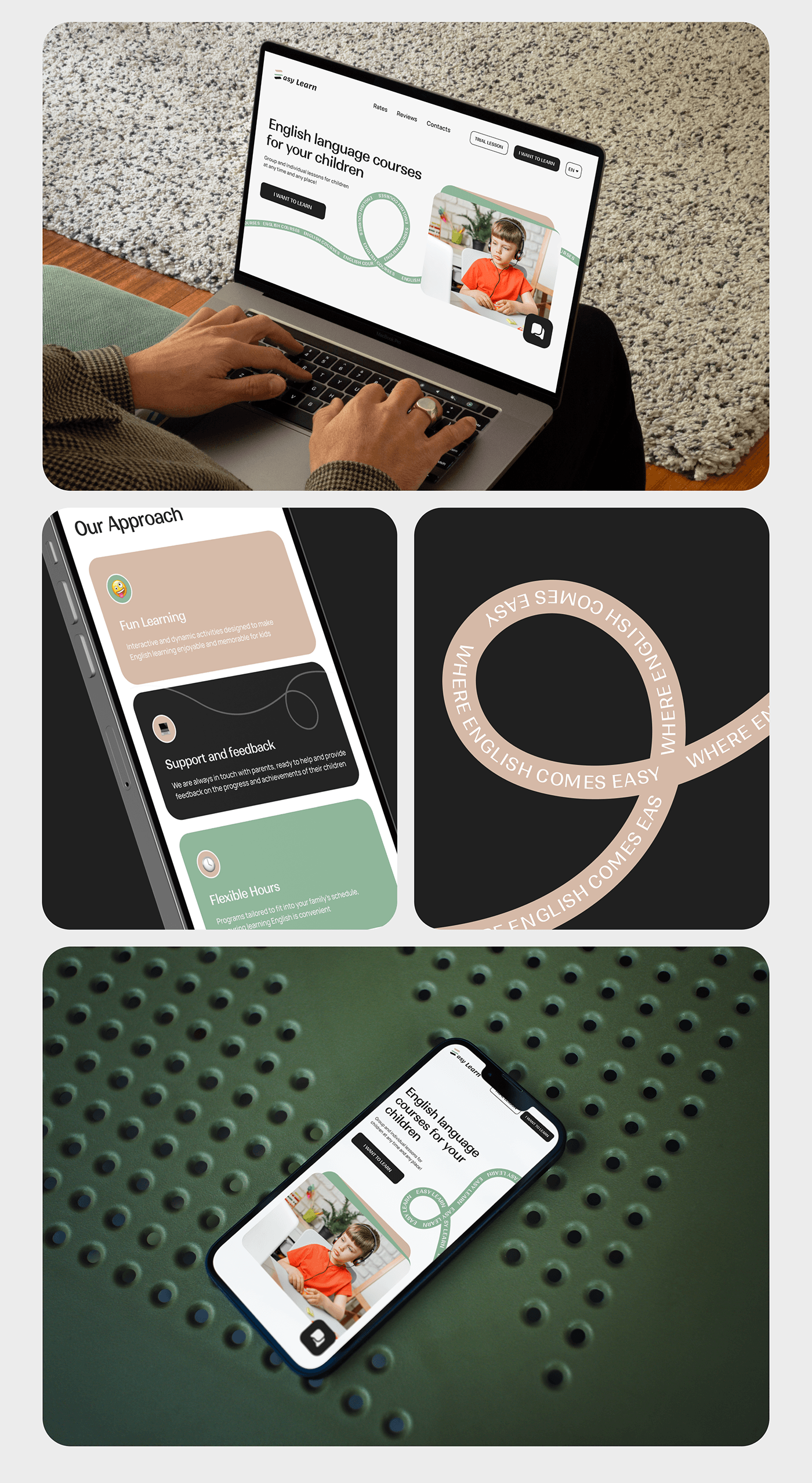
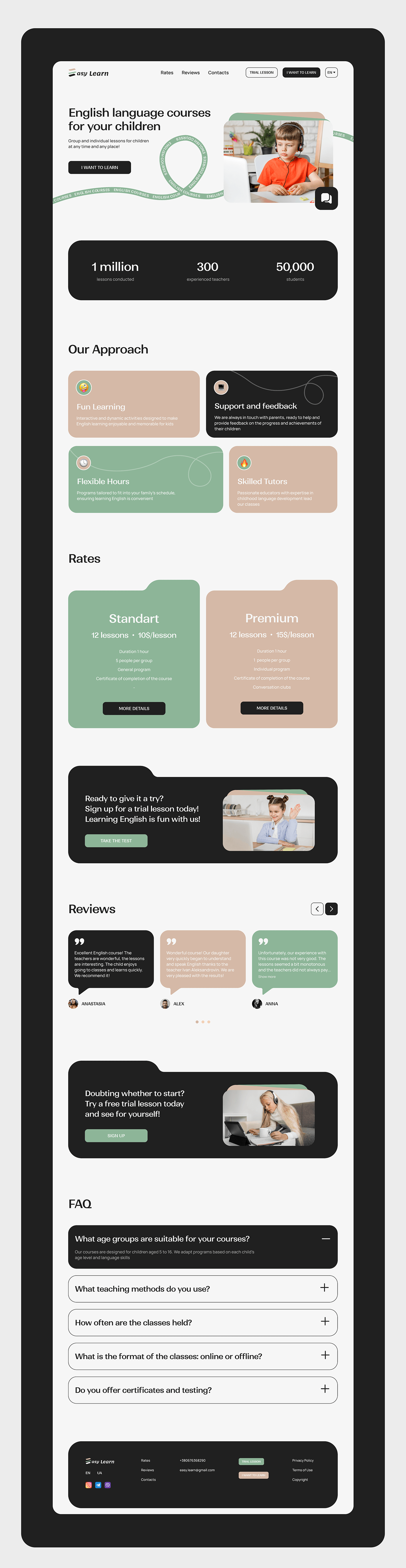
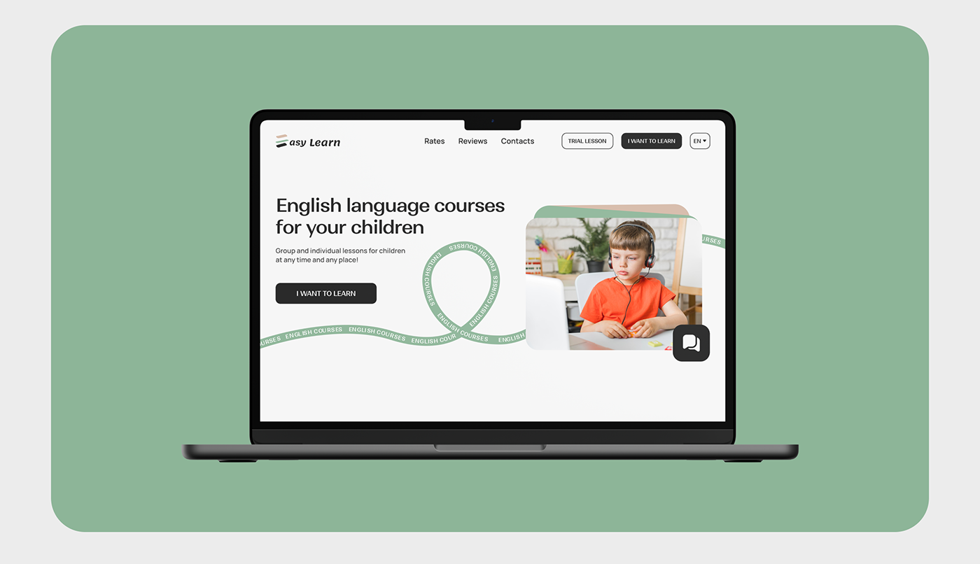
Landing page
The website and its mobile version for the children's English language school were meticulously crafted with rounded shapes and fonts, aiming to create a friendly and inviting atmosphere. Images of children were strategically placed throughout the design to instill a sense of trust and reliability, while the soft yet vibrant color palette adds an element of excitement to the learning experience. Emojis were cleverly integrated to make the content more engaging and relatable to the young audience. Additionally, playful lines and shapes were incorporated to enhance visual interest and encourage exploration.