Beryozka
Russian gas station
Russian gas station
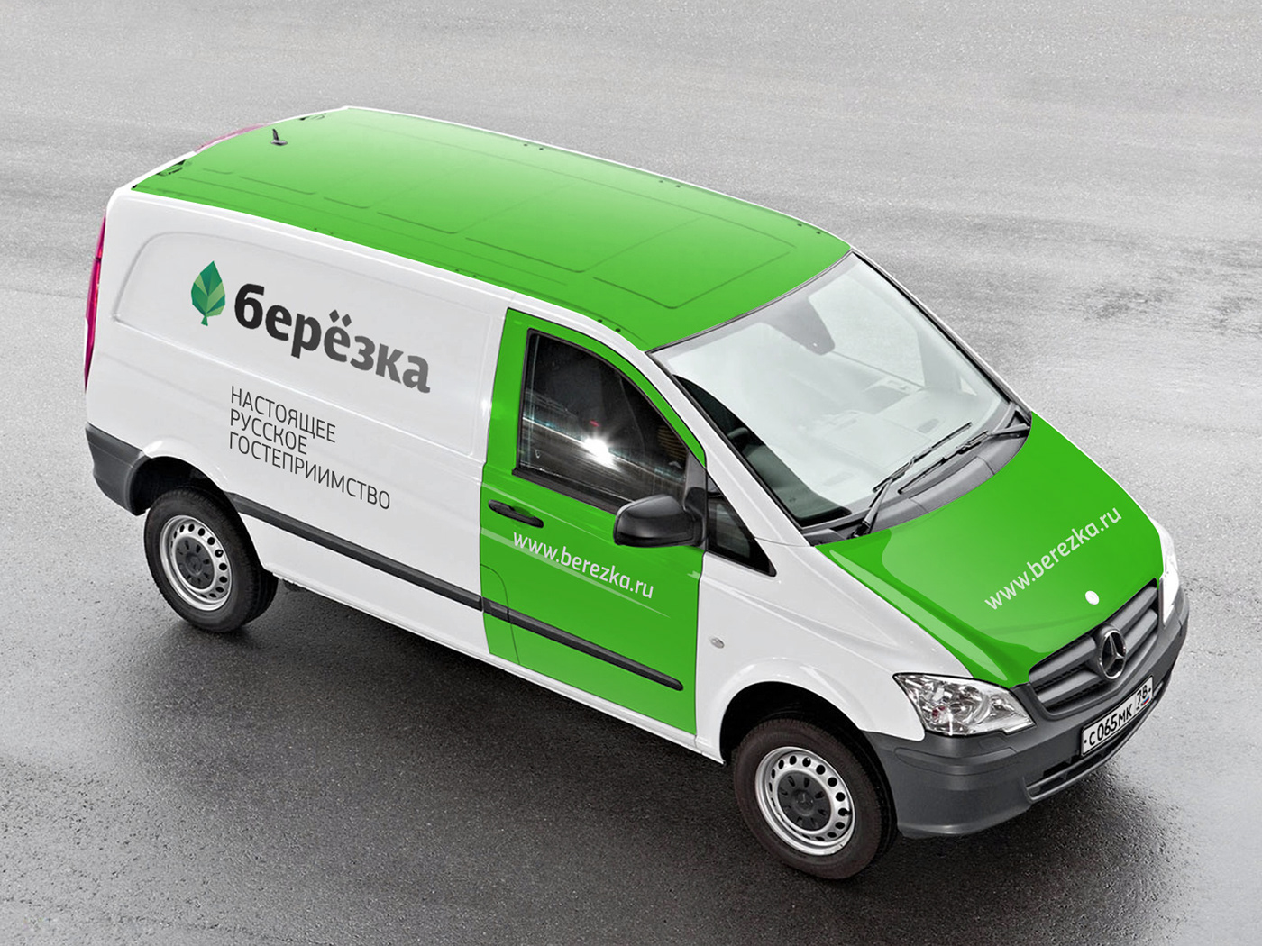
Plenum Brand Consultancy has demonstrated that a brand that goes to the essence of the Russian character may be, all at once, contemporary, laconic and daring. Service with a Russian character means hospitable service.
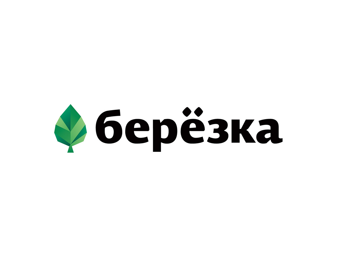
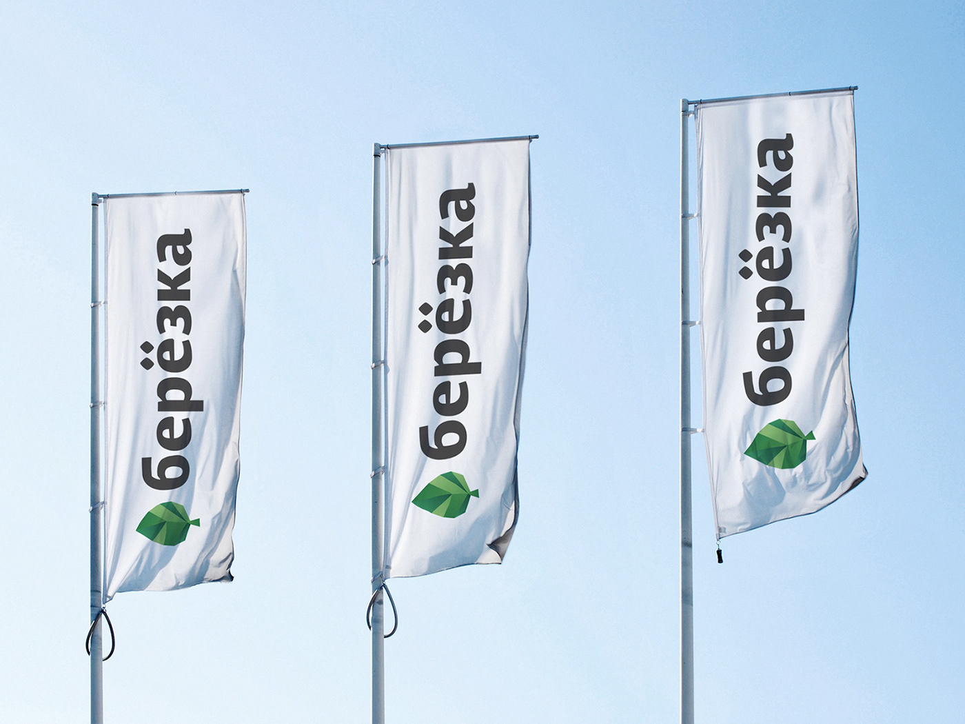
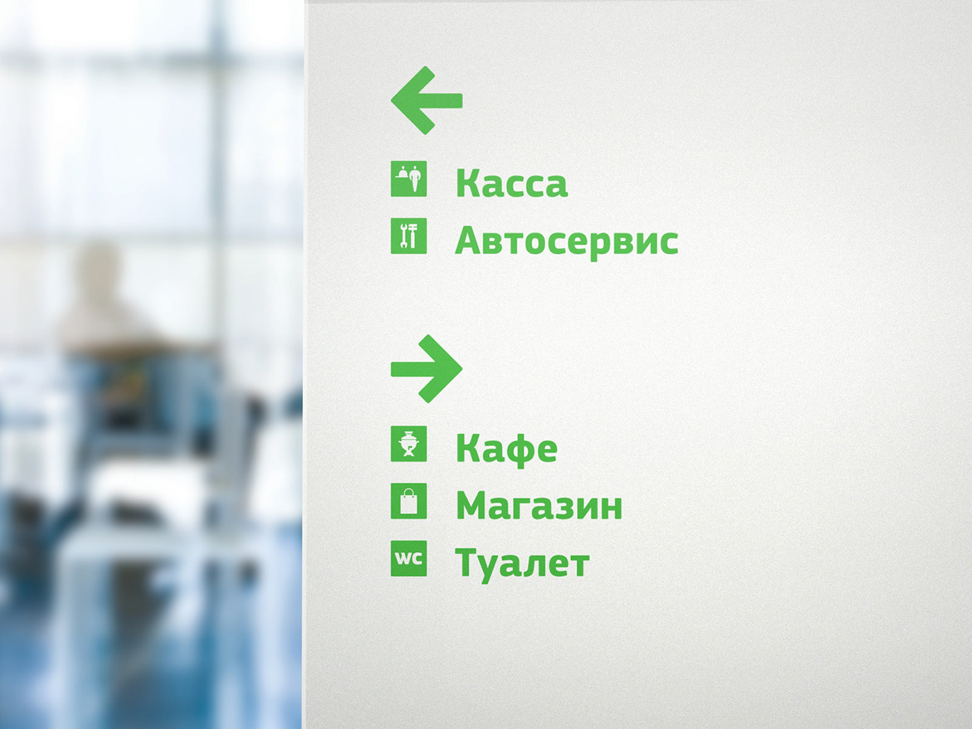
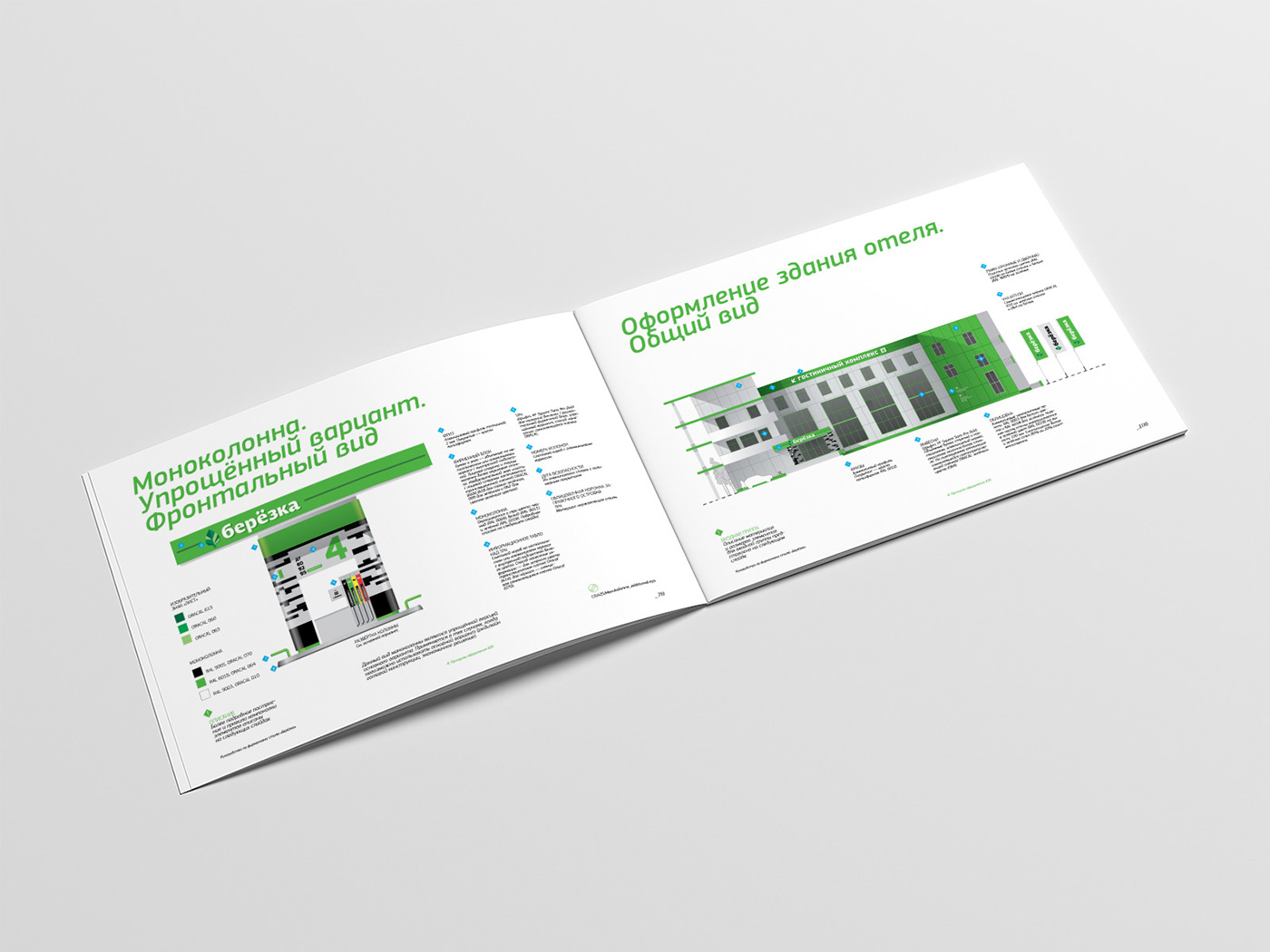
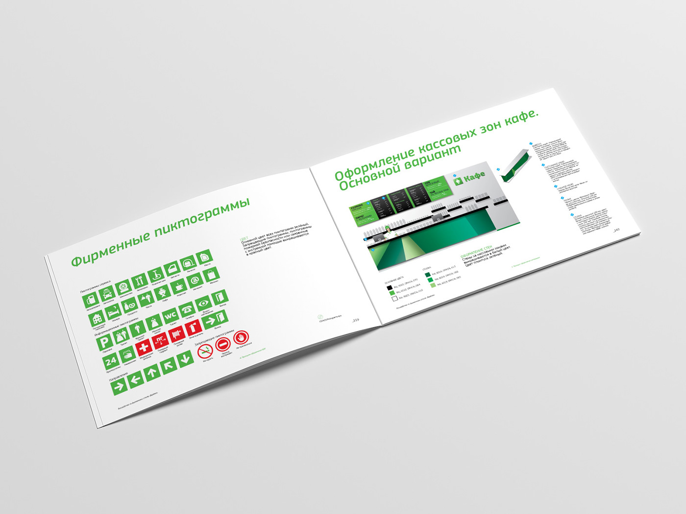
This unique graphic solution for the conservative and faceless Russian petrol station market is based on the name “Beryozka”, which is very familiar to every Russian. “Beryozka” is the diminutive word of beryoza (“birch tree” in Russian). Ecological andplant motifs thus become the basis of a company image based on technology and friendliness.
Project was selected for a Red Dot Design Award, communication design 2011.


Project by Plenum
Brand consultant Tanya Haritonova
Brand analyst Katerina Palshina
Art director Egor Myznik
Senior designer Elena Bean
Designer Olya Balina
Copywriter Nadya Yurinova
3-d modeling Alexey Cherkasov
Brand consultant Tanya Haritonova
Brand analyst Katerina Palshina
Art director Egor Myznik
Senior designer Elena Bean
Designer Olya Balina
Copywriter Nadya Yurinova
3-d modeling Alexey Cherkasov


