Project Overview
The product:
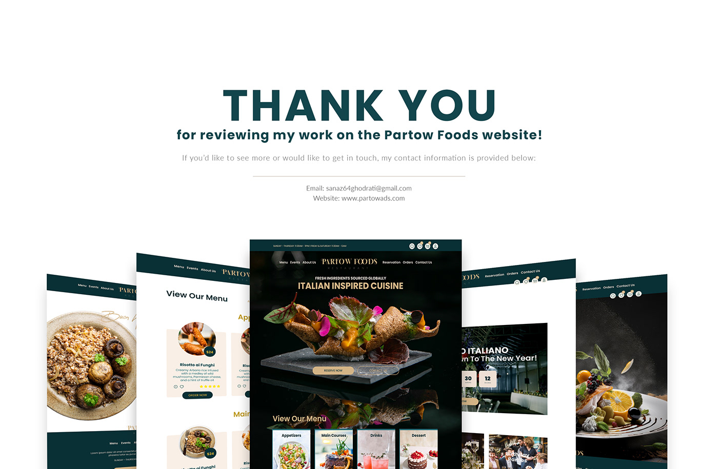
Partow Foods is a fictional restaurant website designed to provide users with a seamless and delightful dining experience. The platform allows users to reserve a table, explore the food menu, stay updated on upcoming events, and conveniently order food for delivery.
The product:
Partow Foods is a fictional restaurant website designed to provide users with a seamless and delightful dining experience. The platform allows users to reserve a table, explore the food menu, stay updated on upcoming events, and conveniently order food for delivery.
Project duration:
20 January To 31 February 2024

The problem:
Partow Foods, a local restaurant, faces the challenge of providing a seamless digital experience for its customers. Users find it cumbersome to reserve tables, explore the menu, and stay updated on restaurant events. Additionally, the process of ordering food for delivery lacks efficiency.
The goal:
The goal is to design and implement a user-centric website for Partow Foods that simplifies the reservation process, enhances menu exploration, keeps users informed about events, and streamlines food delivery orders.
The goal is to design and implement a user-centric website for Partow Foods that simplifies the reservation process, enhances menu exploration, keeps users informed about events, and streamlines food delivery orders.
My role:
UI/UX designer leading the Partow Foods website design
Responsibilities:
Conducting interviews, paper and digital wireframing, low- and high-fidelity prototyping, conducting usability studies, accounting for accessibility, iterating on designs, and responsive design.
User research:
Conducted a mix of online surveys and in-person interviews to gather insights. It was assumed that users primarily faced issues with navigation, information clarity, and a lack of convenience. Surprisingly, the research highlighted four main pain points:

Problem statement:
Sarah is a busy professional who needs an efficient way to plan dinner outings with her family because her hectic schedule leaves her with limited time for meal planning.
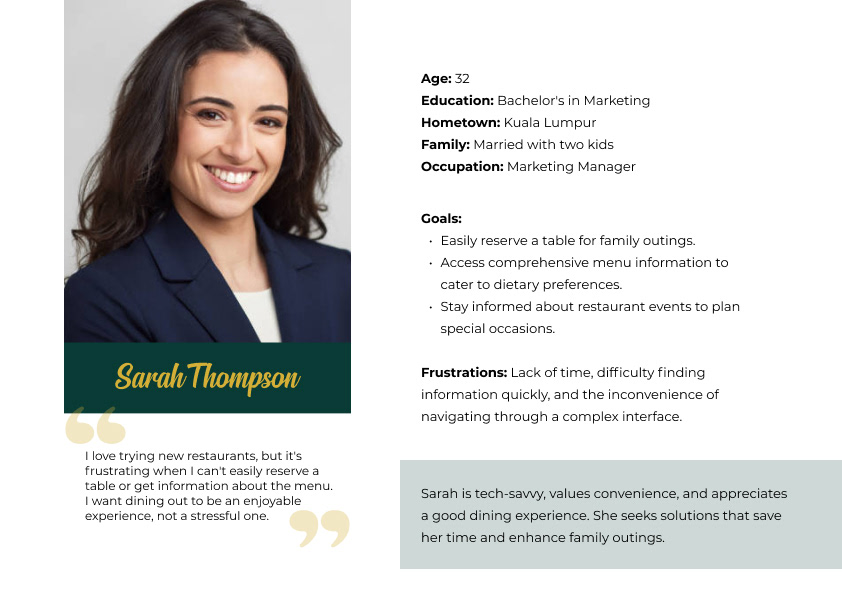
User journey map
Understanding Sara's journey helps prioritize improvements for a smoother experience—focus on event visibility, reservation simplicity, menu clarity, and efficient food delivery.

Sitemap
My goal here is to create a sitemap that ensures a logical and straightforward structure for users to navigate easily between reservations, menu exploration, events, and online ordering.

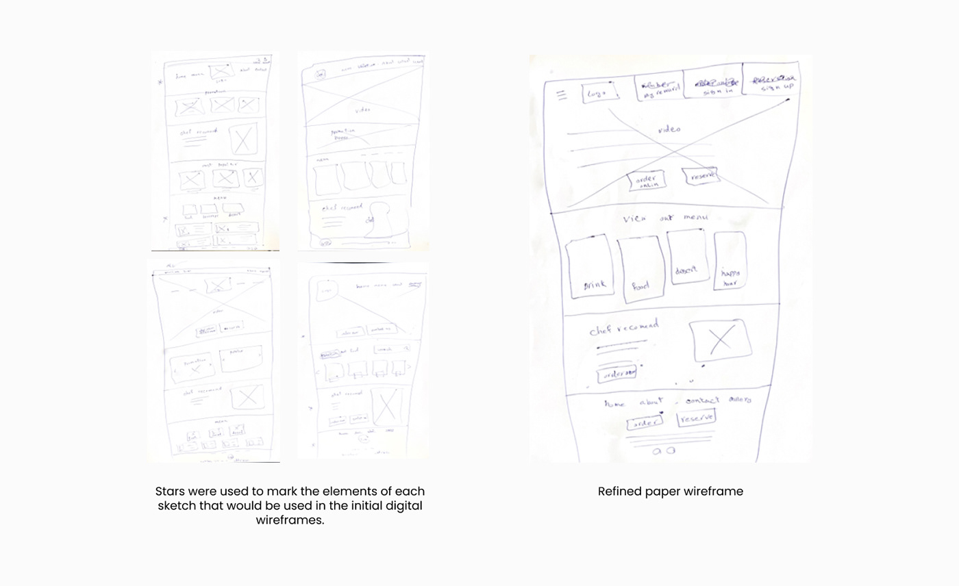
Paper wireframes:
Next, I sketched out the paper wireframes, focusing on creating a clean and intuitive interface. Prioritize simplicity in navigation, emphasize the visual appeal of the menu items, and ensure a straightforward process for table reservations and food ordering. Consider feedback loops for users to express preferences and streamline the overall user journey.
Next, I sketched out the paper wireframes, focusing on creating a clean and intuitive interface. Prioritize simplicity in navigation, emphasize the visual appeal of the menu items, and ensure a straightforward process for table reservations and food ordering. Consider feedback loops for users to express preferences and streamline the overall user journey.
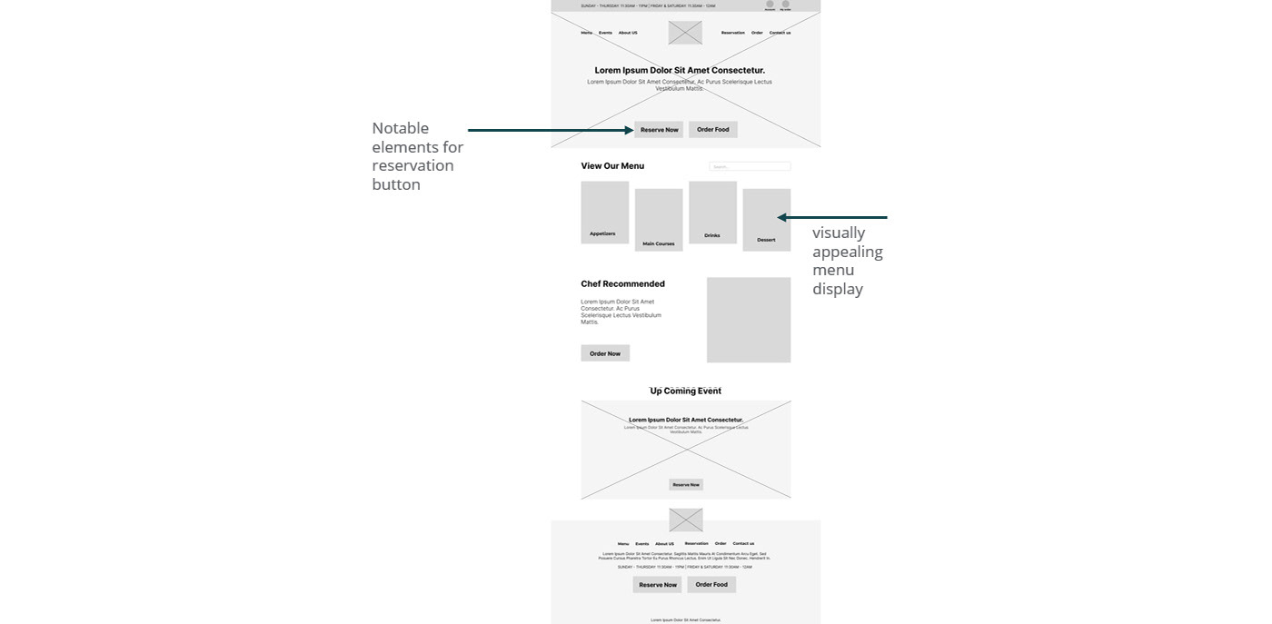
Digital wireframes
Implemented peer feedback to enhance the design, emphasizing the importance of clear CTAs and visual hierarchy. Notable elements included a prominent reservation button, a visually appealing menu display, and a simplified online ordering process, ensuring a seamless user experience.
Low-fidelity prototype
I crafted low-fidelity prototypes for Partow Foods Restaurant's responsive website, presenting various screen variations. The user flow ensures easy navigation, from menu exploration to placing orders. Peer feedback played a vital role in refining our design; we carefully considered suggestions for clarity and simplicity. Links to these prototypes are shared below, demonstrating our commitment to an intuitive user experience.
Partow Foods low fidelity prototype
Partow Foods low fidelity prototype

Usability study: parameters

Usability study: findings
These were the main findings uncovered by the usability study:
1. Reservation: Not clear date and time table reservation steps lead to task failure.
2. Menu: Menu navigation confusion impacts the time spent on the website. There is no filter item or search button
3. Place order: There are issues on the order page, such as credit card process
Refining the design
Based on the observations from the usability research, I made improvements to the site's menu by adding a category filter and making it easier for users to discover food.

In my first low-fidelity mockup, users couldn’t pick a day and time from the calendar and had to write manually, which made them fatigued and increased the error rate. Adding a calendar and timetable to a drop-down made it easy for users.

Sticker sheet

Mockups: Original screen size


Screen size variations
I included considerations for additional screen sizes in my mockups based on my earlier wireframes. Because users shop on a variety of devices, I felt it was important to optimize the browsing experience for a range of device sizes, such as mobile and tablet, so users have the smoothest experience possible.


High-fidelity prototype
My hi-fi prototype followed the same user flow as the lo-fi prototype, and included the design changes made after the usability study, as well as several changes suggested by members of my team
View the Partow Foods high-fidelity prototype

Accessibility considerations
1. Use color contrast for readability.
1. Use color contrast for readability.
2. Provide alternative text for images.
3. used headings with different sized text for clear visual hierarchy
Takeaways
Impact:
Users reported increased satisfaction and a 20% rise in successful reservations and food orders.
What I learned:
The importance of simplicity and efficiency in user interface design. Users appreciate clear communication and streamlined processes.
Next steps
1. Continuous user feedback collection and iterative improvements.
2. ٍExploring website development for a more personalized experience.
3. Increasing the website's accessibility for users with disabilities