


Dallas Public Library
Design Objectives and Challenges
The previous Dallas Library logo suffered from generic design elements, including dull pastel colors and an unremarkable font. Its lack of distinction failed to encapsulate the library's essence as a vibrant hub of ideas and learning.
Design Process and Concept Development
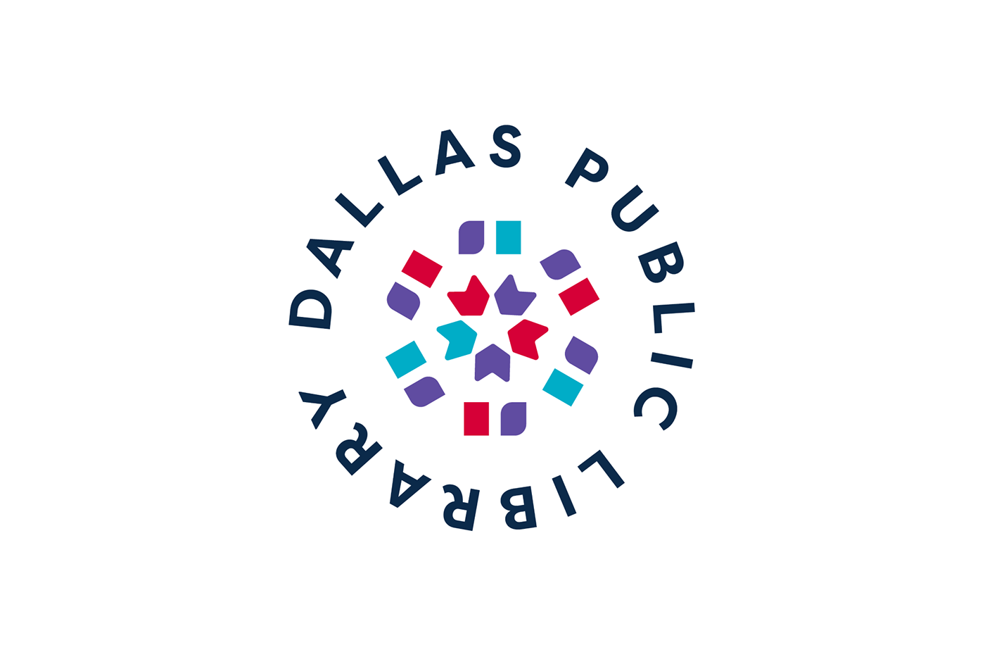
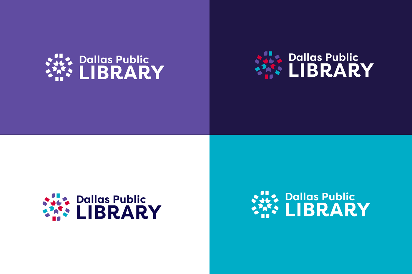
To address these shortcomings, I drew inspiration from the library's role as a kaleidoscope of ideas and learning, the crafted a logo mark that symbolizes the convergence of diverse perspectives and knowledge.
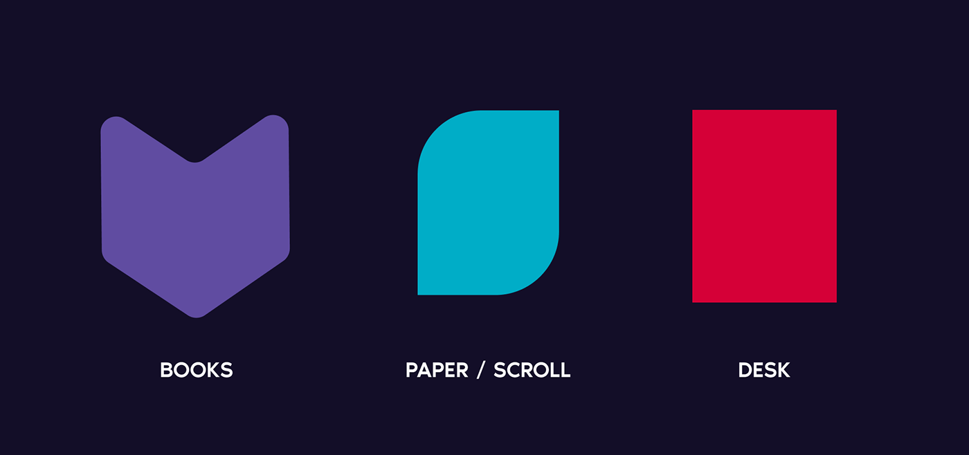
The shapes within the logo were designed to evoke the image of overhead tables coming together, symbolizing collaboration and community. Abstract representations of books (the chevrons) further reinforce the library's core mission of fostering education and enlightenment.
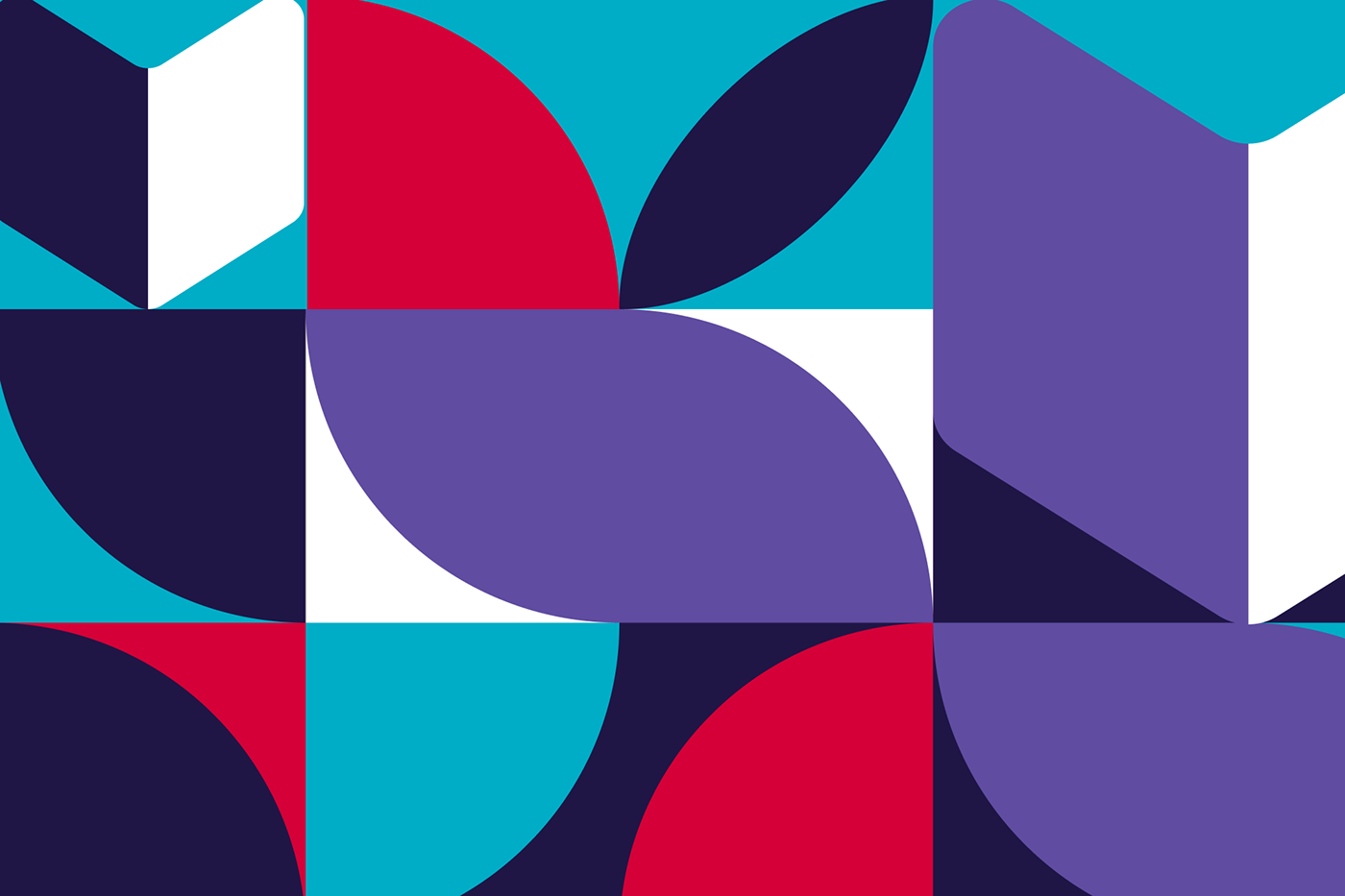
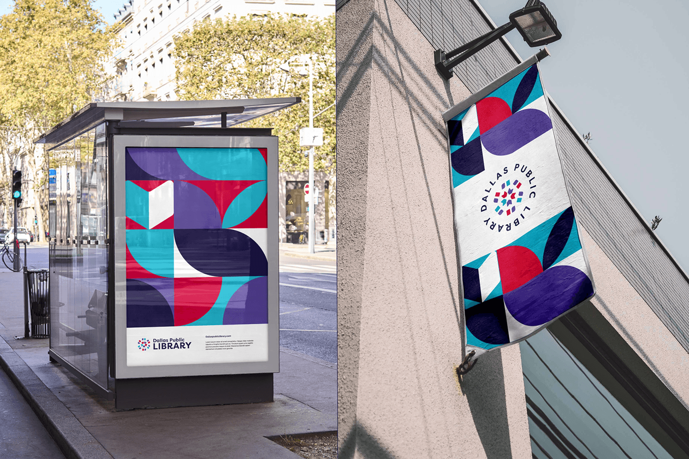
Incorporating vibrant deep colors such as red, purple, and blue injected new life into the logo, infusing it with energy and dynamism. These bold hues reflect the library's commitment to creativity, exploration, and inclusivity.
Final Design Selection and Implementation
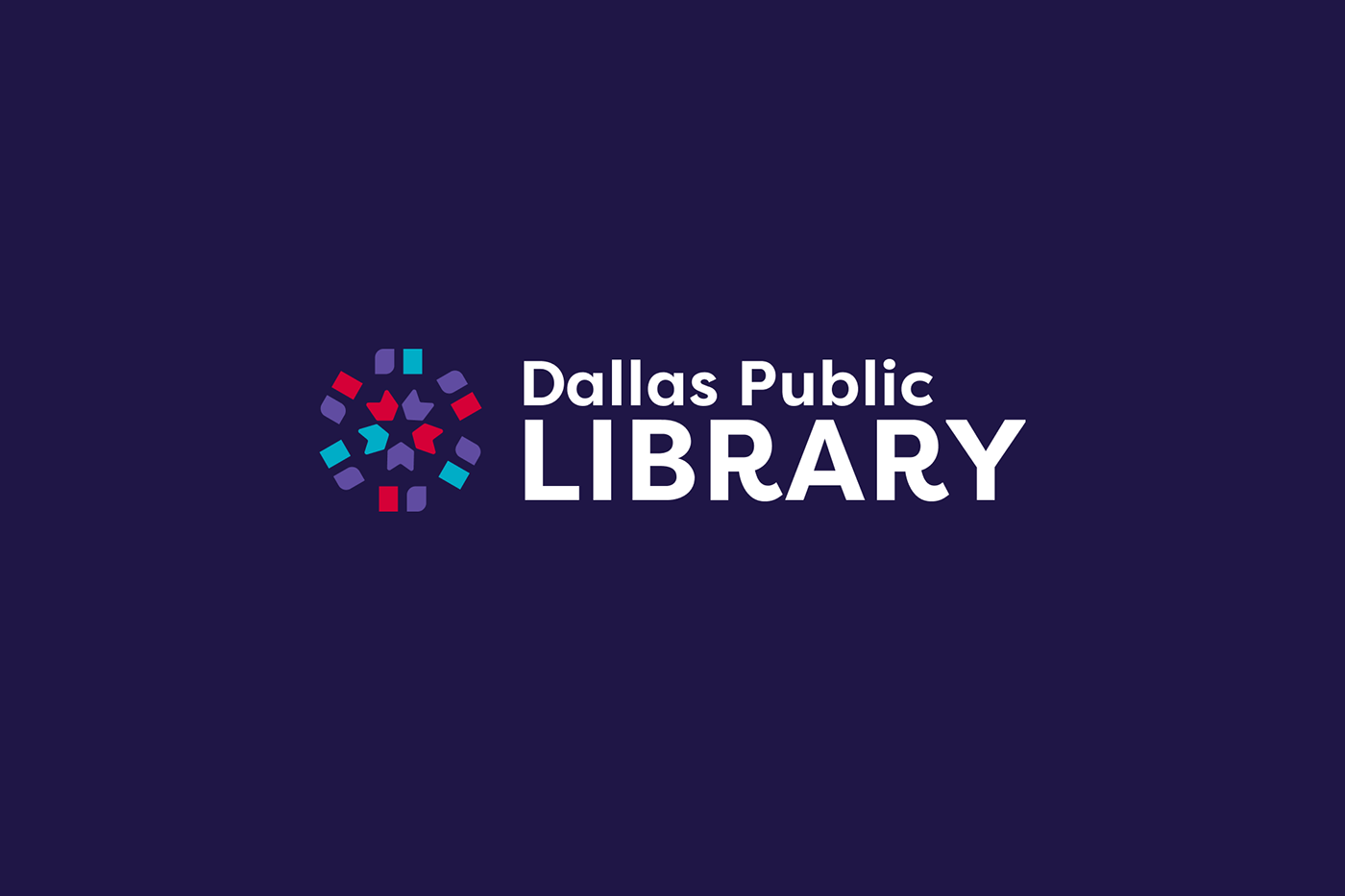
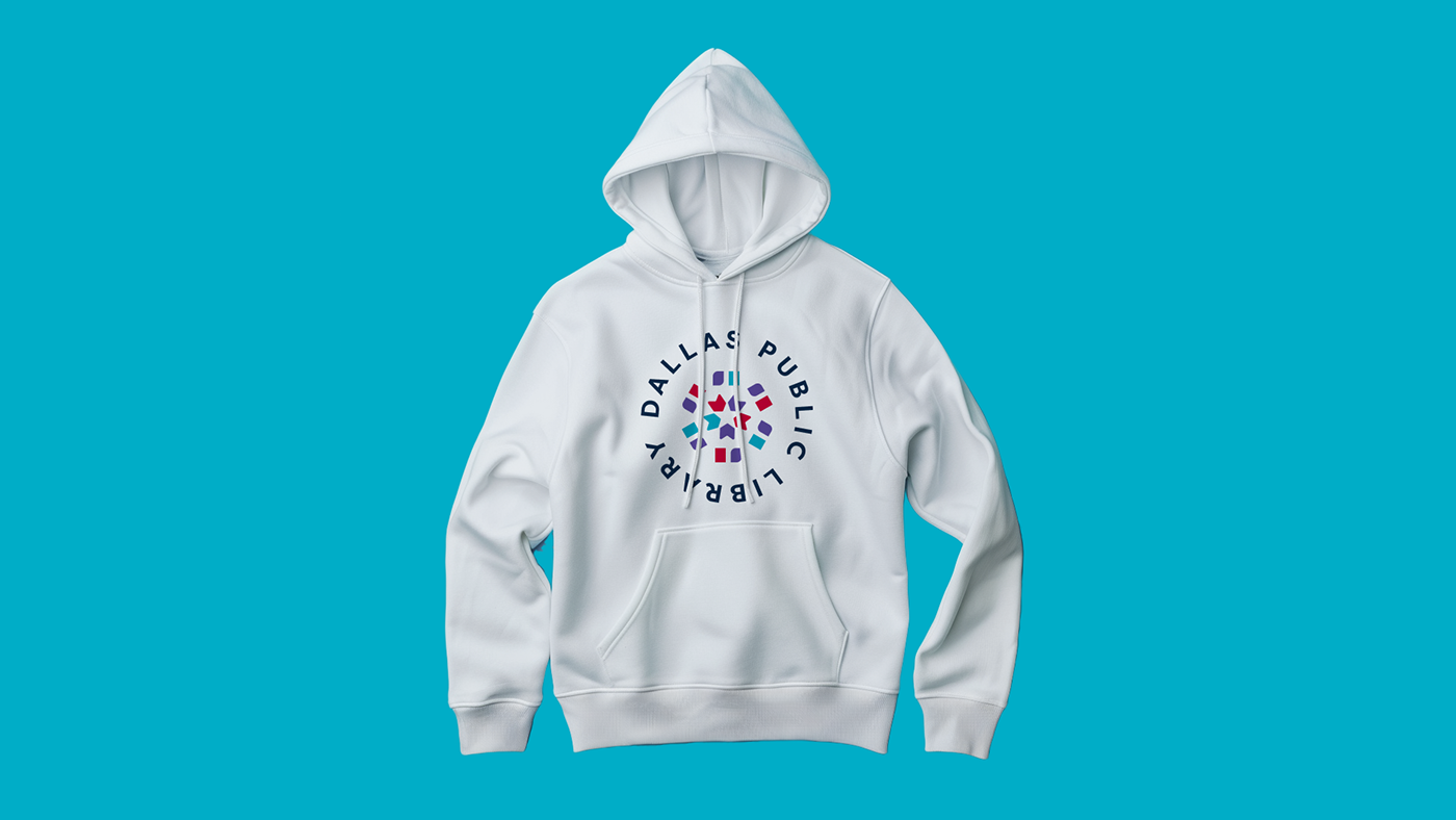
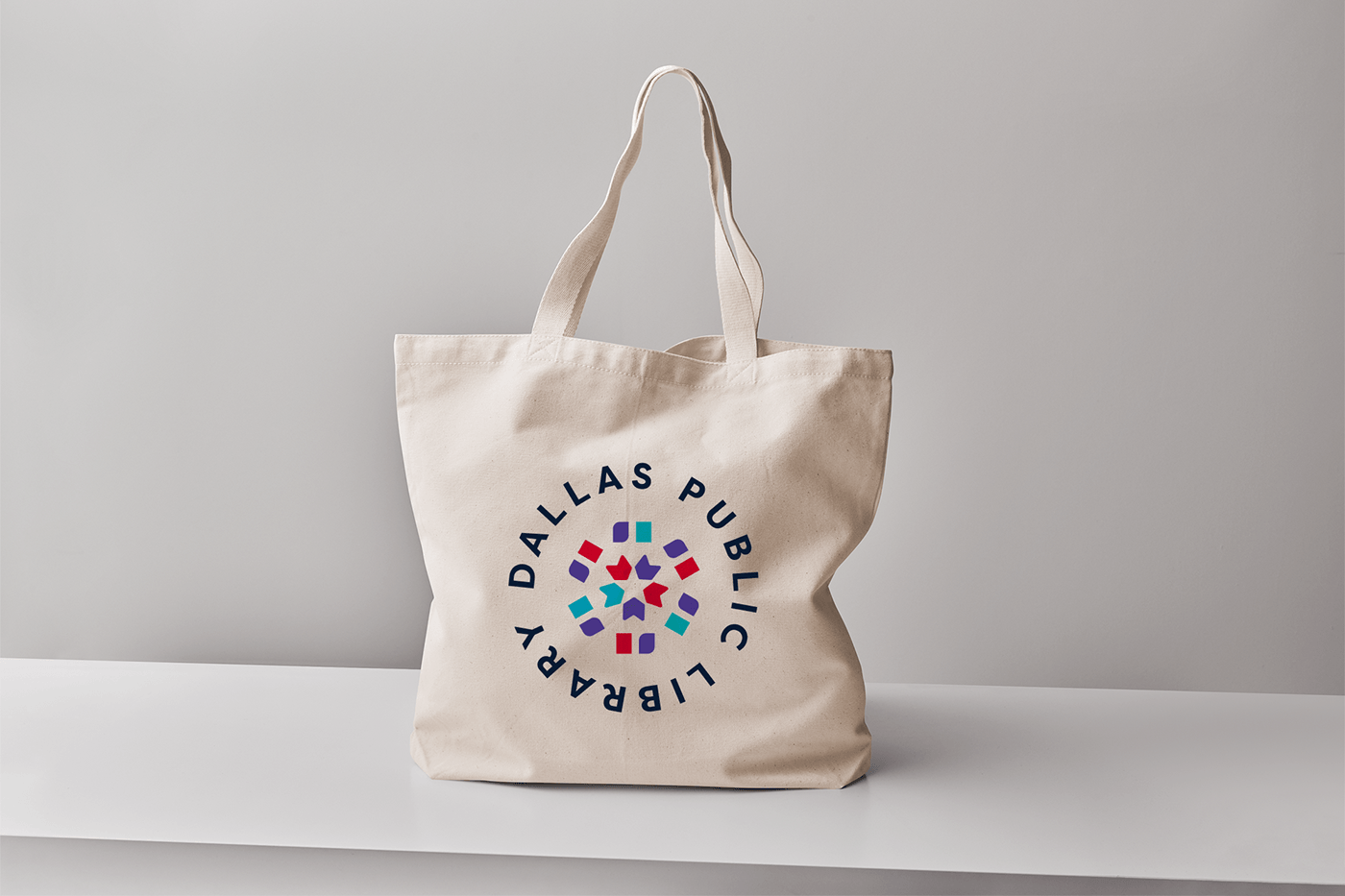
After careful consideration and refinement, the chosen logo design emerged as a powerful symbol of the Dallas Library's renewed identity. The playful curves of the revamped font, particularly the distinctive "R," lend an approachable quality to the logo, resonating with people of all ages.
Results and Impact
This refined identity provides a focused narrative of the Dallas Library logo redesign journey, highlighting the transformation from a generic rectangles to a vibrant symbol of intellectual discovery and community engagement.
#library #brandidentity #branding #visualidentity #logodesign #logodesigner #branddesigner


