
Why Boarding Passes seems to be so chaotic?
Unless you're a experienced traveler, Boarding Passes (with almost no exceptions between companies) are something chaotic and hard to understand.
The information seems to be written randomly and, when you need to take you plane in just 10 minutes, you don't want to waste your time reading the Boarding Pass.

Lufthansa's actual Boarding Pass. Something that really bother me is that the printer doesn't print the elements where they're supposed to be. You can see how the "ETKT no." space is empty, and how the printer put that number on top. Why?
I simply rearranged the elements, deleted extra text and used universal icons that almost everybody, no matter where they are from, would understand. Clean and easy.
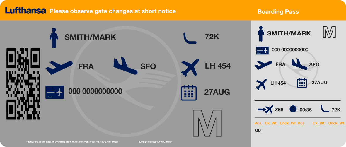
My concept includes easy to understand icons, big texts and information arranged in a more logical way. Note that this is just a concept and not an official Lufthansa's design.


