CF Napa Makes a Dream Come True
Rhonemus Cellars came to CF Napa to create the ethos of their new wine brand, its story, and visually translate the strategic positioning into a stunning packaging design. Vacations to the Monticello Valley and Napa Valley wine countries inspired the Rhonemus’ dream of bringing the wine tasting experience to their home of Lancaster, Ohio. Rhonemus Cellars was born of this dream and is a destination winery that serves as the foundation of the estate featuring a stunning golf club, visitor center, and restaurant – creating an intersection of wine, food, and golf.

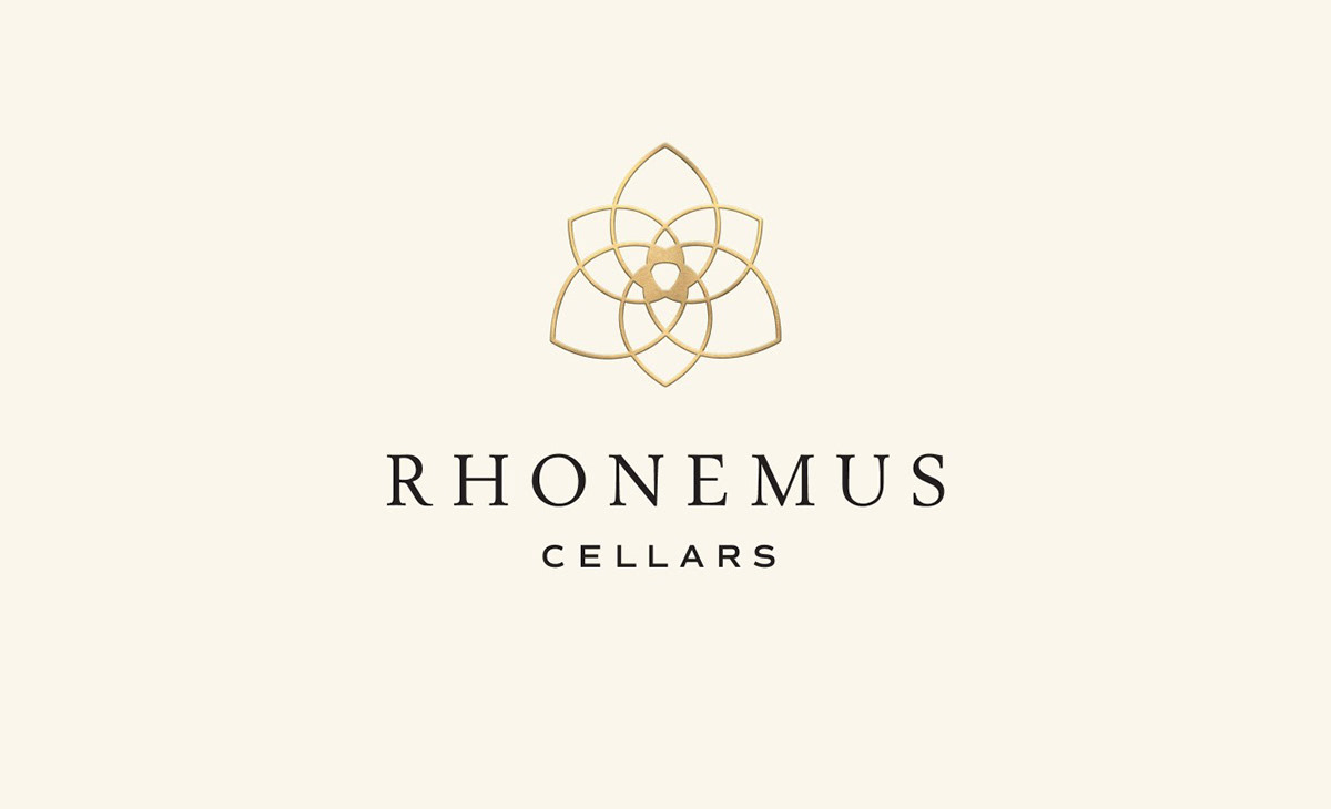
As an ode to Ohio, CF Napa drew a trillium, the three-petaled state wildflower. The three petals echoed the theme of trinity that is ever present within the winery and the lives of the winery owners. To the Rhonemus’, the trinity represents…
- The intersection of wine, food, and golf.
- Their 3 children.
- The trinity of their faith.
- A representation of the bold vision, prayer, and unforeseeable opportunity that made
the winery possible.
- The 3 pillars that form the foundation of their lives – faith, family, and friends.

The trillium flower illustration was embossed and outlined in gold foil; the petals adorned in a subtle pearlescent foil. The minimalist label allowed the flower to remain the focal point of the label, supported by the timeless wordmark and elegant script for the appellation.

Drink With Your Eyes®


