MOON Studio for URBAN coffee
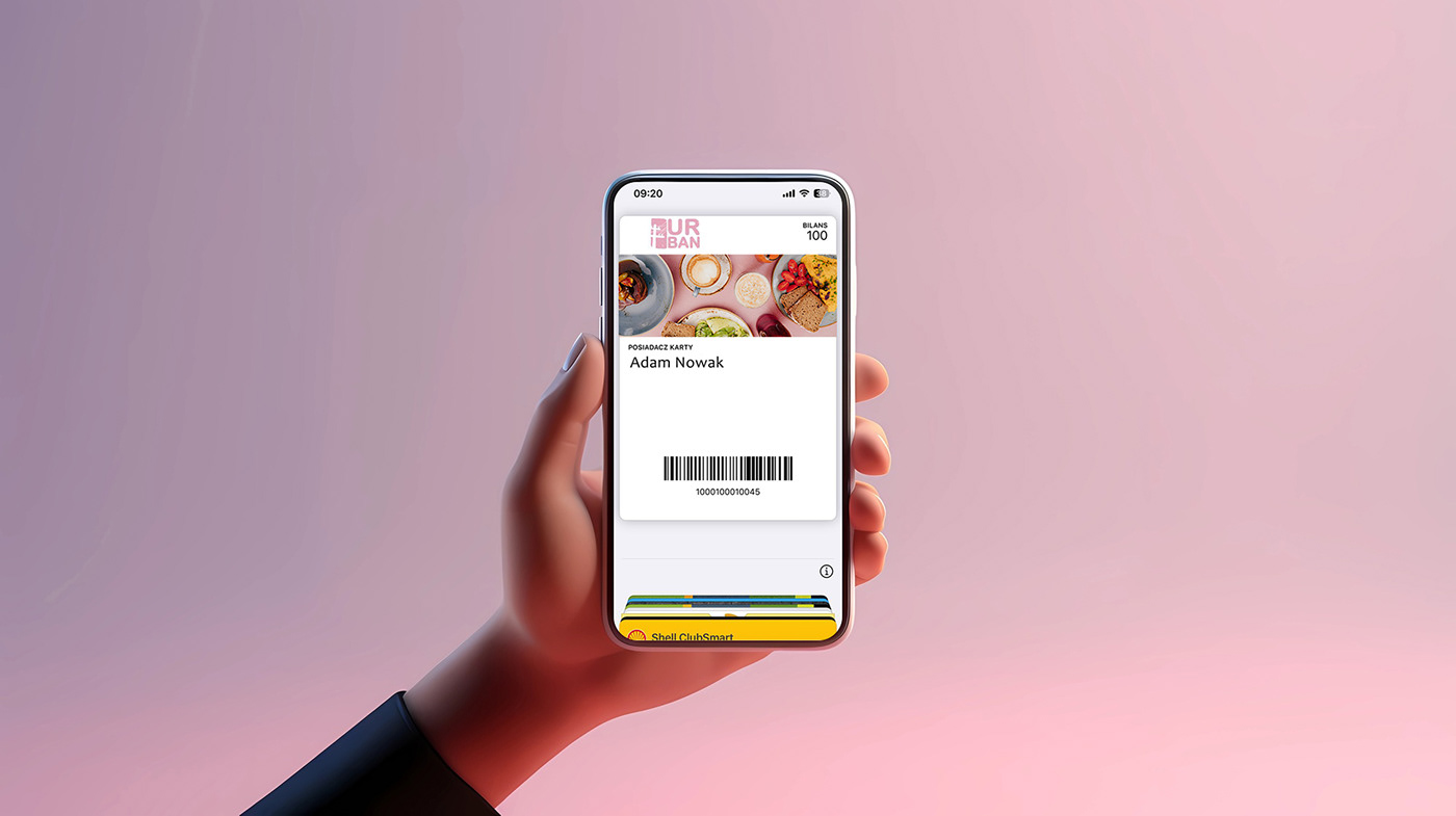
The task was to rebrand the "URBAN coffee" cafe chain while maintaining the corporate style, brand colors, and ambiance of the establishments. It was decided to keep the name "URBAN" and either keep or change the "coffee" subtitle. There was no specific task regarding the logo, and the client allowed for creativity based on their preferences and target audience.
The goal was to reflect the meaning of the establishment's name - urbanization, civilization, city life. And so, we decided to create a creative logo with a symbol that does not directly represent coffee but rather symbolizes urbanization - the first wooden pillars - "electrification" - the first step of humanity in this direction. The logo should not clearly depict the company's sphere of activity (like Apple or Starbucks). It should be memorable. A creative logo with a meaningful idea will undoubtedly be noticed and remembered.
The font of the logo is as similar as possible to the previous one but with more stylistic details in the letters. The scratch effect adds historical significance to the idea and resembles the concrete walls of the establishment. The logo and illustration can be used separately from each other, giving the opportunity for identity to stand out among competitors.
Design a vision and communication path for business contact us