

Brand Essence

Brand Evolution
Who we’d like to be
We heard a genuine desire to elevate and express love in all of its many forms, to better connect with women in the entertainment space and in life in this modern time.
Live up to the quality of our content
Our brand expressions should feel cinematic, confident, premium, and relevant to the caliber of our shows, talent, and titles.
Keep the spotlight on the story
We make sure our visual system grounds our content and our characters. It should never overpower or pull focus away.
Hallmark Logo Evolved
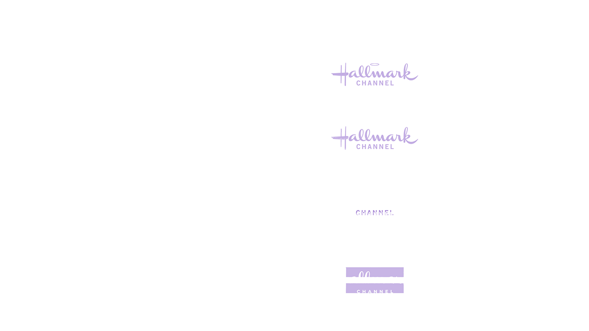
Logo Refreshed

Logo + Tag Line

Illuminate
Light is the language of modern storytelling.
Cinematic, Luminous, Sophisticated, Inspired, Warm
At an elemental level, our stories are made of light; characters are captured and recreated in light. Because light is a spectrum of additive color, our content becomes the source of illumination, which shines through the Hallmark universe. Our design bridges content and brand; furthermore, it echos the emotional connection from the look and feel of the content.
Typography Family

Motion Behavior

Font: GT America Bold + GT America Light
Tune in + Title create an eye-catching horizon axis.
Illuminates outward with a clean flowing layout.
Illuminates outward with a clean flowing layout.
Flexible Promo System
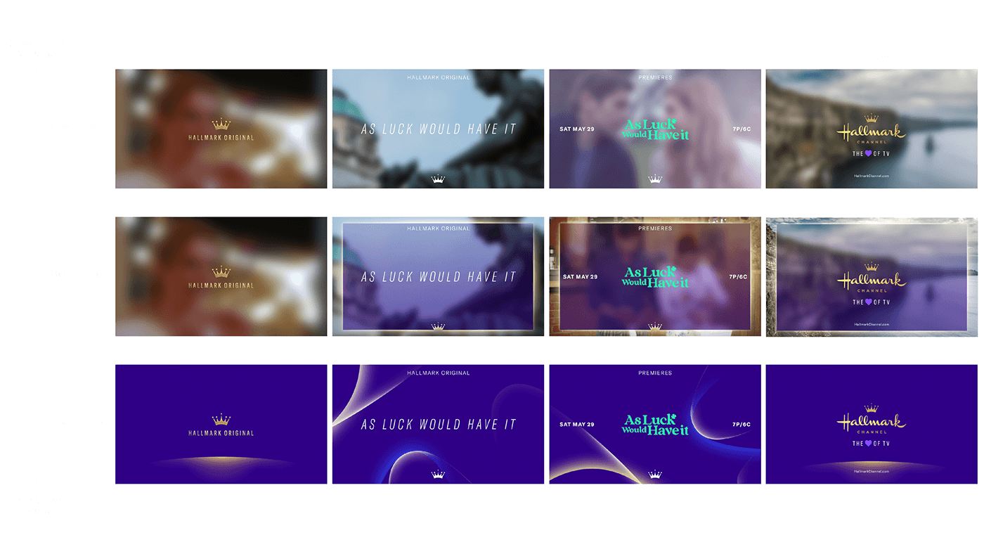


Top Tag - Original Series


Left: Main Theme - Original Premieres
Right: Seasonal Franchise - Countdown to Christmas
Title Card - Seasonal Franchise


Seasonal Icon + Seasonal Franchise Logo or Title
Talent ID


Left: Main Theme - Original Premieres
Right: Seasonal Franchise - Spring Season, March to April
Photoshoot Guideline: Close-Up on the Talent Solo Shot
Cooler Skin Tone Lighting / Color Correction
Cooler Skin Tone Lighting / Color Correction
Tune-In


Low Touch - Over Footage Treatment


High Touch - Full Color Page
Overview
Context
Roger, an LA-based agency, contacted me about collaborating on Hallmark Channel's rebranding. It was a fantastic opportunity to work with a new agency on such an iconic family and female-oriented TV network. The challenge was to ensure the new look and feel resonated with the network’s newly defined audience segments — to maintain the core Traditionalists and to grow the younger crowds as the Embracers.
I was fortunate to work closely with the agency Partner/CD, Dane Macbeth, Head of Production, Anne Pendola, and had full support from the in-house team — top-notch talents.
This project took a drastic turn as my baby boy was born in the middle of the night while I prepared the presentation deck for the following day’s meeting. I did my last Zoom call in the hospital room before I left the leading role. I wanted to do a special shout-out to everyone on this job at Roger for their professionalism and understanding. It was a brief but incredible experience working with them.
Brief
As the leading creative, it’s vital to communicate with the internal team that our approach should establish the visual language for the Hallmark Channel and, more importantly, that our concepts comprise a series of strategies and designs that have the power to effectively imprint the Hallmark Channel in the minds of the audience.
The directions create a through-line that unites our incredible variety of content while connecting with viewers in ways that feel direct, seamless, and authentic.
Service/Project
TV Network Rebranding
Client: Hallmark Channel
Agency: Roger
Partner/CD: Dane Macbeth
Head of Production: Anne Pendola
Role: Creative Director


