

Usability Report
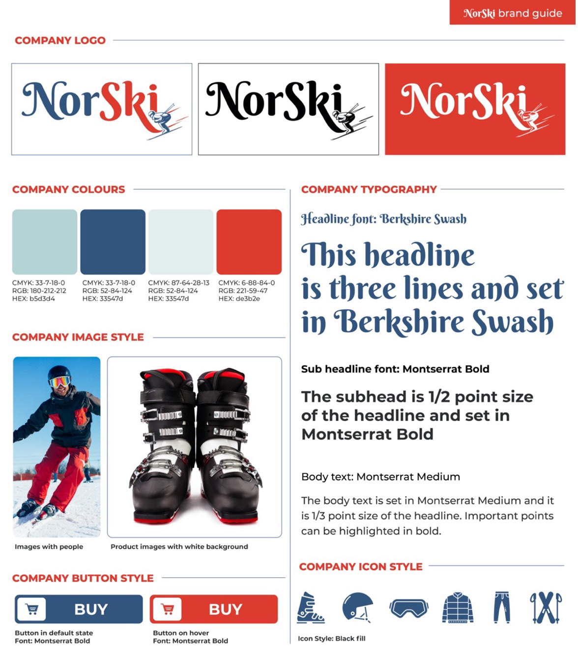
In this task I tried to create a positive first impression for users by implementing brand colors and styles of NorSki, keeping the design consistency, so that visitors could recognize this company’s landing page, e-commerce product page and dashboard as “representatives” of the same corporate brand. My goal was to keep all the pages clean, simple, and visually pleasing.
I designed these materials for scanning, offering users F-pattern layout which is great for Viewing content – like in the product page (e-commerce). Also I user Z-pattern layout for quick scanning/ reading of content.
In case of the lead capture landing page users will need to fill in the form with their personal data in order to get a chance to win a pair of ski. Required information is: Name, surname, email address, post code, age. This will allow to evaluate users according to their needs, age specific, demographics for the future email marketing and bonuses offers/ “give away” campaigns.
There is a clear call to action on the product page, that will stimulate buying behavior of users. Also, illustrations of the product (ski googles) are presented. Users just need to choose size and color and will be redirected to the payment method page or “wish list” or “basket”.
On the e-commerce product page I designed a usable navigation areas (top menu), as well as in the Landing page. But after that, I decided to delete it, because this type of Landing page has only one purpose - capture leads and gather their contact information. So it doesn't need to have a header (in order to avoid "going back' or skipping from the primary action on this page.
I designed the layout of pages to be usable: for the landing page I used a big hero section with the main photo that gives users relevant emotions during skiing, on the right part of the page I placed the registration lead capture form, below there are some examples of the skis offered with prices and then the subscription option (as required in the task), and footer.
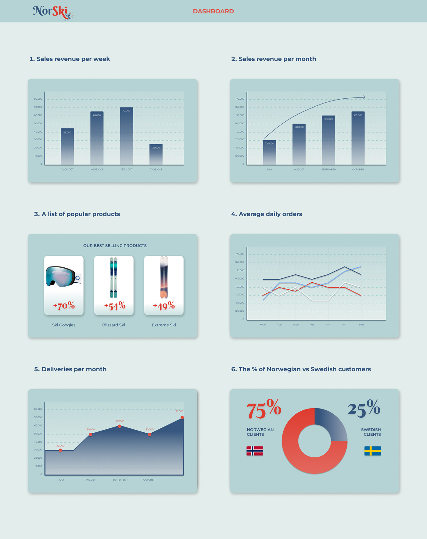
For the dashboard I user a clean layout with two columns of charts, graphs and illustrations of data for marketing department of NorSki.
Headings can be of 2 types: main title (1X) and subtitle (1/2 X) which is two times smaller. Body text is tree times smaller than the main title (1/3X). I used corporate fonts and colors to keep consistency of the design.
Oslo, Norway.


