PROJECT INFORMATION
Beans United is a holding company based in Saudi Arabia, specifically tailored to the B2B coffee market. Overseeing several coffee business brands, including Piccolo Coffee Roasters, Beans United aims to position itself as a successful beverage business partner, particularly in Saudi Arabia.
Widarto Impact has been granted the opportunity to design Beans United's brand identity, positioning it as a holding company for multiple coffee business brands under its umbrella. The name Beans United reflects the company's ability to meet all the coffee business needs, especially B2B, from upstream to downstream.
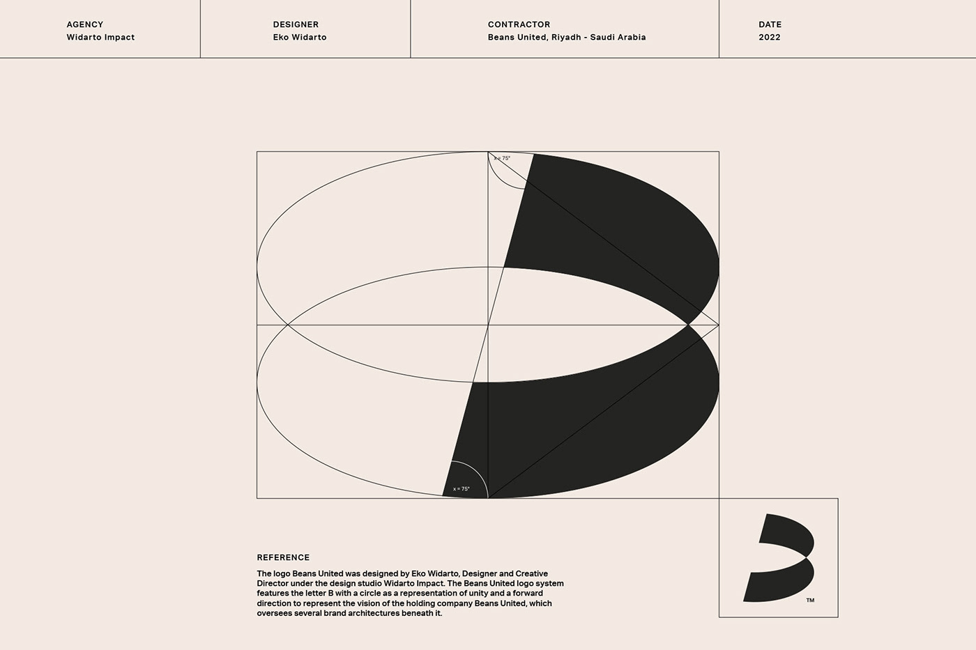
The Beans United logo is bold, simple, and memorable. The brand's symbol consists of an abstract letter "B," designed from a combination of the initial letter of the brand's name "B," a circle reflecting "United," and an arrowhead symbolizing the company's forward-moving spirit for continuous growth and development. The wordmark is displayed in the geometric sans serif Aktif Grotesk, with secondary type set in the serif Lapture.
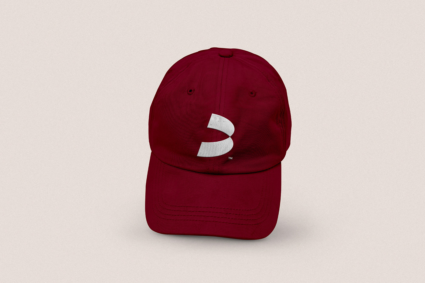
A distinctive color palette conveys the sense of passion at the heart of the Beans United brand. The brand color is an intense, raspberry red that is markedly different from the greens typically associated with coffee companies. The white beige (Alabaster) is placed against a raspberry red for a rich, clear look.
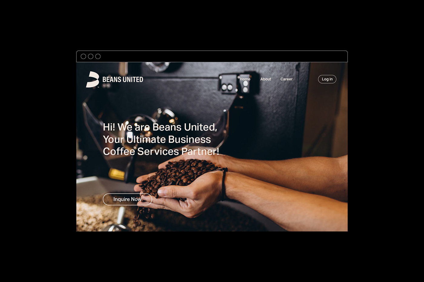
The simplicity and elegance of this identity are conveyed through brand expressions such as stationery, packaging, marketing collaterals, merchandise, and website design. All design applications are based on the Beans United symbol, providing a cohesive brand experience.
Credit:
Creative Director & Designer: Eko Widarto
Motion Designer: Dwiken Maulana
Pre-press designer: Renzy Rohmatillah