


I recently complete a new Instagram design community brief posted by BriefHaus, about a skincare brand called Pur. I had a lot of fun with this project and am really proud with how it turned out.


Pur is a skincare brand and I designed their logo with a droplet in mind and the brand name fitting inside. The original thought was to include it dripping from a pipette, but K.I.S.S.

This is the full style guide I created for the branding of Pur. Lately I've started each project by setting up my style sheet template and adding elements as they come together. When I publish these Instagram design community briefs, I don't include the style sheet, but it helps to layout my post carousel. So each is complimentary to each but not the same.
The Tagline for this brief was "Think Skin". The official copy provided with this brief was "This comprehensive serum brand is brimming with botanical ingredients - Spanish Lavender, willow bark, and sea fern - that work together to target wrinkles, lax skin, pigmentation, and dryness, and leave skin feeling soft and supple. In addition to being vegan, they're free of parabens, phthalates, SLS, mineral oil, petrolatum, paraffin, DEA, and polyethylene beads."
I used the botanical ingredients in this brief, Spanish lavender, willow bark, and sea fern, to inform the colour palette of the brand.
I wanted a bold colour palette to provide direct contrast to all the skincare brands using pastels.
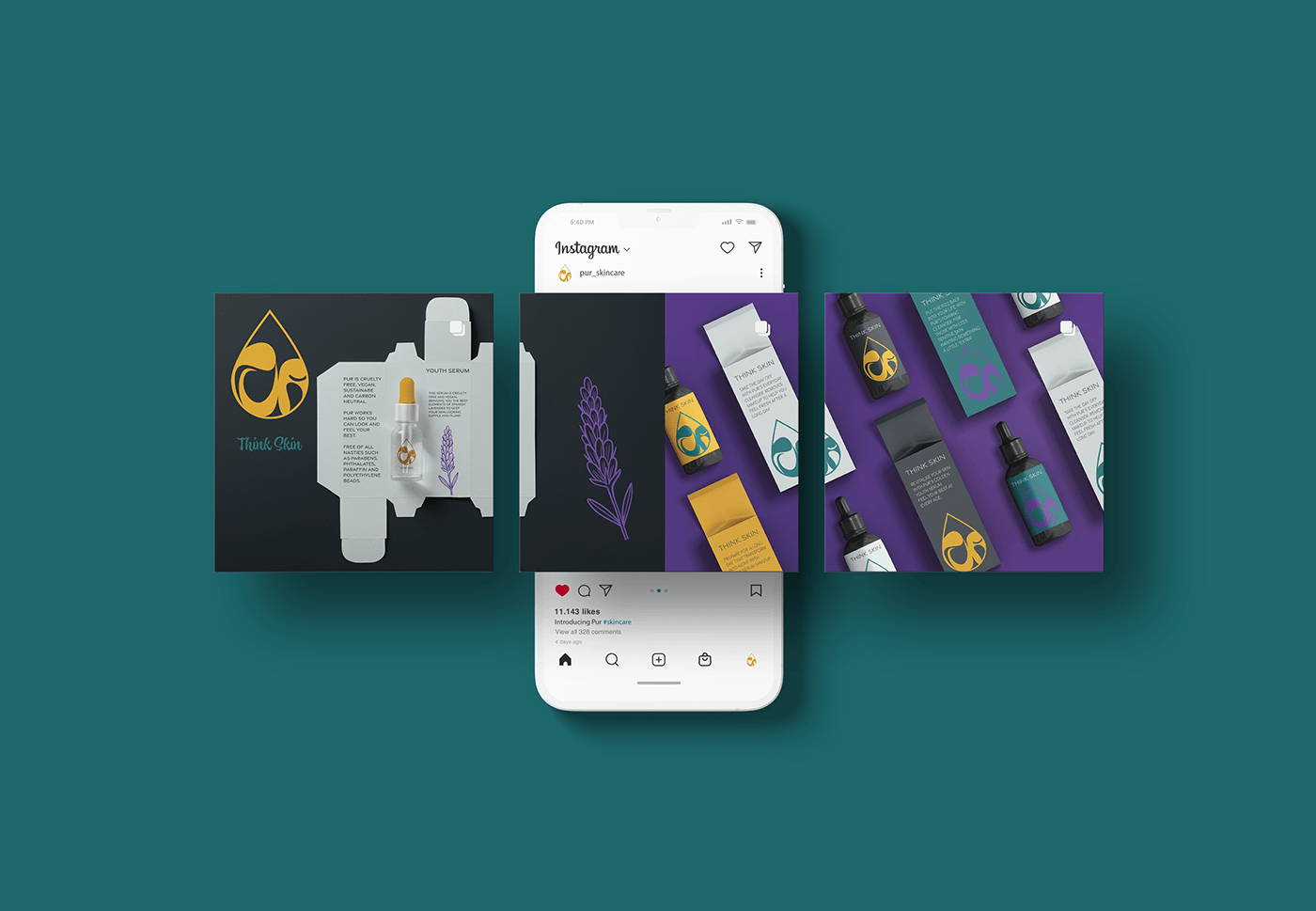
This Instagram image carousel mockup is a sample of the way I presented the project on Instagram.


These are some mockups that I did for the project.


This is a pattern swatch that I created in Adobe Illustrator to include in the project.


